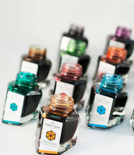

Why Choose Montblanc Inks?
This week's topic was actually suggested to me by one of our store regulars, Essandra. We were discussing favorite inks, and she brought up Montblanc and said she thought I could offer a unique perspective on Montblanc ink because I write articles that are accessible to all levels of fountain pen lovers. "Some people think Montblanc inks are unattainable," she told me, and I agreed: Montblanc's status as a luxury brand is a double-edged sword. Montblanc inks are harder to buy because only a small number of fountain pen stores are allowed to carry them, and their Limited Edition, Special Edition, and Elixir lines are pricier than most other brands' inks. This high cost is not the case for their standard inks, as I will discuss later, but Montblanc is perceived as very expensive by many fountain pen users. This makes the inks feel more special, but that feeling of exclusivity is also something that scares people away.
Customers who are into Montblanc ink are often very passionate about it, though, and some even buy multiple bottles of the same ink because they love it so much and don't want to worry about running out of their favorite color. Montblanc regularly releases special edition and limited inks that are only available for a short time, and they have also retired many beloved inks from their standard line over the years, making Montblanc ink lovers even more fanatical about their favorites.
Why do Montblanc ink fans love it so much? The ink isn't just revered because of its elevated status as a desirable designer brand, although of course that is part of it. Montblanc ink devotees return to these inks time and again for their high-quality, reliable formulas. Many Montblanc pen owners will only put Montblanc inks in their pens, not because they are snobs but because they know these inks will be most compatible with their pens. Their experience tells them that Montblanc inks are well-behaved and safe in their expensive (and/or vintage) pens, and that the formulas, which are generally on the drier side, will be the perfect match for their wet-writing Montblancs. Not only will the combination of the pen and ink look the most beautiful, using this ink will keep their writing instrument running smoothly and protect their treasured pen.

But, you don't have to own a Montblanc pen to appreciate Montblanc inks. These inks work beautifully with many other brands of pen, especially wet writers such as Pelikans. I regularly use Montblanc ink in my fine nib Esterbrook Estie, and Montblanc is also very compatible with my Faber-Castell Hexo, my Otto Hutt Design 04, and my two Pelikans.
The great thing about using Montblanc inks with brands like Faber-Castell and Otto Hutt is that these brands, and many others, use Standard International cartridges. Montblanc's cartridges are the standard from which Standard International is based, so their cartridges are a convenient and much lower cost way to fill your favorite Standard International pen with Montblanc ink without having to buy a bottle. When I was discussing the idea of writing a blog about Montblanc inks with Essandra, she commented that people "forget that they come in cartridges." She often buys the cartridges for her own pens, and other customers have specifically asked me to sell them non-Montblanc pens that use Standard International cartridges because they want to be able to use their favorite Montblanc cartridges in a less expensive pen that they don't have to worry about losing. If you aren't sure if your pen uses Standard International cartridges, you can check out our Cartridge or Converter Compatibility reference chart. We carry a pretty wide selection of Montblanc ink cartridges and there are some very nice colors available!

Montblanc's Bottles and Boxes
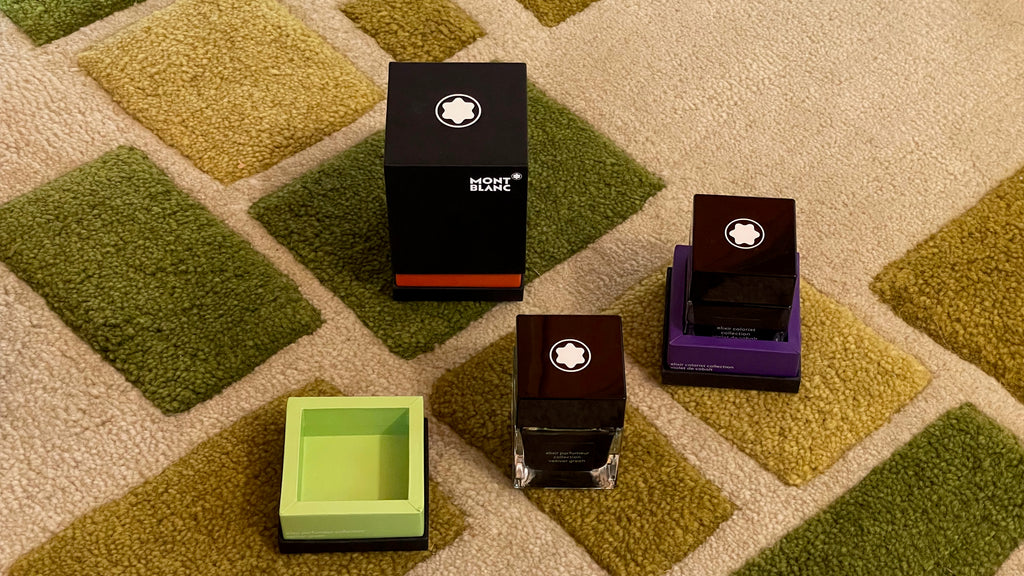
Of course, if you do buy a bottle of Montblanc ink, one of the things you will appreciate most is the beautiful and functional heavy glass bottle. Montblanc ink bottles come in a variety of shapes, all of which are very enjoyable to use and to look at. The bottles we currently have for sale in the store are three different shapes, as you can see in this photo.
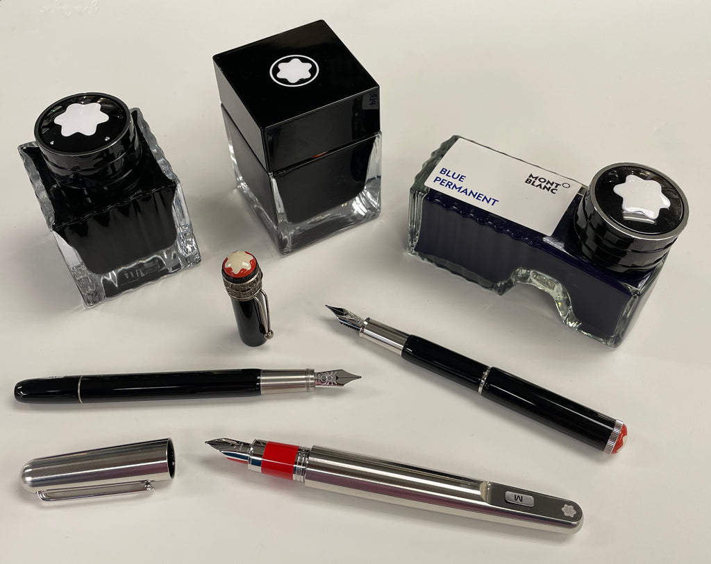
[Left to right: Special Edition/Limited Edition bottle, Elixir bottle, and Standard ink bottle. Featured pens: Montblanc Heritage Spider Metamorphosis, Montblanc Heritage Baby Black (cartridge only), and (Montblanc M)RED Signature.]
Montblanc's famous "shoe" shaped bottles (on the right) come with their standard line of inks, and are designed so that, when your ink is running low, you can tilt the bottle and collect the remaining portion of ink in the "heel" and still have a deep enough well to fill your pen. Very clever!
You may be surprised to know that these large 60ml bottles are actually pretty economically priced. Right now, the regular (non permanent) inks cost $26.00 for a 60 ml bottle (43 cents per ml), which is far less expensive than popular brands like Sailor, Pilot Iroshizuku, Jacques Herbin, and Pelikan Edelstein, and even beats standard J. Herbin and Diamine 150th Anniversary inks. They come in a variety of beautiful and very usable colors.

The angular square bottles, like the one in the center of my photo above, are part of the Elixir line. Elixir Colorist inks are inspired by ancient colors long used in human history, and the recipes for these inks use natural dyes. The Elixir Parfumeur inks are scented, and are inspired by luxurious and historical fragrances that similarly made their mark on human history.
The lovely ridged square bottles, like the one on the left in my photo at the beginning of this section, house Montblanc's Limited Edition and Special Edition inks. Special Edition inks are special colors that aren't part of Montblanc's standard line, and the Limited Edition inks are designed to complement Montblanc's limited edition pens. These bottles are so pretty that people sometimes buy empty ones, or save their finished bottles to reuse.

A nearly empty bottle with evaporated ink clinging to the glass gives you a feeling of timeless beauty and connection to memories of the past, like an old perfume bottle with the thickened remains of an almost-forgotten scent from long ago. This bottle belongs to a good friend of mine, and I couldn't resist taking this photo a few months ago. It's so evocative.

Here are just a few examples of Montblanc's interesting boxes. Thank you to store owner Leena for loaning me her Montblanc ink collection for this article. Some of the featured inks, like the ones in these boxes, are no longer available.
The Limited Edition inks' boxes have fascinating and meaningful artwork just like the corresponding pens do. I'll always remember the gentleman with Mexican heritage who came into the store during one of my first months at Pen Boutique and admired the incredible Patron of Art Homage to Moctezuma I limited edition pen I showed him. This pen is one of the most impressive and expensive ones we have on display. He loved the pen, but thought the $9,200 price tag was a bit high for him, so instead he bought our last bottle of Homage to Moctezuma I Pierced Sky ink. It was a cool way to honor his heritage and his love of fountain pens, without breaking the bank, and I bet the box looks great on display in his house! Montblanc's limited editions pay tribute to a wonderful variety of subjects from art, history, literature, and culture, so you may find one that especially speaks to you.

Here are a few of the current Limited Edition inks and pens we have in the store.

[Inks: Ladies Edition Pearl, Enzo Ferrari Purple, and Around The World in 80 Days - Year 2, a warm grey. Featured pens: Montblanc Great Characters Limited Edition (1898) - Enzo Ferrari, Montblanc Meisterstuck 145 Doue - Around the World In 80 Days - Year 2, and Montblanc Muses Marilyn Monroe Special Edition.]
I also thought you might like to see some cool older bottles from Leena's collection. They include several interesting shapes that are no longer available.

By the way, Montblanc does sometimes reissue beloved older colors with new names, so, if you missed out on a favorite, don’t despair... keep an eye out, and it may return. You'll notice some of the inks in my swatches in the next section look very similar. It's always fun to try to figure out if an older ink has reinvented itself and come back for a second appearance.
Colors With Character


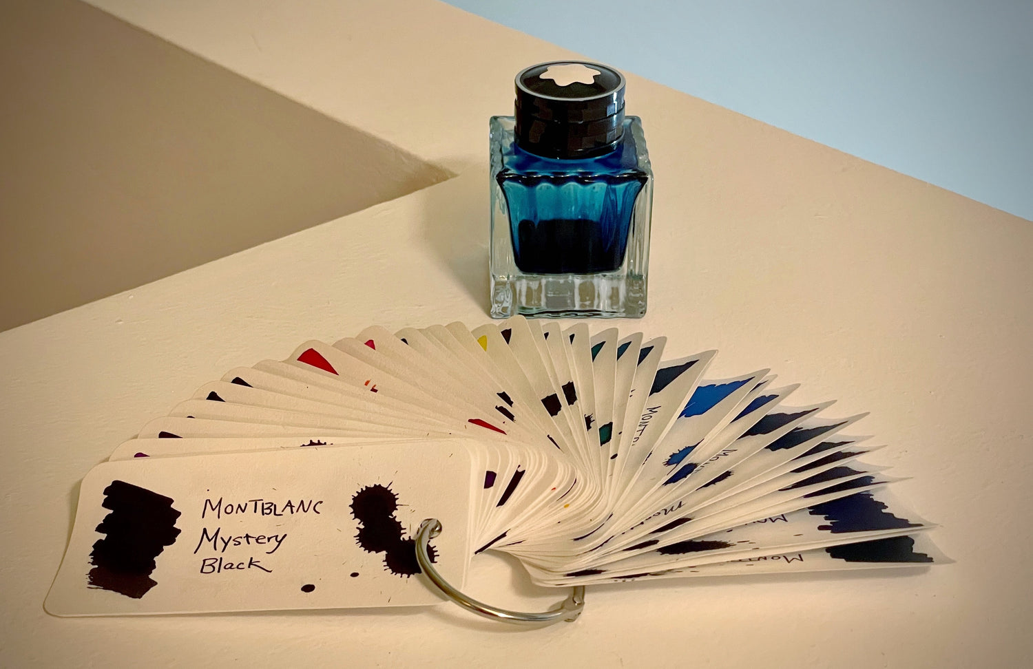
I know I don't have every Montblanc ink color (far from it), but I had fun trying all the ones I could get my hands on. Most were borrowed from Leena. A lot of these have been retired, but we thought readers would still be interested to see what they look like. Before I painted my squares, I swatched all the inks on my Col-o-ring ink testing cards and put the cards in the order that made sense to me. (See below.)
For my Col-o-ring swatches, I used a watercolor paintbrush, a blunt syringe for the splotches dropped from above, and a medium nib Pilot Iro-Utsushi dip pen. I thought the pen was a little fine for really showing off the ink, so I switched to a brass dip pen for my color grids, and, once again, used a watercolor paintbrush, but this time it was an angled one that is easier to control when you want to paint right up to the edges. Since I divided my squares with thin washi tape, I didn't worry about being too perfect. Some of these colors look quite different depending on what paper you use, but I decided on 68 gsm Tomoe River paper because I liked the feel of the ink of this paper.
It's very hard for me to say which colors were my favorites. This was a lot of colors, obviously, and it took me a long time to do all the swatch cards and squares. It wasn't feasible for me to use the inks in my real fountain pens, and a dip pen experience can only approximate what you feel when you use a fountain pen. With the dip pens, I thought the nicest feeling inks were Toffee Brown, Racing Green, Jimi Hendrix, Le Petit Prince Rose Burgundy, Mystery Black, Midnight Bkue, Black Permanent, Irish Green, and The Tiger Red. These inks were a little richer and clung to the pens in a satisfying way.
My swatches aren't perfect, but hopefully you'll enjoy comparing the different colors, and either remembering your favorites or discovering new ones you'd like to try! I've broken them down into rough categories, made a few observations, and linked to the ones we still have listed on our site.
[Also check out my fun Instagram video showing off my swatch cards!]
Black/Grey
Around the World in 80 Days Brown

Black Permanent is very thick and dark and took a long time to dry.
The new Around the World in 80 Days ink matches the Series 2 pens and is anthracite (a variety of coal) -colored, not brown like it says on the bottle. It's a complex and interesting shade that has a very subtle brownish tinge but is definitely grey.
Purple
Elixir Colorist Violet de Cobalt
The Beatles Psychedelic Purple

The Elixir Colorist Violet is a shade that Montblanc tells us "is one of the ancient colors used by human beings. The color was used for hand paintings on rock walls and caves. In the Renaissance, the violet retained its status as the color of the emperors and princes of the church throughout the Byzantine Empire. The precious natural ink recipe contains Gardenia Blue extract, a specific concentration of the flower." This ink is a little light, but the color is exceptionally beautiful.
The Beatles and Jimi Hendrix are similar but definitely distinct inks. The Beatles is a more vivid shade of purple and the concentrated splotches have gold sheen. Jimi Hendrix has slightly less sheen and it's a deeper, more brownish shade of gold. The ink also has more shading and is more serious looking.
Enzo Ferrari is more similar to Amethyst Purple, and both of these inks also have a little brownish gold sheen. I particularly like Enzo Ferrari, which is a rich and sophisticated dusky plum with a lot of character. It has more sheen than Amethyst and also more shading. I tried a sample of Enzo Ferrari Purple in my Lamy AL-Star a while ago and loved writing with it. An interesting note about Enzo Ferrari Purple: you'd think an ink named after Enzo Ferrari would be red, but in fact the reason it's purple is that he always used a fountain pen with purple ink in his own correspondence, as a tribute to his father. I love this story. There is a fascinating thread discussing this topic on the Fountain Pen Network.
Burgundy/Red
The Legend of Zodiacs The Tiger Red
Scarlet Red (Homage to Arthur Conan Doyle)
The Legend of Zodiacs Red Chine

Le Petit Prince Rose Burgundy is a very beautiful and intriguing dark rose with a hazy bronze sheen, inspired by Antoine de Saint-Exupéry's poignant and touching novella. We had it in stock a few months ago and I was able to splat it, but it's sold out now. This is an amazing ink and I wish I'd bought a bottle.
Burgundy Red from the standard line has a slight pinkness and nice shading! It's a cool color.
The Legend of Zodiacs Tiger Red and Homage to Arthur Conan Doyle Scarlet Red (named for Doyle's first Sherlock Holmes story, A Study in Scarlet) both have a bit of glossy sheen and a slight orangish tinge.
Modena Red from the standard line is a pure, bright red named for the city in northern Italy.
Pink/Orange
Elixir Parfumeur - Orange Brown - Leather Scent

Pop Pink and Manganese Orange from the standard line are both beautiful, bright colors, but less saturated than the more intense pinks and oranges. Pop Pink is an unusual and sophisticated warm shade that's a little hard to properly capture in a digital photo. It has a rosiness like flushed lips. Some of the prehistoric cave paintings in Lascaux, France, used manganese-based pigments.
Ladies Edition Pearl is a delicate soft rose color, inspired by Marilyn Monroe's iconic pearl jewelry.
Orange Brown from the Elixir line is a scented ink that both smells and looks like leather. It's more brown than orange, and reminds me of a nice pair of gloves.
Brown
Homage to Victor Hugo Sepia Brown
James Purdey & Sons - Cigar Scent
Swan Illusion Plume

My favorites of these browns are Toffee Brown from the standard line, which is a nice rich brown with pretty shading, and Swan Illusion Plume, a fascinating and unusual taupe color that I bought a sample of back in 2019. It's a little light to write with, but is a color that's very hard to match, and it's slightly multichromatic, too. This is a color I've used very sparingly in some of my paintings, since I only have a small sample.
Oh, and James Purdey & Sons - Cigar Scent really does smell like a cigar! (An unsmoked one.) It loses its scent after it dries, though. I'd like to try Montblanc's James Purdey & Sons' Single Malt Scent ink, but I didn't have access to a bottle of that!
Yellow/Green
Elixir Parfumeur - Vetiver Green
Jonathan Swift Seaweed Green
Racing Green
Homage of Brothers Grimm Green

Disney is a very bright yellow inspired by Mickey's shoes. It's an intense color but almost impossible to read. I'd only use this ink for art. It's even brighter in real life than it looks in my swatch. The camera couldn't handle it!
Vetiver is a plant in the grass family that has long been prized for the fragrant essential oil distilled from its roots. It's used in 90% of western perfumes. I didn't like the strong fragrance of this ink, but I'm not a perfume kind of person. The scent fades after you write with it, and the color is a nice chartreuse.
All of the other greens in this group are quite nice and I like all of them. Jonathan Swift Seaweed Green, Racing Green, and Homage of Brothers Grimm Green are complex and intriguing greens touched by grey. They are similar but distinct. Irish Green from the standard line is the perfect shade of green for an ink that really looks green. It's not too light, too dark, too vivid, or too pale. It has nice subtle shading and looks great!
Blue-Green, Petrol, and Azure
Elixer Egyptomania Collection Green
Homage to Moctezuma Pierced Sky
Chinese Blue
Petrol Blue
Around the World in 80 Days Blue
Montblanc for UNICEF Collection
Honoré de Balzac Dandy Turquoise


I love all the inks in this grouping. They are the type of cool in-between colors I adore. Unfortunately, these shades are also extremely hard to display digitally. Emerald and Homage to Moctezuma Pierced Sky are much more intense in real life--a rich, clear aquamarine with incredible depth and shading. While working on this article, I tried a sample of Emerald in my Petrol-Marbled Pelikan M205 and fell in love with the beautiful color and how well it matches my pen. I'm kind of obsessed with it right now and am very, very tempted to buy a bottle.
I use Petrol regularly in my Esterbrook Estie, as a friend gave me a bottle because I love the color petrol so much. I'm obsessed with this mysterious and slightly murky color that isn't quite blue or green. And yes, Petrol and Around the World in 80 Days Blue are definitely the same color. They have identical serial numbers.
UNICEF and Honoré de Balzac Dandy Turquoise are extremely beautiful bright azure inks that I can't capture with my camera. They are brighter and slightly warmer than you see above--similar to Iroshizuku Kon-peki and Waterman Inspired Blue, but richer and more intense. Sorry I can't do them justice!
The other colors are very close to what I see on my swatch cards. These are all very interesting and cool colors.

Blue, Blue, and more Blue
Homage to Napoleon Blue
Homer Greek Blue
Leo Tolstoy Sky Blue
StarWalker Blue Planet
JFK Navy Blue
Elvis Presley Old Glory Blue


Montblanc makes lots of blue inks! This is no surprise, as blue is a very useful and popular color, and there are definitely quite a few beauties here.
I was kind of surprised by Royal Blue, Montblanc's standard blue that is available in the most refill formats. It leans a little bit toward purple and is a much more interesting color than I was expecting! I also really liked Elvis Presley Blue (which makes sense, as I also like Elvis's music). It's a rich indigo like the stripes in the American flag, and has nice bronze sheen.
Midnight Blue from the standard line is also a great blue-black, and Homer Greek Blue and Leo Tolstoy Sky Blue are also beautiful shades with very evocative names. Tolstoy Blue has crimson sheen.
I think my favorite Montblanc blue, though, is Blue Glacier, because it reminds me of the color of my father's eyes. It was inspired by the ice crystal reflections in the glaciers at the top of Mont Blanc.

[Pens featured: Montblanc Meisterstuck 145 Doue - Glacier, Montblanc Solitaire Blue Hour - Legrand, and Montblanc Meisterstuck Glacier White (Classique).]

Final Notes
Just a quick note about the seals on Montblanc's ink boxes. They are not consistent, so don't panic if your box of ink is missing a seal or has a seal that isn't stuck down. Montblanc uses both white and clear seals, and sometimes the boxes even arrive with no seals. The white seals aren't very sticky, so the ends often pop up without even being touched, as you can see from this photo of our store display. They arrive that way from Montblanc, and it doesn't mean they are counterfeit or have been tampered with.

In some of the other pictures in this article, I photographed brand new bottles of ink that had sticking up labels, but I smoothed the labels down first. They popped back up a minute later! So, don't worry about it. The not-very-sticky seals make it easy to remove yours cleanly, with minimal residue left on the box, and keep the boxes' pretty artwork and bright colors looking their nicest. I hate sticky label residue, so I think this is actually a great feature!
Which Montblanc ink color is your favorite? Did I leave out the one you love best? Do you have a "holy grail" Montblanc ink that you're still looking for, or one that you hoard? What's your desert island Montblanc ink? Why? Tell me about it in the comments!
-Laura P.
I love comments on my blog! Please leave comments if you like the articles, and, if you have any questions about this article, or any of the other blog articles, you can e-mail support @ penboutique.com. Thank you!