


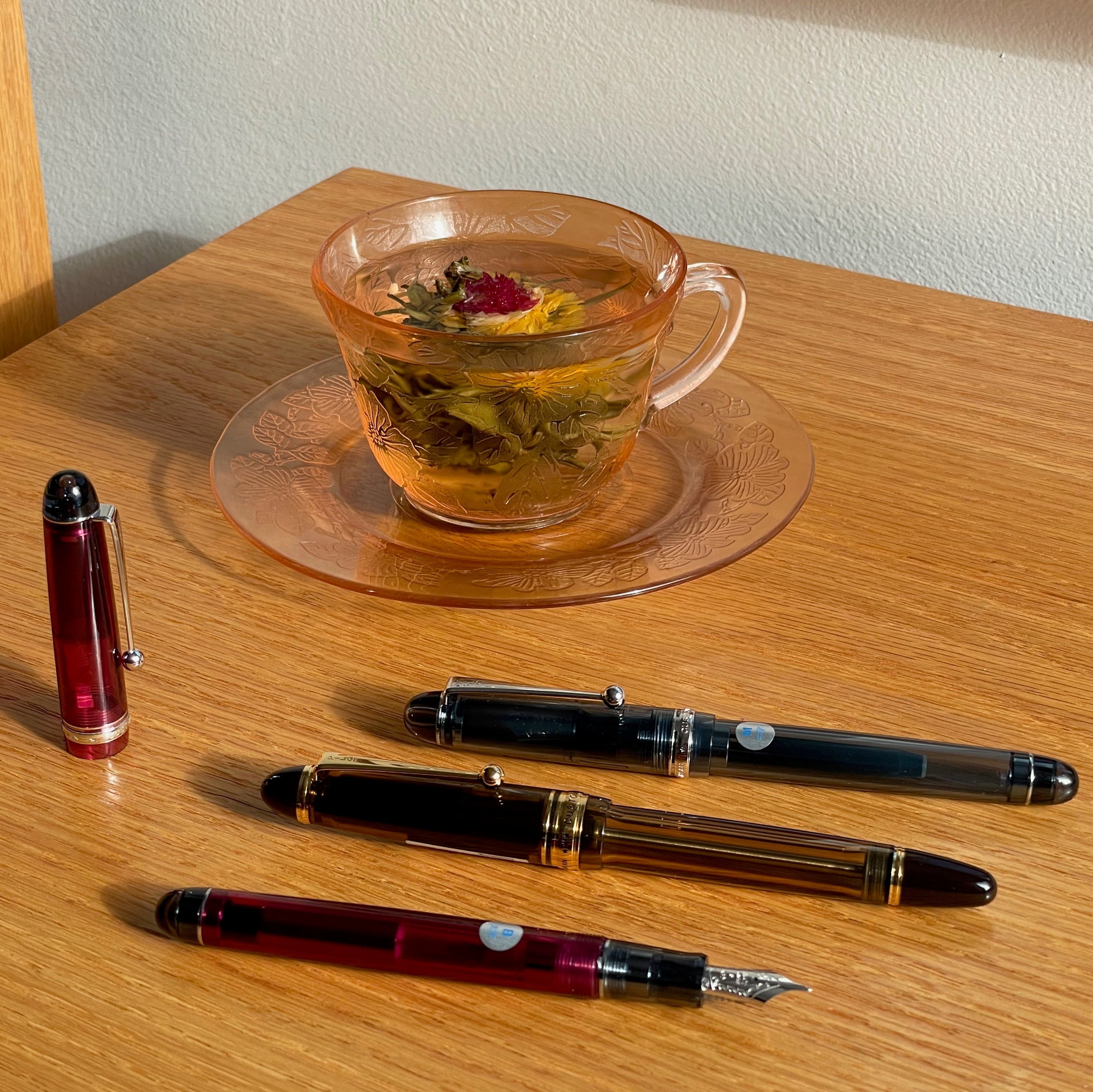
Aunque me encanta la tinta, suelo usar mis favoritas una y otra vez. Si bien es valioso encontrar tintas de confianza, también creo que es importante explorar cosas nuevas y no estancarse, así que usé estas cinco tintas en mis bolígrafos durante una semana.
Wearingeul - Drácula
Wearingeul es una fascinante marca surcoreana cuya misión es "Visualizar lo Invisible". Sus principales fuentes de inspiración son obras de arte como la literatura y la música, que son visualmente amorfas y vagas, y por lo tanto abiertas a la interpretación creativa. Wearingeul no se limita a... Imita las obras de arte originales, pero cada una se expresa con su propio enfoque de diseño moderno. Algunos colores de tinta ilustran escenas específicas o la atmósfera de poemas o novelas, o representan personajes individuales de una historia. Sus colecciones incluyen tintas de literatura coreana, tintas de literatura mundial y tintas de mitos mundiales, y también elaboran "pociones de purpurina" que se pueden añadir a las tintas sin brillo de cualquier marca. También ofrecemos tarjetas de muestra de tinta y cuadernos de Wearingeul. Tanto Leena, propietaria de Pen Boutique, como Leila, mi copresentadora de For Your Penjoyment, las usan y les encantan.
La historia detrás de la incorporación de Wearingeul a nuestro catálogo de tintas de Pen Boutique también es interesante. Ofrecemos esta marca gracias a los esfuerzos de Amber, cuya voz quizás conozcan si han llamado a nuestro servicio de atención al cliente. Amber nos dejará a finales de esta semana para emprender nuevas aventuras, pero lleva trabajando en Pen Boutique unos cinco años y casi diez años en el mundo de las plumas y las tintas. Empezó trabajando en la tienda, pero se unió a Joy entre bastidores en nuestro departamento de Atención al Cliente durante el confinamiento por la COVID-19 en 2020, y continuó en ese puesto después de que pudiéramos reabrir nuestra tienda física al público. Cuando le pregunté cómo empezó a interesarse por las plumas estilográficas, me contó que una vez salió con un empleado del almacén de Goulet Pens, y él la introdujo al mundo de las plumas estilográficas. ¡Guau!
Amber estudió inglés, así que el concepto de Wearingeul le atrajo mucho. Contactó con ellos el otoño pasado para hablar sobre la posibilidad de añadir sus tintas a nuestra colección. Wearingeul es una marca muy popular, y todos estábamos entusiasmados con la posibilidad. Además, cree que sus colores son realmente vibrantes y diferentes, y le pareció genial ver a algunos de sus personajes favoritos representados en tintas. La idea de pedir Wearingeul se suspendió porque estuvimos demasiado ocupados durante las fiestas, pero Leena, propietaria de Pen Boutique, volvió a contactar con Amber en febrero y le pidió que hiciera una lista de las tintas Wearingeul que creía que deberíamos tener. Amber consultó su extenso catálogo y eligió personajes conocidos para empezar, asegurándose de que hubiera suficiente variedad de colores en nuestra selección. Hemos empezado con 20 tintas diferentes y estamos abiertos a que nos den su opinión sobre qué tintas adicionales les gustaría que agregáramos a nuestra colección. Si hay alguna que realmente les gustaría comprar y que aún no ven en nuestra página web, simplemente envíen un correo electrónico a support@penboutique.com con sus solicitudes. Pueden ver todas las posibilidades en la página web de Wearingeul. Actualmente tenemos Perséfone , Soyoungwije , Hades , 20000 Leguas de Viaje Submarino y Por Quién Doblan las Campanas en pedido gracias a las peticiones de nuestros clientes, y estas llegarán en nuestro segundo envío, que probablemente habrá llegado para cuando publique este artículo. [Actualización: ¡Ya llegó, mientras aún estaba editando! ¡Miren todas esas tintas!]

No he trabajado muy de cerca con Amber, pero nos hemos hecho amigas en los últimos cinco meses, ¡y me da mucha pena que se vaya! Me encanta pasarme por su escritorio para probar las delicias que trae y comparte con generosidad, para compartir ideas para programas de YouTube e Instagram, o para que me bromee un poco con mis manías (como mis constantes problemas con el reloj). ¡También es una persona genial para sentarse a su lado en las cenas de personal! Amber conduce casi una hora para venir al trabajo, así que estoy segura de que no echará de menos el trayecto, pero nosotros sí la echaremos mucho de menos. ¡Creo que siempre pensaré en ella cuando use tintas Wearingeul!
Como dije antes, nunca había usado tintas Wearingeul, así que estoy deseando probar estos emocionantes colores, sobre todo los inspirados en mis personajes literarios favoritos. (Al igual que Amber, también estudié literatura inglesa y me concentré en la escritura creativa). Hay muchísimas opciones interesantes, pero la que más me atrajo de inmediato fue la tinta " Drácula " de su... Colección de Literatura Mundial. No suelo usar tinta roja en mis bolígrafos, pero me encantan Drácula y otros vampiros desde hace mucho tiempo, así que no pude resistirme a entintar mi Lamy Safari con Drácula. Mi Safari blanco pálido con ribete rojo brillante siempre me ha recordado a un vampiro, sobre todo con la punta cursiva negra que le puse. (Bueno, tengo una imaginación peculiar y creativa).

Fue difícil capturar en una foto la intensidad del brillo con la iluminación adecuada. Mi cuaderno estaba en el suelo de mi habitación en un día parcialmente soleado, y cada vez que el sol se asomaba entre las nubes e iluminaba la página, el glamour de la escritura brillante me llamaba la atención y me distraía de escribir este artículo.
El tono es tan intenso como el Fresa Salvaje o el Escarlata de Diamine, pero con un interesante brillo azul violáceo que combina a la perfección con el tono rojo rosado de esta tinta e insinúa la piel fría de un vampiro y la naturaleza sanguinaria del Conde Drácula, miembro de la nobleza. Me encanta cómo me recuerda al azul de las venas y le da al color un aspecto más misterioso e hipnótico.

Diría que la tinta tiene un flujo medio (ni húmedo ni seco) y las partículas brillantes son de un tamaño bastante pequeño, lo que evita que obstruyan el bolígrafo. No tuve ningún problema con el flujo en mi Safari con la punta cursiva, y creo que también funcionaría bastante bien con una punta mediana para escritura húmeda. Sin embargo, recomendaría usar una punta ancha, doble ancha, de punta corta o cursiva para obtener los mejores resultados con cualquier tinta brillante. Me gusta mucho cómo el brillo no eclipsa el rojo subyacente de esta tinta, sino que lo realza. 
Hay mucho brillo, pero en muchas letras actúa casi como sombreado, donde el brillo se aprecia solo en ciertas partes de las letras o en ciertos ángulos. Esto añade interés visual a la escritura y me recuerda al efecto de sombreado, que resulta apropiado para una tinta inspirada en un habitante de las sombras. Fue difícil fotografiar los efectos del brillo, pero observen las palabras "Lamy cursive" en esta foto, comparadas con el resto de la escritura. Las palabras con tintes azulados cambiaban constantemente al ver la página desde diferentes ángulos.

Una última nota: cuando intentaba sacar fotos de mi cuaderno afuera, una ráfaga de viento voló la página y me salpicó la mano con una gran gota de tinta húmeda. ¡Drácula definitivamente parece sangre si te toca la piel, un efecto que me pareció genial!

Alquimia sin fin - Lápiz del mago
Endless Stationery es otra marca completamente nueva para nosotros y ofrece un toque ingenioso y divertido. Su lema es "¡Donde la imaginación se encuentra con el papel!" y sus tintas se presentan como "portales a un mundo de alquimia creativa".
Vienen en botellas únicas que parecen una mezcla entre un frasco de alquimista y una peonza. Son divertidas para jugar, pero en realidad son muy prácticas para llenar el bolígrafo, ya que la posición inclinada y la protuberancia en la base, que las hace inestables, también permiten alcanzar la última gota con mayor facilidad cuando el nivel de tinta es bajo. Estas ingeniosas botellas se elaboran individualmente mediante soplado de vidrio, por lo que cada una es única y se comporta de forma ligeramente diferente al colocarla sobre una superficie plana y girarla.
También se proporciona en la caja una tarjeta de muestra para usar con tu tinta y un posavasos de corcho de doble cara para colocar debajo de la botella si no quieres ponerla directamente en tu escritorio o mostrador. Un lado tiene una hendidura para mantener la botella anclada, mientras que el otro tiene una superficie plana y te permite jugar con la botella y divertirte con su inestabilidad. La botella viene con un sello de viaje de goma extraíble para proteger contra cualquier fuga durante el transporte, junto con una tapa de rosca normal que puedes reemplazar una vez que abras la botella y comiences a usar la tinta. Si lo deseas, puedes conservar el tapón de goma original para usarlo si viajas con la botella en el futuro. Endless incluso proporciona una pequeña servilleta cuadrada con su nombre y logotipo, para ayudarte cuando quites el tapón. ¡Es muy bonito! Claro, el diseño de la botella y los accesorios son un poco efectistas, pero también son creativos y divertidos, algo que definitivamente aprecio.

Endless Stationery es una marca india bastante nueva, y cuando mencioné lo genial que es esto para mí, Raj, nuestro director de operaciones y esposo de Leena, propietaria de Pen Boutique, me contó que Endless se fundó con la ayuda de otra marca india que quizás conozcan: Krishna Inks. El propietario de Krishna Inks es médico, está muy ocupado y no tiene mucho tiempo para su afición por la fabricación de tintas, así que un grupo de jóvenes entusiastas de la tinta que pueden dedicarse más al negocio fundó Endless.
Las tintas de Endless están formuladas para ser suaves con las puntas, y cuando probé los cuatro colores con la pluma Pilot Iro-Utsushi , me impresionó muchísimo la suavidad y facilidad con la que escribían. A menudo me cuesta escribir con plumas y conseguir que las tintas queden bien al hacer muestras para la tienda, ¡pero todas mis muestras de Endless quedaron geniales!


Hasta ahora solo hay cuatro colores de tinta Endless Alchemy, pero todos son buenos, se ven bien en el papel y se comportan bien. Candy Sea, el color azul, tiene un brillo agradable, y el resto son tintas estándar. Ninguna tiene brillo.
Decidí probar el Lápiz Mago , un gris interesante y complejo con un ligero matiz verdoso. La tinta parece verde al humedecerse sobre el papel, pero al secarse se vuelve gris con un toque verde intrigante. El sábado que empezamos a vender estas tintas, un cliente vino desde muy lejos solo para comprarlas y se emocionó mucho al descubrir que teníamos el Lápiz Mago en stock, porque estaba agotado en todas partes. Compraron tres botellas de Endless, lo que me hizo pensar que el Lápiz Mago debía ser muy especial.
Primero probé esta tinta con mi plumín mediano Diplomat Elox , que es una pluma muy húmeda. Se sentía genial y no se corría nada, pero me pareció que se veía demasiado oscuro, casi negro, en una pluma tan húmeda, y que sus sutilezas se enmascaraban. Cuando la cambié por el Estie que el maestro de plumín Kirk Speer de Pen Realm había rectificado a medida para mí, empezó a brillar de verdad. Kirk volverá a visitar nuestra tienda el mes que viene, del 30 de mayo al 1 de junio. Puedes inscribirte en su página web para pedir una cita y que te afinen, ajusten o reparen tu plumín. ¡Estoy muy emocionado por este evento y tengo muchas ganas de volver a verlo!
No necesitas una punta de fude para obtener buenos resultados con el lápiz Wizard, pero disfruté de poder ver lo que esta tinta puede hacer con diferentes tamaños de punta, desde una extrafina hasta una ancha, tipo pincel, según el ángulo en el que sujetara el bolígrafo. ¡Quedó genial en todas!
 Mientras escribía con más fluidez con esta tinta, usando el bolígrafo en mi ángulo natural, observé: "Me encanta la sensación de esta tinta y su aspecto similar al de un lápiz. Fluye maravillosamente, tiene un sombreado interesante y una riqueza que le aporta profundidad y belleza. Sé que esto sonará falso después de lo que dije sobre que Drácula es mi nueva tinta roja favorita, ¡pero creo que esta es mi nueva tinta GRIS favorita!".
Me gusta mucho que sea bastante oscuro, por lo que es fácil de leer, pero sin duda es gris .
Se siente raro emocionarse con un gris. Normalmente me encanta el color . Pero cuanto más escribo con él, más me encanta y más disfruto mirando las palabras que he escrito. No es que escriba con especial pulcritud o belleza, pero simplemente me gusta. No sé explicar por qué.

El ligero toque de verde es fascinante y genial. Me encanta lo esquivo que es.

 También me encantó ver que, aunque esta tinta no tiene un brillo metálico contrastante como la tinta de brillo tradicional, al secarse adquiere un brillo negro brillante y reflectante al acumularse en alta concentración. ¡Es precioso! Disfruté mucho usando el Lápiz del Mago, y creo que definitivamente tiene algo especial.

Pelikan Edelstein - Lapislázuli dorado
Recién llegada la semana pasada es la Tinta Edelstein del Año 2024 de Pelikan , Golden Lapis . Esta tinta de edición limitada fue anunciada en febrero y muy esperada por los fanáticos de la tinta Pelikan que comenzaron a clamar por ella tan pronto como vieron fotos y se dieron cuenta de que es otra tinta dorada brillante como la muy popular Golden Beryl, Tinta del Año 2021, que se agotó y ahora se lista a precios muy inflados en lugares como eBay. Golden Lapis, en lugar de ser oro puro como Golden Beryl, es un azul cobalto profundo entrelazado con partículas de brillo dorado, por lo que es extremadamente bonito como Golden Beryl, pero más utilizable como un color de escritura diario. Golden Lapis llegó tarde porque estaba retenido en la aduana, así que tuve que responder a muchas preguntas de los clientes que me preguntaban cuándo lo recibiríamos. Cuando finalmente llegaron las botellas, solo unas pocas tiendas las recibieron, ¡pero fuimos uno de los afortunados! Para celebrar la llegada de esta tinta, hice un "splat" en la tienda, algo que no había hecho en casi un año porque suelo estar muy ocupada. El hermoso azul celeste, con un ligero brillo rojizo y un deslumbrante brillo dorado, sin duda parecía una nueva versión del Golden Beryl para los amantes del azul.

Cuando decidí escribir este artículo, le envié un mensaje de texto a nuestro representante de Pelikan (y Gary, Director Nacional de Ventas de Chartpak / Gerente de Marca de Pelikan, le preguntó qué tamaño de plumín creía que debería usar con la tinta. Gary lleva usando Golden Lapis en su plumín mediano M800 desde febrero y me comentó que nunca ha limpiado la pluma ni ha tenido problemas de obstrucciones. Me envió esta magnífica foto para mostrarme lo bien que escribe su pluma. ¿Ves el dorado?

Gary me instó a que lo probara con un bolígrafo de punta fina, y estaba bastante nervioso, pero finalmente cedí y lo puse en mi Caran d'Ache 849. Me encanta el azul intenso de la punta fina y cómo el brillo dorado se ve más en algunas letras que en otras. Si ilumino las letras con la linterna del teléfono, todas se ven súper doradas, pero con luz normal, el brillo se refleja de forma diferente en cada letra. También me encanta cómo el brillo dorado no opaca el azul, como suele ocurrir. Parece azul a menos que le dé la luz, y entonces es muy dorado. Gary y yo usamos cuadernos Maruman Mnemosyne .

Las tintas Edelstein de Pelikan son su línea premium y están inspiradas en piedras preciosas. "Edelstein" significa "piedra noble" en alemán y se pronuncia como... flor de las nieves ( Flor "blanca noble") de la que se habla en "Sonrisas y Lágrimas". (Es decir, "edel" rima con "dreidel" y "stein" es como una jarra de cerveza). Me sorprendió lo bien que Golden Lapis logra capturar el lapislázuli , la piedra semipreciosa de color intenso que fue su inspiración.

Así se ve la tinta en una escritura más larga, sin iluminarla en ángulo para resaltar los reflejos dorados. ¡Es muy legible y hermosa!

De todas las tintas de este artículo, Edelstein Golden Lapis es con la que más he escrito, no necesariamente porque sea mi favorita, sino porque la usé para escribir todas mis notas para el episodio 13 de "For Your Penjoyment" cuando grabamos el lunes. ¡Escribía de maravilla en mi cuaderno de Write Meeting y fue un placer usarla!

Robert Oster - Amanecer plateado
Honestamente, no suelo usar tanto las tintas brillantes, así que me disculpo porque tres de las que elegí eran brillantes. Pero todas son hermosas y diferentes, y elegí estas cinco porque eran las cinco que más me atrajeron de todos los nuevos lanzamientos.
Robert Oster es una marca popular de Australia, pero no la he usado mucho en mis bolígrafos. Me encantan sus hermosos colores para pintar, pero no me ha gustado mucho para escribir. Hace años, probé algunas tintas brillantes "Shake 'n' Shimmy" de Robert Oster un par de veces, pero no eran compatibles con los bolígrafos en los que las usaba, así que empecé a buscar otras marcas. Sin embargo, el nuevo color Silver Dawn que recibimos hace poco me llamó mucho la atención cuando vi la muestra de Shirya.

Este es uno de mis tonos de malva favoritos, ¡y no podía dejar de soñar con él! Aunque todavía me daba algo de miedo usar tinta brillante Robert Oster, porque sé que las partículas son un poco más grandes que las de otras marcas, decidí vaciar mi TWSBI Diamond Mini AL , color uva, que normalmente se rellena con Colorverse Hayabusa Glistening . Es decir, el bolígrafo es morado, sé que admite tintas brillantes, y la idea de ese hermoso malva deslizándose por el cuerpo transparente con facetas de diamante era demasiado buena como para dejarla pasar.
Empecé a usarlo en la tienda el sábado pasado, ¡y a todos los clientes a los que se lo enseñé les encantó la hermosa combinación! A uno incluso le encantó tanto que se inspiró para comprar una botella de Silver Dawn y un... ¡Pluma Diamond Mini para colocarla! (¡Hola, Logan!)

Me encanta este color de tinta. Es extremadamente plateado, pero el plateado no opaca el malva violeta subyacente, y es lo suficientemente oscuro como para ser muy legible, a diferencia de otras tintas malva que me encantan.
Desde ciertos ángulos, esta tinta es casi como un espejo, mientras que, vista de frente, es de un lila suntuoso. Me encanta ver cómo el color más oscuro se extiende sobre el papel y luego cómo el brillo emerge al secarse.

Debo admitir que esta tinta no era perfecta. Me obstruyó el bolígrafo varias veces, pero fue bastante fácil que volviera a fluir. Solo tuve que girar ligeramente el botón del pistón para que saliera un poco de tinta de la punta y despejar la obstrucción, o sumergir la punta en un poco de agua para hacer lo mismo. Aun así, recomendaría Silver Dawn, dependiendo de tu tolerancia a una tinta que requiere un poco de experimentación. En mi caso, el color excepcionalmente hermoso lo vale, y sin duda usaría esta tinta para pintar. De hecho, es en parte culpable de mi cansancio la semana pasada, porque estuve soñando con él (literalmente) toda la noche y me desperté sintiendo que no había tenido tiempo suficiente para que mi mente descansara. Supongo que suena un poco mal, pero no es frecuente que un color me emocione tanto y no abandone mi imaginación. Estoy seguro de que mi subconsciente se calmará y se relajará cuando compre un frasco y empiece a usarlo para expresar las ideas que intentan salir.

Montblanc - Gustav Klimt
La nueva tinta Masters of Art Homage to Gustav Klimt de Montblanc, rica y compleja, es la que menos he usado de estas cinco, pero no porque no me guste. Cuando recibimos el primer envío, se agotó casi al instante y no pude probarla hasta después que las demás. Dudé si incluir otro azul, ya que ya había empezado a usar Golden Lapis, pero es un color tan diferente, y las tintas azules son tan apreciadas, que decidí probarlo. La muestra de Aurora, hecha un día que estaba en casa trabajando en mi anterior artículo del blog, tiene un tono perfecto, similar a los colores de la tinta austriaca. El famoso retrato azul de Emilie Flöge , de la pintora Art Nouveau y simbolista. compañera de vida de Klimt.

En la imagen: muestra de tinta de Aurora con la pluma fuente Montblanc Master of Arts Homage Gustav Klimt Limited Edition 4810 a juego recientemente lanzada.
Pongo esta opulenta tinta azul en mi punta mediana de escritura húmeda Diplomat Elox y escribir con ella se siente como un sueño.

Incluso la caja es hermosa. Usarla me hace recordar mis visitas a la Neue Galerie de Nueva York, donde vi las pinturas de Klimt y a menudo disfruté de un almuerzo relajante. Café Sabarsky, uno de mis restaurantes favoritos de la ciudad.

Creo que escribiría aún mejor con un plumín ancho, o mejor aún, con mi Montblanc favorito: ¡el Blue Hour Legrande Solitaire ! Probablemente no vuelva a la Neue Galerie pronto, pero usar esta tinta, aunque no tenga un Montblanc para usarla, es bastante especial por sí solo.
¿Qué tintas te evocan recuerdos o sentimientos especiales? ¿Qué tintas nuevas te entusiasma más probar? ¿Crees que soy capaz de escribir un artículo corto? ¡Me encantaría saber de ti y tal vez pruebe tu sugerencia de tinta en un artículo futuro!
-Laura P.
¡Me encantan los comentarios en mi blog! Si te gustan los artículos, déjalos en tus comentarios. Si tienes alguna pregunta sobre este artículo o cualquier otro, puedes escribir a support@penboutique.com . ¡Gracias!


5 comments
H.Peter Drescher
Sitting in a small and quiet Cafe ,somewhere in the Austrian Mountains , a Place called Kleines Walstertal a really cool place. I just wanted to thank you and your Team for this great Info on what you are doing and how you are sharing your “Passion” .
Your Passion is very evident and definitely contagious.
I do have a moderate Fountain Pen collection , and my favorite Pens are the ones crafted by the " passionate " Folks at Pelikan.
Thank you with Kind Regards and Best Dishes
( I am a retired Chef , having traveled the World ,worked at some really cool Hotels, Restaurants and most importantly amazing People .
with Kind regards and Best Dishes
H.Peter Drescher
leena
love these new inks.
love these new inks.
Stacy Schulze
If you consider each individual ink review an article and this post a collection of articles; then yes, you can write a short article! The number of new inks just did you in.
I bought a bottle of Golden Lapis as soon as I could, in part for my love of the history of the use of the stone it is named after. To think that Michelangelo couldn’t afford it and so left a painting unfinished, and so many other painters had connections with it that lead directly to a hunt for a synthetic. And now, I get to write with an ink inspired by all that! (It may be my July journal ink.)
I’m also enjoying playing with a bottle from Endless. It is sitting at my writing area next to my inkwell, ready to be a fidget toy whenever I need a distraction. (I bought Mystic Forest since I love a diverse range of green inks, but Wizard’s Pencil was absolutely tempting, too.)
Thanks for all the sample photography and thoughts!
Laura Petix
Hi Stacy! I just saw your comment now! I’m so sorry it took me this long to respond. I don’t receive notifications about them. I love that you bought Golden Lapis for such a cool reason (I do things like that, too), and I didn’t know about the Michelangelo and other painter connection. Wow!! I also love knowing that you enjoy using your bottle from Endless as a fidget toy. It’s always great to hear from you!
Hi Stacy! I just saw your comment now! I’m so sorry it took me this long to respond. I don’t receive notifications about them. I love that you bought Golden Lapis for such a cool reason (I do things like that, too), and I didn’t know about the Michelangelo and other painter connection. Wow!! I also love knowing that you enjoy using your bottle from Endless as a fidget toy. It’s always great to hear from you!
Laura Petix
Thank you!
Thank you!