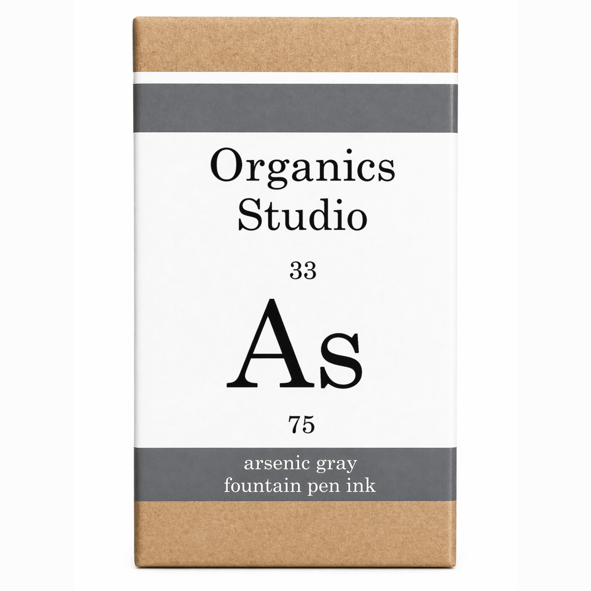
Organics Studio Periodic Table Ink Bottle - Arsenic


Elegir opciones
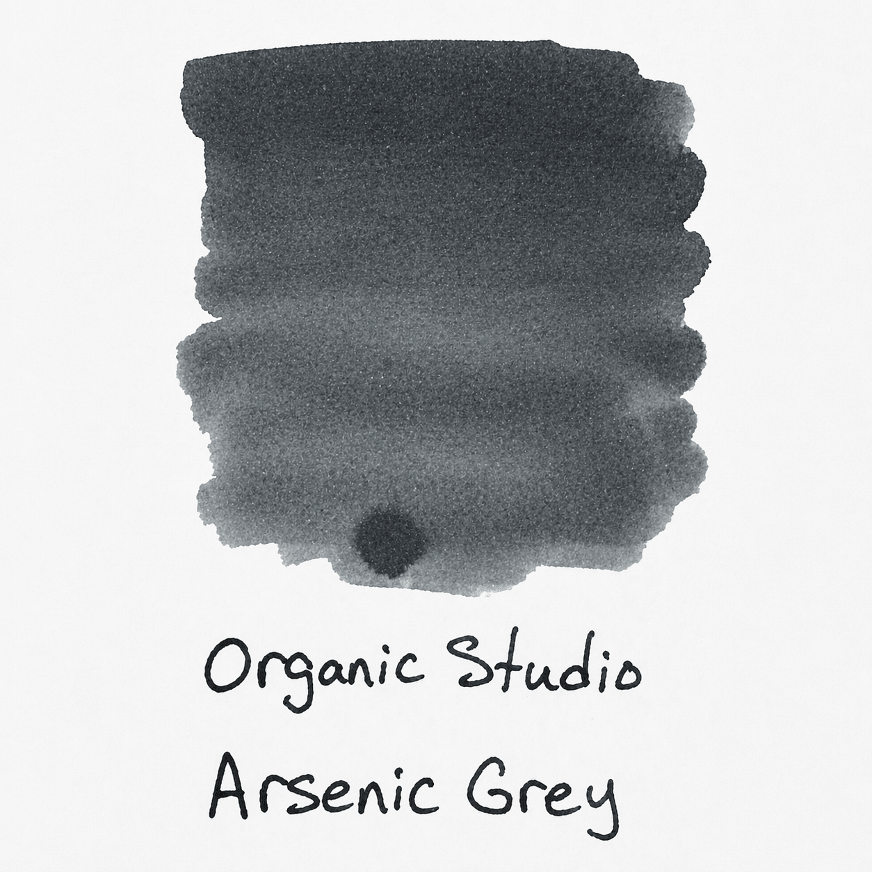
The Alchemist’s Shadow: Organics Studio Elements – Arsenic Gray
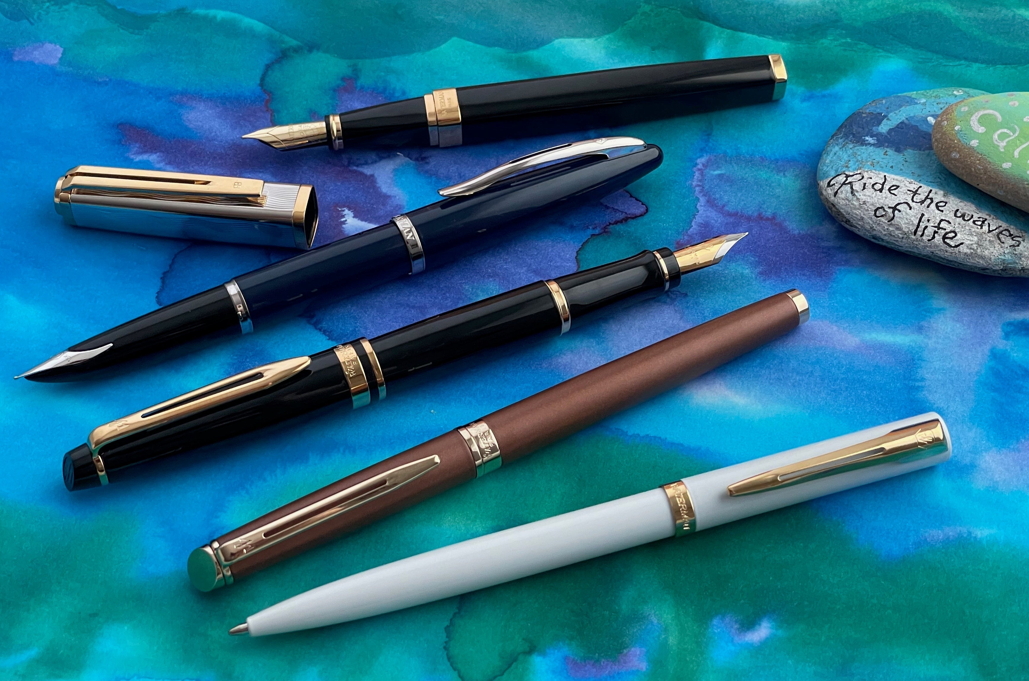
Delve into the darker side of the periodic table with Organics Studio Arsenic. As a prominent member of the Elements Series, this ink is part of the brand's original "foundational" collection. While Organics Studio is often celebrated for its vibrant "sheen monsters," Arsenic represents their mastery of moody, sophisticated neutrals—capturing the essence of a cold, metallic element through the medium of fluid.
Arsenic Gray is a heavy-duty Neutral to Blue-Gray with a "gunmetal" character. It is an intellectual's gray, designed to provide a somber, professional line that offers more depth and intrigue than a standard black or pencil-gray.
✨ Signature Features: The Gunmetal Neutral
Arsenic Gray is favored by those who want a "dependable" daily driver with a distinct, atmospheric personality.
-
Neutral Gunmetal Base: A dark, solid gray that perfectly captures the look of polished metal. Depending on the pen and lighting, it can lean slightly toward a "cool" blue-gray or a very deep charcoal.
-
Outstanding Shading: This is Arsenic's true signature. It is a high-shading ink that transitions beautifully from a light, misty silver to a dark, saturated leaden gray. This gives your handwriting a three-dimensional, "lithograph" quality.
-
Periodic Table Heritage: Part of the brand's first venture into chemistry-themed inks. It follows the tradition of Carbon, Cobalt, and Manganese, prioritizing reliable "elemental" colors for the basic writing spectrum.
-
Exceptional Flow: Known for a very "wet" and smooth flow, it glides across the paper. It is an excellent choice for "dry-writing" pens that need a boost in lubrication.
-
Professional Utility: Because it lacks aggressive sheen or shimmer, Arsenic is a perfect "work-safe" ink. It is conservative enough for formal documents while remaining interesting enough for personal journaling.
🖋️ Best Practices for Arsenic Gray
To capture the "elemental" beauty of this gray on your page, consider these tips:
-
Nib Extremes: This ink is best at its extremes. A Dry Fine nib will make the ink look lighter and more like a classic graphite pencil. A Wet Broad or Stub nib will reveal the darker, gunmetal tones and maximize the dramatic shading.
-
The "Pencil" Aesthetic: Many enthusiasts love Arsenic because it mimics the look of high-quality pencil lead but with the permanence and flow of a fountain pen.
-
Paper Pairing: Arsenic behaves well on most paper types. On Bright White paper (like Rhodia), the neutral gray tones stay crisp. On Cream or Ivory paper, it takes on a warmer, slightly more antique character.
-
Easy Maintenance: Unlike the high-saturation "Masters" series, Arsenic is very low-maintenance. It is easy to clean out of your pens and won't "crust" or clog the feed, making it safe for daily use in your favorite pens.
The Enthusiast’s Note: "Arsenic is my go-to when I want my writing to look 'serious' but not 'boring.' It has this incredible way of shading that makes every word look like it was etched into the paper. It’s a very 'wet' ink, which I love—it makes my Lamy 2000 feel like it’s floating."
| Brand | Organics Studio |
| Colors | Arsenic |
| Type | Ink Bottle |