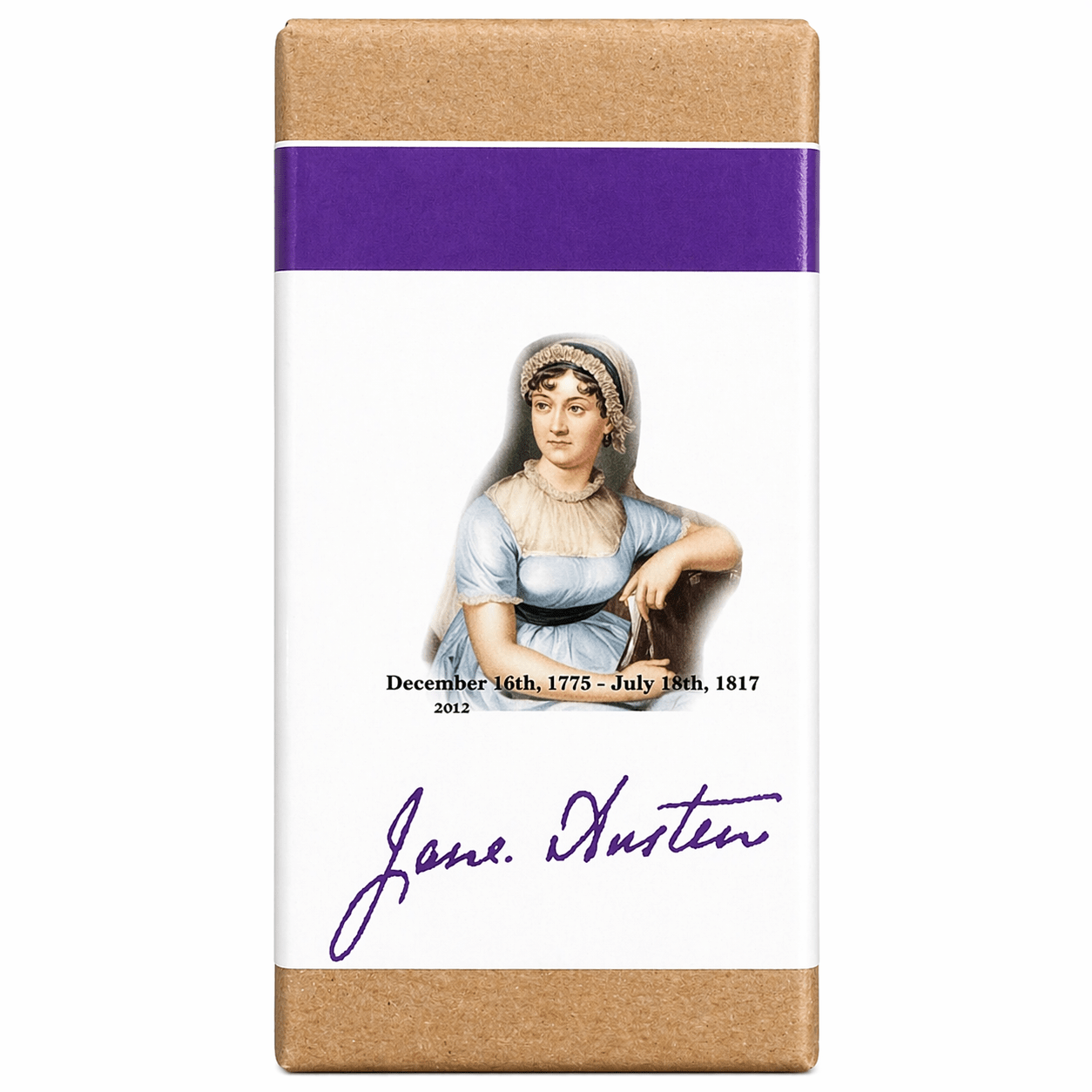
Organics Studio Writer Ink Bottle - Jane Austen


Configurer
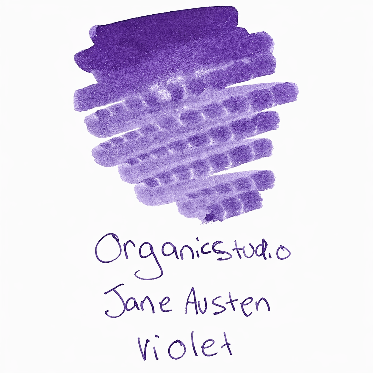
Regency Romance: Organics Studio – Jane Austen (Violet)
Step into the refined world of 19th-century English literature with Organics Studio Jane Austen. As a beloved member of the Masters of Writing series (often called the "Writer" series), this ink is a tribute to the author of Pride and Prejudice. Designed to capture the elegance, wit, and subtle emotional depth of the Regency era, it offers a writing experience that is both sophisticated and timeless.
Jane Austen Violet is a stunning, high-shading Dusty Lavender-Purple. It is a "muted" violet that avoids the neon intensity of modern purples, favoring a soft, vintage aesthetic that looks like it was plucked straight from a handwritten letter at Pemberley.
✨ Signature Features: The Literary Lavender
The Jane Austen edition is a favorite for those who prefer "shading" and "chromatic character" over aggressive sheen or shimmer.
-
Dusty Violet Base: A soft, sophisticated purple with distinct gray and blue undertones. This "muted" quality makes it highly legible and professional enough for daily use, while still being unmistakably unique.
-
Exceptional Chromatic Shading: This is a world-class shading ink. In a single stroke, it "breaks" from a pale, misty lilac to a deep, saturated plum. This creates a beautiful, rhythmic texture that gives your handwriting a classic, hand-lettered feel.
-
Regency Aesthetic: Unlike bright "grape" purples, Jane Austen has an "antique" quality. It looks like a historical ink that has been preserved in a cedar chest, making it the perfect choice for journaling or personal correspondence.
-
Smooth, Lubricated Flow: Part of the Masters series, this ink is formulated to be "wet" and easy-flowing. It glides across the paper, preventing skips and making even the finest nibs feel luxurious.
-
Handmade in Maryland: Small-batch brewed by chemist Tyler Dahl, ensuring the precise chemical balance required for its signature "soft-focus" shading.
🖋️ Best Practices for Jane Austen Violet
To truly bring the "romance" of the Regency era to your page, follow these tips:
-
The Shading Secret: To maximize the transition between light lilac and deep plum, use a Medium, Broad, or 1.1mm Stub nib. These nibs allow the ink to pool in the loops of your letters, which is where the darker violet tones emerge.
-
Paper Pairing: This ink is a "chameleon" depending on paper color. On Bright White paper (like Rhodia), the purple stays crisp and cool. On Cream or Ivory paper (like Midori MD), the warm paper tones make the violet feel more organic and "aged."
-
Low Maintenance: Unlike the "Sheen Monsters" (like Nitrogen), Jane Austen is very well-behaved. It is easy to flush out of pens and is less prone to drying on the nib during pauses in writing.
-
Artistic Potential: This is a favorite for ink-washes. When diluted with water, it yields beautiful, smoky lavender and pinkish-gray washes that are perfect for floral sketches or atmospheric backgrounds.
The Enthusiast’s Note: "Jane Austen is the most 'polite' purple I’ve ever used. It doesn't scream for attention; it just whispers class and intelligence. It’s my go-to ink for writing letters or for my 'long-form' journaling sessions when I want something that looks beautiful but doesn't distract from the thoughts on the page."
| Brand | Organics Studio |
| Colors | Jane Austen |
| Type | Ink Bottle |