


The first time I heard about our new store exclusive pen was when Pen Boutique owner Leena texted me a photo of it lying across the open pages of her notebook, with the explanation, "This is our MONTEGRAPPA PEN BOUTIQUE EXCLUSIVE. I am loving it. I am using it all day." I gasped when I enlarged the image. The rich reddish-orange resin blend was one of my very favorite color combinations, and I immediately loved the vintage-inspired shape. Not only that, but the gleaming, graceful clip had my favorite design feature: a wheel on the end! I couldn't wait to see it in person. Several days later, I was given one of the pens to use for photos and videos and told its name: Venetian Lagoon.

Surprising Name, Inspiring Pen
Venetian Lagoon?! Let me get this out of the way: the color of Pen Boutique's new collaboration with Montegrappa is not what comes to mind when I think of Venice's lagoon. When I picture the lagoon, I remember a milky bluish green. Yes, the color of this pen does remind me of things I associate with Venice: bitter aperitifs like Crodino, Giusto Sapore, Stappi, Select Pilla, and Aperol... the Venetian Red paint color used by artists... the floor of a gondola... the lace-trimmed shawl I bought on Burano, and the brightly-painted Burano homes.

I know this is an Italian pen, and the new shape, "Venetia," is Montegrappa's tribute to Venice. But I still think Venetian Lagoon is a weird name for a reddish-orange pen. If I were to name this pen, I'd call it something like "Magnifico Autunno." This pen looks gloriously, flamboyantly, perfectly like autumn.
When I brought the pen home to start my blog article, at first I was feeling conflicted because I didn't know how I would write convincingly about it as a Venetian Lagoon pen. I took it to a favorite coffeeshop for an espresso macchiato, but I still wasn't quite feeling the Venetian vibe. I had loved the pen from the start, but selling it as lagoon-inspired really seemed like a stretch. I dreamed about the pen all night long, and woke up knowing the answer: forget about the lagoon; this pen is about autumn, so just embrace it!
The morning was overcast and cool, and it did feel like autumn was on its way. When the sky cleared, I put on long sleeves and took the pen for a walk. Outside in the sun, it came alive! The intensity of the colors revealed their full glory, and I immediately saw that they matched the fall mums on the doorstep and the dense late-blooming marigolds.

I showed the pen to a few butterflies and a grasshopper, then continued toward the center of town, where I planned to write with it for the first time.

My walk wasn't as direct as it could have been. I kept getting diverted by beauty, by sights that seemed to be just waiting for me to check out with Venetia.

I had to take off my shoes and climb down into a rocky stream to get this photo, but obviously the pen wanted to explore.

Inks for Autumn
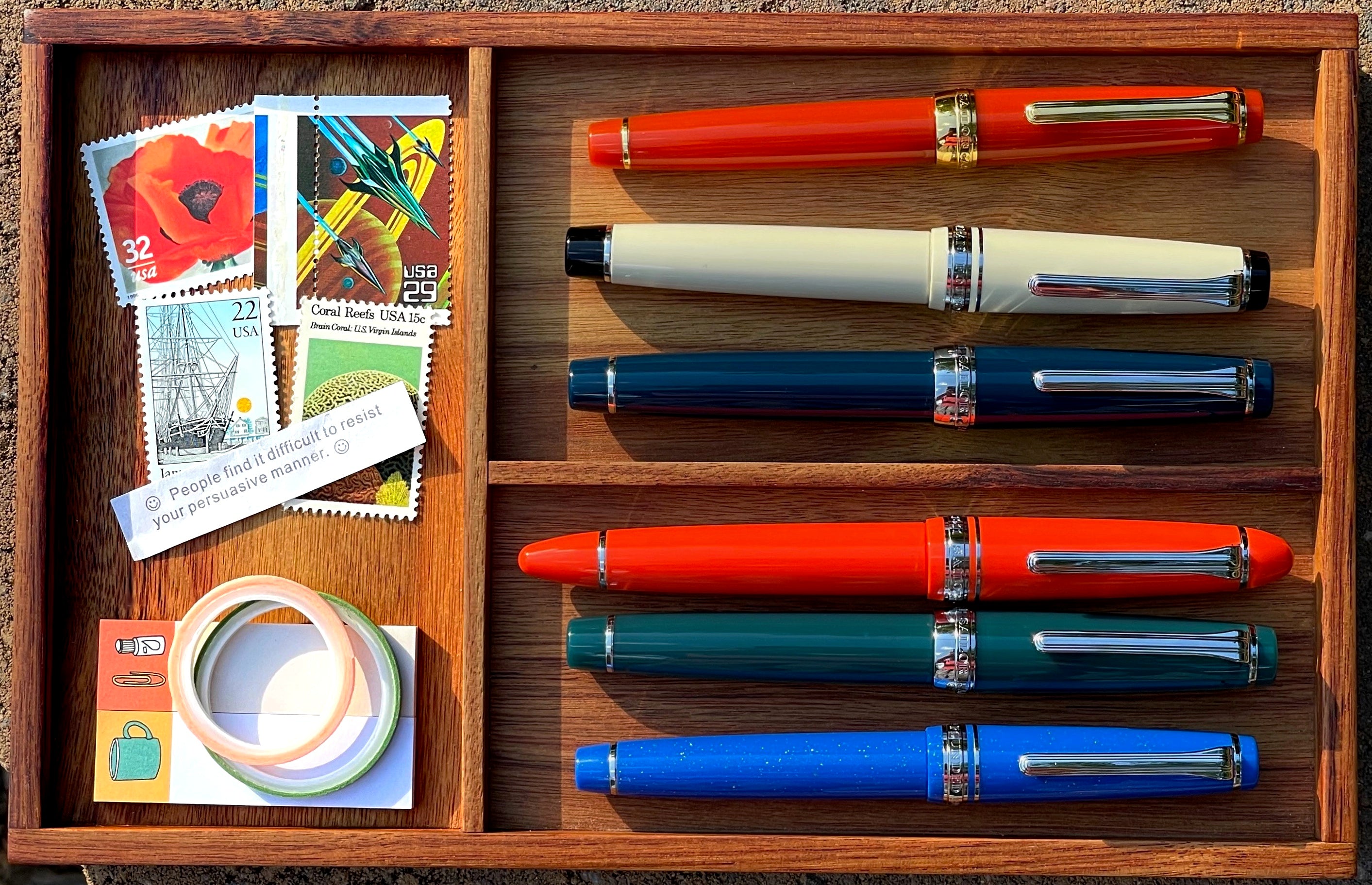
As I got closer to the center of town, I came to just the right spot to lay out the ink swatches I had brought with me. I think all these colors are perfect with the Venetian Lagoon pen, and are also perfect inks for autumn. We carry most of them at Pen Boutique, including Iroshizuku Ku-jaku, Robert Oster Burned Orange, 3 Oysters Peacock Blue, Diamine Blood Orange (my choice for inking the pen), Diamine Golden Honey, Sailor Ink Studio 830, Sailor Ink Studio 873, Diamine Ancient Copper, Diamine Red Dragon, Diamine Aurora Borealis, Iroshizuku Yu-yake, Taccia Saraku-Koiame, Iroshizuku Ama-iro (reminds me of a bright blue September sky!), Pineider Ciclamino (store only), Diamine Magenta Flash, Taccia Akasakura, Jacques Herbin Bleu Austral, Robert Oster Yellow Sunset, Sailor Manyo Akebi, J. Herbin Rose Cyclamen, Diamine Fire Embers, Iroshizuku Yama-budo, and Jacques Herbin Rouge Hematite.

A lot of these inks are particular favorites of mine. I always keep my Pilot Custom Heritage 91 inked with J. Herbin Rose Cyclamen, Diamine Ancient Copper is a perennial fill for my Pilot Custom 74, and I have emptied a bottle of Iroshizuku Yama-budo returning to it over and over in various pens. Jacques Herbin Bleu Austral is a more recent obsession. I discovered it at the store when I used it for an ink splat, and then one of my favorite customers bought a bottle and generously had me siphon off a sample to put in a vial and take home. It's such a beautiful and unusual shade of petrol blue, with rich burgundy metallic sheen that looks perfect with this pen.

Many of the other inks, such as Iroshizuku Ku-jaku, Diamine Blood Orange, Sailor Ink Studio 873, and Robert Oster Yellow Sunset are ones I've reached for again and again when doing art projects. Here are a few closeups to get you inspired. A couple of these are inks we don't carry, but you may already have them and want to team them up with Venetian Lagoon!


(I posted a video of the inks swatches to Instagram, with a perfectly-timed autumn breeze mishap at the end!)

Writing in the Sunlight... and Moonlight
When I reached the Center, I chose a table and sat down in the afternoon sun to try writing with Venetia for the first time. Yes, I was in love with the pen's beauty, but a fountain pen is for writing, and I was eager to see how it felt.

When I picked up the pen to write, I loved the feel right away. The Venetia model is larger than any of the pens I own, except the beautiful Sea Glass Esterbrook Estie that Leena gave me to thank me for writing the blog, but it's not overly heavy and doesn't feel too large in my hand. When I weighed it later, I discovered that it's exactly the same weight as my Estie and my Pilot Metropolitan: 26 grams!
I prefer to use this pen unposted, but it can be posted if you desire, and it is slightly longer than the Estie when posted: 7" vs. Estie's 6.7. They are both beautiful pens, but I prefer Venetia's pointy profile and extra comfortable flared grip section. (Sorry, Estie... I still love you.)

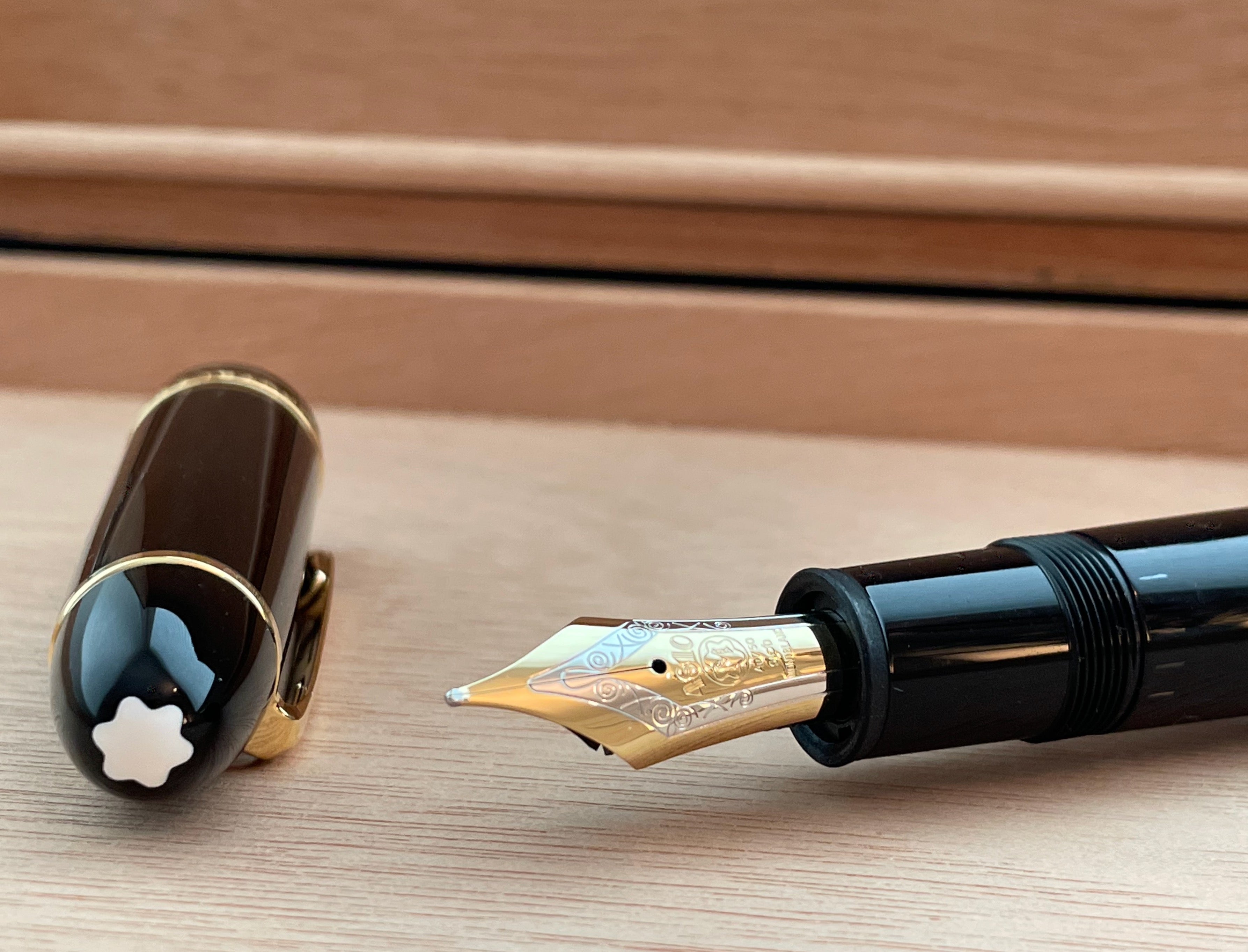
The balance is ideal, and the JoWo nib writes like a dream. The pen I brought home is a Fine, but it's smooth and juicy, and I was very pleased by the amount of shading in my letters and the way the wet ink glistened on the page for a moment before it dried. JoWo nibs are among the best German-made steel nibs available today and they are used by many of the finest pen manufacturers. I can see why they are so revered. No, it's not a gold nib, but I didn't find myself wishing it were, either. It was a total pleasure to write with and perfect for sketching. I used a blunt syringe to fill an empty Standard International cartridge with Diamine Blood Orange so I could use the pen more extensively and not get the converter dirty (since it's not my pen), and I absolutely loved the matchup. I felt like the nib provided just the right amount of feedback so that I was in touch with the page, and something about the shape of the pen encouraged me to hold it more lightly than I usually do, so that my hand moved effortlessly. I kept wanting to just draw scribbles, loops, and lines for the sheer joy of it!
Late last night, I decided to use Venetia for one of my amari tastings, and realized it was the right time to try Select Pilla, since that amaro is from Venice. Yes, again, perfect matchup. I loved using the pen to just write my stream of consciousness thoughts in my natural, slightly messy handwriting.


This pen is equipped with one of Montegrappa's excellent threaded German Schmidt converters, and two Montegrappa ink cartridges.


It also comes in a very nice box, in case you're wondering. Pretty perfect gift for the autumn lover in your life, or someone you shared a memorable trip to Venice with!

The Rest of the Details
I'm probably sharing way too many photos of this pen, but I can't help it... I enjoyed my time with it so much, and it's extremely photogenic. What else can I tell you about Venetian Lagoon, besides that it's beautiful, is a pleasure to write with, and is a Pen Boutique exclusive fountain pen that is limited to 100 pieces? (Each pen's limited edition number is written on the barrel ring alongside a simple and classy "Italy.")
Here's what I learned from Kenro, Montegrappa's US distributor:
The Venetia model is a brand new silhouette for Montegrappa that will be released in the next month or so, but we were able to get our custom limited version in Montegrappaite before the initial launch. Montegrappaite is Montegrappa's name for their special
Venetia joins Brenta, Elmo 01, and the recently refreshed Elmo 02 in Montegrappa's new Vintage Class. Like the other Vintage Class pens, it revives a 1920s archival shape, with similarly frugal use of metal trim.
Cary Yeager from Kenro provided me with this beautiful photo of the original pen that the new Venetia is based on.

Cary also shared these great images of Venetian Lagoon being created in the Montegrappa factory in Bassano del Grappa, Italy. How cool is that?! Montegrappa has been making their pens in this same factory since the company's founding in 1912.


Montegrappa's description of the new Venetia model makes me appreciate its vintage-inspired details even more:
The pen's retro character is achieved with expressive resin lathing. Venetia is full-bodied and distinctive, with precision, bullet-nose tapering at each end. The grip section also features daring industrial design, with an innovative graduated step and flared, ski-jump profile.
Venetia is made of resin and uses gold-plated brass to recreate our famous ruzzolino contour clip and an elegant, thinline cap band. Our Ambigram device is diamond-engraved in resin above the cap band, and the silhouette’s historic roots.
Uniquely in its class, Venetia carries a flourish typical of many late-1920s models. Our retro touring logo is diamond-engraved into the barrel. This historic device has featured on several of our Storia Series editions, and recalls the earliest recorded use of the Montegrappa name on a writing instrument.
I had no idea that the wheely clip is actually called a "ruzzolino" clip. "Ruzzolino" means "tumbling" in Italian. That'a a great name, but I'll probably still call them wheely clips. Maybe I'll get a wheely clip of my own someday.

Fall Feelings
I do have one final confession to make: despite my enthusiastic descriptions of my autumnal walk with this pen, I am not an unequivocal lover of fall. Almost everyone I know adores fall, but I have very ambivalent feelings about the season. I treasure spring, I appreciate winter, and the long, warm summer days and soft velvet nights make me happiest of all. But when the days grow shorter and I feel a chilly nip in the air, I am sad. I don't want to say goodbye. Until last fall, I lived in Connecticut, and although I adored the blazing fall colors, I also hated suddenly being cold and losing the sun.
Last September when I moved to Maryland was the first time I really fell for fall. No, the colors weren't as bright as in New England, but the slowness and gentleness of the season made up for it. Now I understood why my friends and family love fall: here in Maryland, it's the perfect season for long walks outside, for sitting in the sun drinking hot coffee, for campfires on the patio, for reflections on the lake, for bright orange and red leaves on the drive to work and in the trees surrounding Pen Boutique. Autumn means I can get out the scarves and leather gloves I bought in Venice, and switch to inks like Iroshizuku Yama-Budo and Yu-yake, Diamine Blood Orange, and Robert Oster Yellow Sunset. And it's the perfect time of year for our store exclusive pen.


To make my peace with autumn, I used Venetian Lagoon and some of my fall ink picks to do this painting for my Dad's birthday. I hope he likes it! I enjoyed creating it, and, especially, being able to spend time with this gorgeous and very special pen.
-Laura P.


2 comments
Susan Dye
What a beautiful writing instrument. Fall IS my favorite and this pen so beautifully honors that season of abundance.
What a beautiful writing instrument. Fall IS my favorite and this pen so beautifully honors that season of abundance.
Jim George
The “lost” art of writing is in good hands.
The “lost” art of writing is in good hands.