


Inky Inspiration
When I'm working in the store, I always get excited when customers talk to me about ink. It's a topic I'm passionate about, and it's so fun to share knowledge and inky experiences. My idea for this blog article started with two of these conversations, both of which happened to be about water resistant inks.
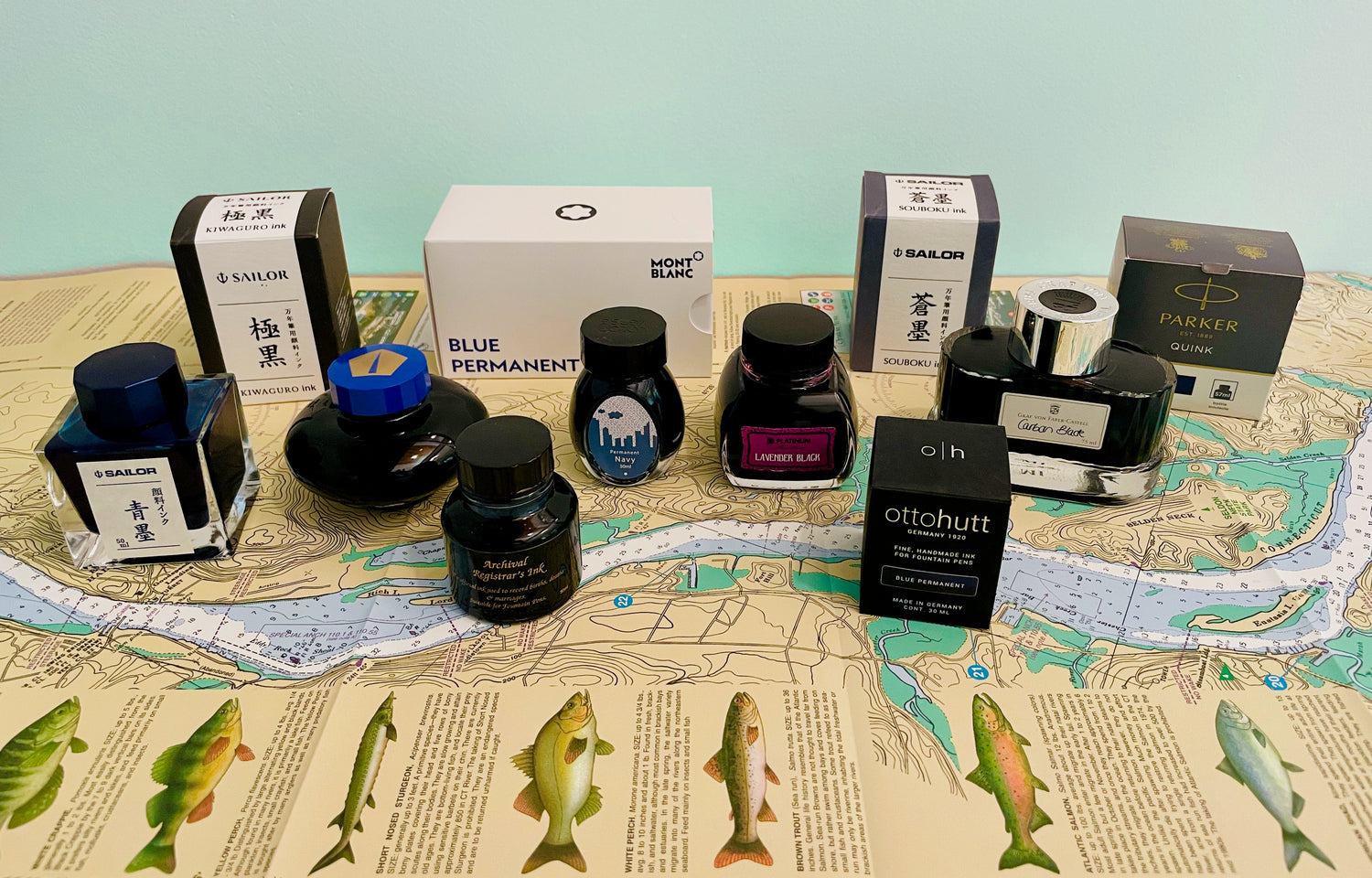
A few months ago, a customer asked me if I had ever used Diamine Archival Registrar's blue-black, an iron gall ink that we carry in two sizes--100 ml and 30ml. I had not, but I was very interested to hear her thoughts, as I've always been curious about iron gall inks but a little afraid to try one in my pens because I've read that they can be corrosive if left in a pen for a long time. If you'd like to learn more about these fascinating and historical inks, the Wikipedia article about them is excellent. Iron gall inks are made with iron sulfate and tannic acids from sources like oak galls. When exposed to air, the iron elements of the ink oxidize, so the color darkens and becomes resistant to light and dampness. The customer I talked to is a big fan of this ink, uses it all the time, loves its permanence, and told me how cool it is to watch the color darken as it dries. She said she makes sure not to let the ink dry up in her pen, but isn't fastidious about cleaning, and has never had any problems with it clogging or damaging a pen. She urged me to give it a try, and I promised that I would.
More recently, another customer was telling me about her favorite inks and mentioned Sailor Sou-boku, a deep blue-black nano-pigmented ink. Again, I was fascinated, as I had read about pigmented inks and always wanted to try one, but never had. These inks have minuscule particles of pigment suspended in the ink formula, and are therefore more permanent than the water- and dye- based inks we most often use in our fountain pens, because these solid particles adhere to the paper and bond to the fibers over time. As with iron gall inks, these inks can be more difficult to flush out of your pen, but this customer told me she uses Sou-boku regularly, loves the flow, and feels that the slightly more difficult cleaning is completely worth it. She was so passionate about Sou-boku that she volunteered to bring me a sample vial from the bottle she had at home. I couldn't turn down a cool offer like that, so of course said I'd love it, and thanked her profusely. To my amazement, she returned that very afternoon with a generously filled vial.
My First Trial: Sailor Pigmented
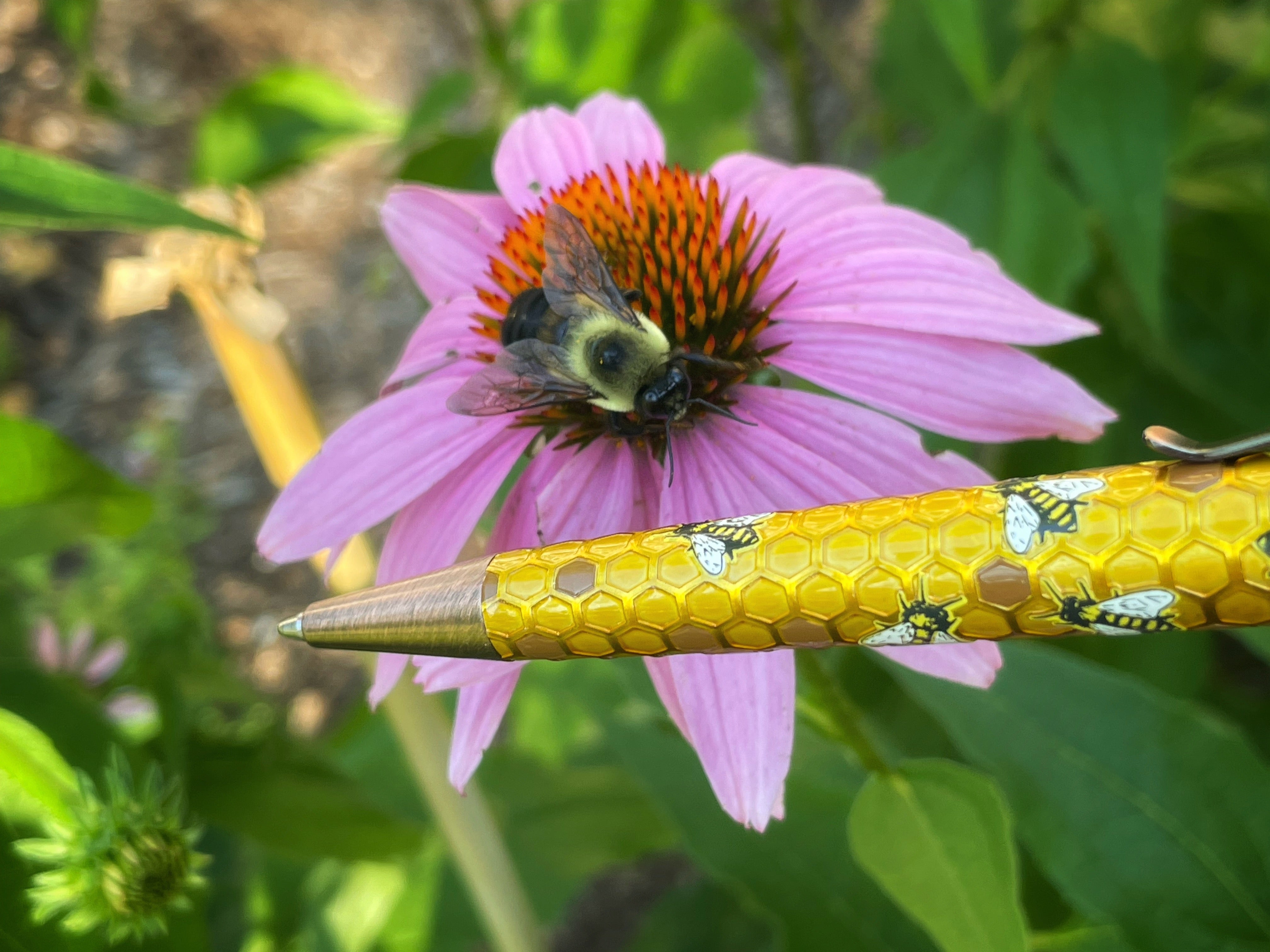
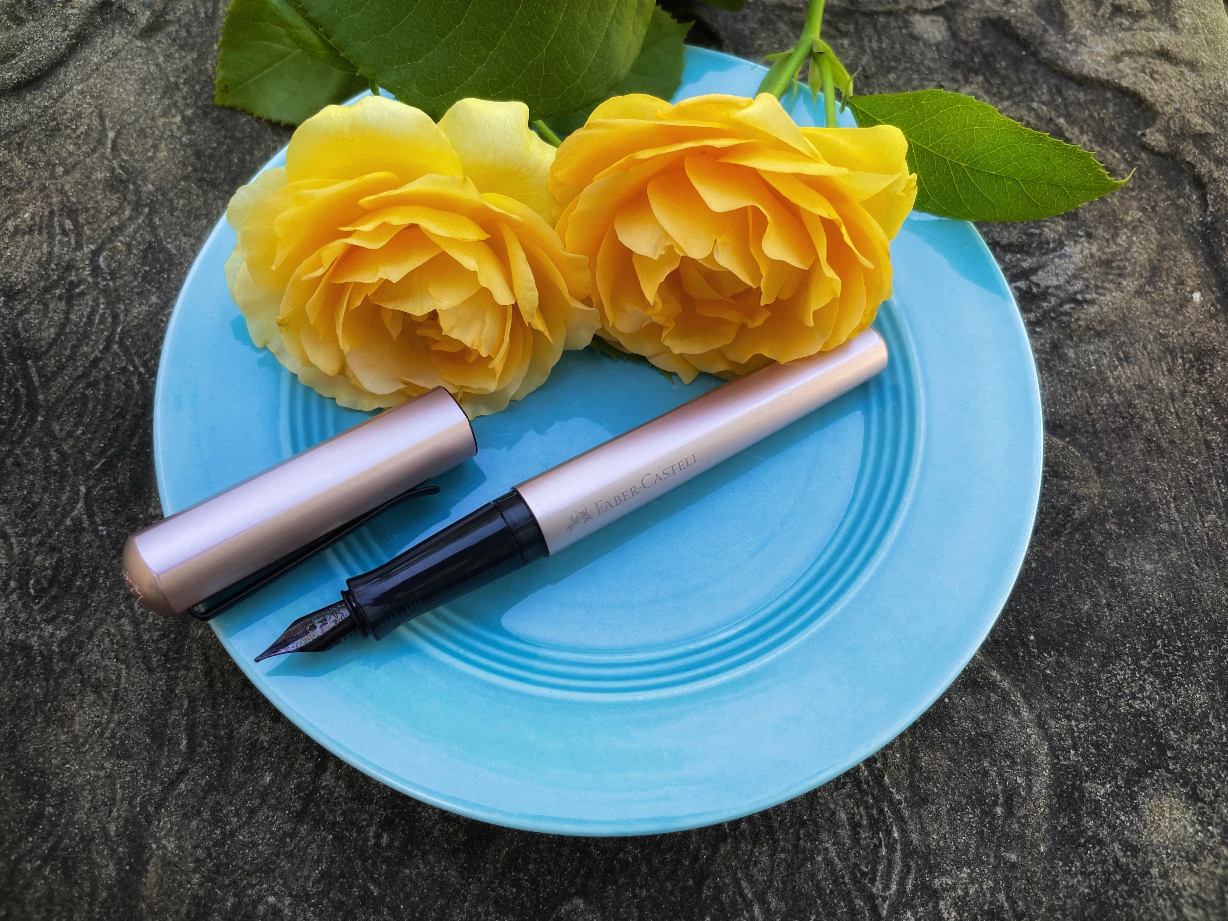
When it came time to choose an ink to use with my new Faber-Castell Hexo for last week's blog, I knew right away I wanted to try the Sailor Sou-boku, and I loaded up the cartridge converter using the vial my benefactor had given me. (I later demonstrated re-filling the converter with a real bottle, for a video on Instagram.) I ended up using three different inks in the Hexo over the next month: Sailor Sou-boku, its sister-ink Sei-boku (which is a brighter blue nano-pigmented ink with even more shading), and the royal blue cartridge that had come with the pen. I loved both nano-pigmented Sailor inks. They were incredibly smooth and had the perfect flow with the pen. The combination of the Hexo and these two inks was a complete pleasure to use.

I did have a more difficult time than usual cleaning the converter, as the particles clung to the sides of the plastic cylinder in a thin filmy coating, but it really wasn't that big of a deal. I was able to clean most of them out just by flushing the cartridge repeatedly with plain water, and, since I was switching between different shades of blue, I decided that it didn't really matter if a small amount of blue particles remained and transferred from one ink to the other. If I were to use a pigmented ink in a pen that I wanted to change colors in a lot, I think I would either buy a second converter to dedicate to the pigmented inks, or just refill disposable cartridges with a blunt syringe. The same concept would apply for any other ink I might have trouble cleaning from a pen, like one that stains or contains shimmer.

(The converter after cleaning. Pretty good!)
When I switched to the cartridge that had come with the pen, the Hexo still wrote well, but the ink was a little too wet with the pen--the lines were thicker and bled through some paper. I used it like that for a while, but today I moved the Faber-Castell ink cartridge to my Kaweco Skyline Sport, where it seems quite happy. (Both brands use standard international cartridges.) Now I am trying the black nano-pigmented Sailor ink, Kiwa-guro. It's great, too! All of them feel very smooth in my Hexo and write crisply, with no feathering and no bleed-though. I haven't had any clogging or hard-starting problems with the inks. My only issue was that they were slightly slow to dry, so I smudged them a few times while writing quickly on smooth paper.
It's hard for me to decide on a favorite. I love all three inks. Sei-boku is the most colorful and offers the most shading, but Kiwa-guro is so precise and is perfect for nice dark black lines when sketching. Sou-boku is a happy medium: a blue-black that can be used for art without drawing too much attention to itself but also has just enough shading to provide interest. I used it in last week's blog to do an ink painting where I drew the lines with Sou-boku and then painted over the top with a watercolor brush and diluted ink. The Sou-boku didn't budge and its slightly softer blue-black outline color looked nice. When swatched on my Col-o-ring Ink Testing cards, all three inks show glossy sheen in high concentration. Just be careful when you are using these inks not to mix them up! The ink names are written in both Japanese and English on the boxes, but only in Japanese on the bottles.

Ink Face-Off!
As I experienced the three Sailor inks in my Hexo, I started to get obsessed by the whole idea of using water-resistant/waterproof inks. Before very long, I knew I couldn't resist writing an entire blog article about them! (Ha, ha.) I decided to sample a wide variety of inks that were potentially waterproof or water-resistant and see how they compared in a face-off.
After reading ink articles and reviews all over the Internet, I chose the following inks for my experiment:
1. Sailor Kiwa-Guro (pigmented) ("waterproof, permanent and lightfast")
2. Sailor Sou-boku (pigmented) ("waterproof, permanent and lightfast")
3. Sailor Sei-boku (pigmented) ("waterproof, permanent and lightfast")
4. Diamine Archival Registrar's (iron gall) ("water resistant and archival in quality")
5. Montblanc Blue Permanent (pigmented) ("document proof quality")
6. Parker Quink Permanent Blue/Black (dye-based) (has "permanent" in the ink name, but the listing on our website says, "note that 'permanent' means it may stain clothing, and does not mean it is water proof or archival")
7. Colorverse Permanent Navy (pigmented)
8. Pilot Namiki Blue (dye-based) (does not advertise as being water-resistant, but online sources say that it is!)
9. Otto Hutt Blue Permanent (pigmented) ("waterproof")
10. Platinum Classic Lavender Black ("there is naturally occurring iron in the ink but is not considered to be an Iron Gall ink") ("highly water resistant and suitable for permanent preservation")
11. Graf von Faber-Castell Carbon Black (dye-based) ("most colors are indelible, smudge resistant, reproducible, light-fast and waterproof")
12. Pelikan 4001 Königsblau (dye-based) (this ink was my control subject; it's a dye based ink that is not supposed to have any water resistance)
The first step in my experiment was to write with each ink in my Clairefontaine Triomphe blank tablet. I dipped a fountain pen, as I can never quite get the hang of writing consistently with glass dip pens. It took a little longer having to clean the nib and feed between each ink, but I wanted the results to be more like the real experience of using the inks in a fountain pen.

(Pictured above: Diamine Archival Registrar's. I used a weird cheap no-name fountain pen I had fished out of the trash after a customer threw it away because it was broken. It works great as a dip pen and I didn't have to worry about any of the inks hurting it, just in case! That turned out to be an unfounded concern, and I switched to my Faber-Castell Hexo as a dip pen using the same inks later in my experiments.)
Here is the completed first stage of my test, after over 24 hours of drying. I used song quotes about water, since this was to be a water experiment!

I loved writing with all three of the Sailor inks!

The strange smell of Diamine Archival Registrar's was so interesting. It reminded me of Chloraseptic Sore Throat Menthol Phenol sore throat spray! I really enjoyed writing with that ink and watching it darken as it dried. I found the Colorverse Permanent Navy "office series" ink kind of blah looking. It was my least favorite, which surprised me because Colorverse makes so many cool and creative inks that I love. The Montblanc ink had a lot of shading on my first dip, then looked super dark on my second, which is one of the downsides of using a dip test instead of an actual inked pen. But, I guess it shows that this ink can look very different depending on how juicy your pen is.

Otto Hutt Blue Permanent was extremely thick and smooth feeling--more so than any of the other inks I tried. It felt and looked like I was writing with a completely different pen. I loved the color of the Platinum Classic Lavender Black, a sophisticated and cool mauve. It was also very fun watching this ink transform from a bright fuchsia to this more subdued color as it dried. Platinum Classic inks come in a bunch of different interesting colors that are made with tea leaves!

Graf von Faber-Castell Carbon Black was nice and dark. "Indelible" is used to describe inks that cannot be erased, removed, or washed out (but it doesn't necessarily mean they won't change appearance when they get wet). I chose the Pelikan Royal Blue as my control ink because I know that, like most fountain pen inks, it's not particularly water resistant. There's nothing wrong with that, of course! Most of the time, good flow and ease of cleaning your pen are much more valuable features in fountain pen ink.
Getting Wet
Next, on a sunny afternoon when I was working from home, I took the pages outside and laid them in a shallow tray. I used a watering can to slowly pour water over each page and completely immerse it. As I poured, some of the inks partially lifted and floated away into the water, while others didn't budge.

All three Sailor pigmented inks were amazing! They didn't change in appearance at all after soaking in water that was poured over them. I loved these inks.

The Montblanc permanent ink and Diamine Archival Registrar's also had extremely impressive results. Diamine Registrar's looked identical before and after its dousing, and Montblanc Blue Permanent also stayed crisp and dark, but with some slight smearing in one word, showing that some of the particles had lifted and washed onto the paper to settle in a new location. The color lightened slightly but stayed plenty dark.
Colorverse Permanent Navy also passed the test very well, with a pretty much identical "before" and "after." I personally wish this was a bolder ink, but it definitely behaves as advertised, so if you love this brand and need a waterproof Colorverse ink, it absolutely does the job.
Parker Quink Permanent Blue/Black, which has "permanent" in the ink name but does not claim to be water proof or archival, proved to indeed not be water resistant, so don't be confused by the name! Only a trace of the writing remained, although the faded ghosts of the letters were still nice and crisp.

The Otto Hutt permanent ink also passed the soak test with flying colors. It didn't change in appearance at all. (Note that the small watery smudge on the paper below the Otto Hutt ink was already there before I dunked it.). This ink is great if you need a very bold and easy to read waterproof ink. It has no shading and is thick and dark.
Pilot Namiki Blue, which does not advertise being water resistant, was indeed quite capable of standing up to being soaked, just as users online had said! This ink does not look identical after getting wet, as part of the color lifted in the water and settled back over the words, giving the whole section of the paper a bluish tinge. But if you like using Pilot ink (cartridges or bottles) and want a very well-behaved ink that has good flow, is easy to clean from your pens, and will be completely readable even if it gets rained on or falls into the water, this is the perfect ink for you. I have always found Pilot Blue to be a little light, so I prefer Iroshizuku inks in my Pilot pens and I don't use it often, but Pilot Blue-Black and Black are reported to have the same surprising water resistance, and any one of these inks would be great for Pilot users who need water resistance in their ink performance.
Platinum Lavender Black was a bit of a disappointment in the water resistance department. As you'll recall, this ink has naturally occurring iron in it, but "is not considered to be an Iron Gall ink." It does claim to be "highly water resistant and suitable for permanent preservation," however. What happened with this ink is that the "black" elements (really more of a sepia) remain firmly attached to the page, but the lavender elements immediately floated away when I poured water over the paper. So, yes, the words were steadfast, but the color was not, and the part that stays behind after getting wet is much lighter than the original ink color, albeit readable. I still think this is a cool ink and love the color, but I wouldn't choose one of the Platinum Classic inks for a situation where remaining unchanged in water is important.

Graf von Faber-Castell Carbon Black behaved similarly to Pilot Namiki Blue. Part of the ink formula separated out in the water and settled back over the words, tinging the paper black and making it look a little dirty. The words stayed nice and dark and crisp, however, so this would be another excellent dye-based ink choice for a situation where you want a high quality, well-behaved ink that is also capable of standing up to getting wet. I've found this ink to be nice and dark and have excellent flow, and in my experience it dries quickly and doesn't feather or bleed. It also comes in standard international cartridges, if you prefer their convenience.
Both Graf von Faber-Castell Carbon Black and the Montblanc permanent inks are classified as “Document Proof,” which means they are not easily smudged, don't fade over time from light exposure, and are not removable without leaving a trace, important attributes for signatures, legal documents, or check writing. Both brands come in bottle and standard international cartridge form, so either brand would be an excellent choice when you need these qualities in your ink. The Montblanc performed better when getting soaked (didn't look muddy afterwards like the GvF-C), so if I had to choose between the two in a situation where I expected my ink to get wet, I'd go with the Montblanc.
Pelikan 4001 Royal Blue, my control subject, was as expected. This ink mostly washed away, leaving only a faint trace that is very difficult to read. Again, this ink behavior is fine in most situations, and having an ink that is easy to wash out of your pens and off your hands and other surfaces is usually a good thing.
I recorded a video while doing my watering can soaking tests, which you can view on Instagram.
Inks for Watercolor Art
One of my favorite things to do with fountain pen ink, when I have the time, is to create art that combines drawing with a fountain pen and painting with ink and a watercolor paintbrush. I usually water down the ink a little, although sometimes I use it straight (especially if I want sheen), as fountain pen ink is mostly water, either way. In the past, if I wanted nice crisp lines on my piece, I had to add those with a pen at the end, after the "paint" ink had fully dried. Otherwise the ink used for the fine details would run and look terrible.
If the piece is a spontaneous one, drawing the lines last is counter-intuitive to how my mind works, so I decided to experiment with the same potentially water-resistant inks and see how they'd behave if I worked in a more natural order: sketching outlines first, and painting second.
For this experiment, I drew eleven river fish on a sheet of Fluid Hot Press Watercolor Paper, a paper that I've found to be very compatible with fountain pen ink. It stands up well to water, doesn't feather, and shows sheen. Each fish was drawn using a different ink: Parker Quink Permanent Blue/Black for the pike, Montblanc Blue Permanent for the trout, Pilot Namiki Blue for the fluke, Diamine Archival Registrar's for the walleye, Platinum Classic Lavender Black for the salmon, Sailor Kiwa-Guro for the eel, Colorverse Permanent Navy for the crappie, Otto Hutt Blue Permanent for the menhaden, Graf von Faber-Castell Carbon Black for the catfish, Sailor Sou-boku for the striped bass, and Sailor Sei-boku for the bluefish.

As you can see, they all worked well for drawing on this paper; none of them feathered, and I was able to get some quirky personality details into my fish even using a medium fountain pen nib. I used my Faber-Castell Hexo as a dip pen for all the drawings, washing the nib and feed in between each one and quickly drying with a paper towel before dipping the next ink.
It's interesting to compare the thickness and darkness of the lines in this example, given that I used the same pen for every fish. The Otto Hutt ink produces a noticeably thicker line, so I'd recommend using that ink in a dry writing pen or in a situation where you prefer bold lines over fine details.
After letting the fish drawings fully dry, I conducted the same experiment on them as I had on the written sheets of paper. I slowly poured water over the entire drawing in a shallow tray. The inks performed the same way they had on the Clairefontaine paper.
This time, however, I followed up my initial test with a second one: with a large "mop" watercolor brush, I brushed ink directly onto the saturated watercolor paper using a wavy motion, on top of what remained of the fish drawings. I used a combination of Diamine Jade Green and Diamine Marine, two inks I own bottles of. This wash technique is one I enjoy using with fountain pen inks, as it produces a pretty effect when the inks flow across the wet paper, run together, and slowly dry in interesting patterns. In this case, I hoped it would look like the fish were swimming underwater in a greenish river. My vintage fish pen hung around to watch.

I liked the results! None of the inks bled any further than they already had, and all of them showed through the wash of ink, some more faintly than others. Although all the lines remained crisp, the Parker Quink fish and Platinum Classic Lavender Black fish almost disappeared, and the Graf von Faber-Castell Carbon Black fish and Pilot Namiki Blue fish looked a bit faded. The Otto Hutt Blue Permanent fish looked a bit too dark.
Here are some closeups:


Why Else Use Water-Resistant Inks?
So, why did I write an article about water-resistant inks, anyway? To be honest, it was mainly because I love ink and I'm fascinated by the properties of different inks. Even after all these years, I'm still amazed by how there can be myriad different inks that are the "same" color, but no two are identical, even in cases where the colors are so similar that you can't tell them apart by sight. Inks have so many different properties that affect your writing; they can be wet or dry, more or less prone to feather and bleed, can smell different, can react differently with different kinds of paper and with different pens, can have sheen, shading, or even be multichromatic. They can have great flow or clog your pen, can stain or be easy to wash away, can fade in sunlight or remain true for hundreds of years, and, as I explored over the past few weeks, can have varying degrees of water-resistance. One of the best things about using fountain pens is trying different inks and having different inks for different purposes.
Most of the time, water resistance isn't that important to me. But, I do love being able to use ink that won't bleed or wash away when I play around with it for art, and there is one other situation where I always use ink I can trust to remain readable if it gets wet: addressing envelopes.
I had always assigned one of my Pilot Metropolitans as my "envelope writing" pen, and I kept this pen filled with a mixture of two water-resistant Noodler's inks that I had bought when I first got into pens. I'm not that crazy about Noodler's brand, but I knew that if the letter I was mailing got rained on, the ink wouldn't wash away and the envelope would still be delivered. Of course, I could just use a ballpoint or a Sharpie for writing addresses on envelopes, but that's not much fun, and I like thinking about how the recipient of my mail will enjoy seeing the more interesting-looking writing that comes from a fountain pen nib, with shading and slight line variation.
Now that I've had the opportunity to test a wider variety of inks, I am going to switch to one of the Sailor Pigmented inks to use on envelopes and in other circumstances where water resistance is important, such as signing important documents, art, or writing in situations that my page might get splashed. I love how these inks behave in my Hexo, so I want to keep using them in that pen.

Will Kiwa-guro (shown above) be my new "envelope ink"? No, I'll probably use Sou-boku or Sei-boku because their shading makes them look more interesting, but all three are definitely waterproof, easy to read, and don't require special fountain pen friendly paper to write well. I used a regular Staples brand envelope and had no feathering or bleed-through at all, important attributes since you often can't control what kind of paper your envelopes are made out of, especially when sending cards. I also tried writing with this ink on a bunch of different junk mail envelopes and envelopes from cards people had sent me, and it looked great every time.
As you've probably noticed, I didn't test these inks for water-resistance until they had fully dried. It took me such a long time to write with all the inks and do the other tests that I just didn't have time to get into all the possibilities of what happens if you drip water onto them at various stages during their drying process. All these inks take different amounts of time to fully dry, and I am more of an artist than a scientist.
I did do one more experiment to simulate the "what happens if this ink gets wet before it has dried" question, but I only used one ink: Sei-boku. Let's be honest, sometimes when you're writing a letter or a journal entry, you are sad. I have definitely cried onto something I'm writing and had the ink run!
For my sad writing experiment, I simulated tears by using an eye dropper to drip salted water on the paper while I pretended to write a journal entry about someone's terrible day. Hopefully reading this will make you end the article with tears of laughter rather than real tears.

Yep, the still-damp ink ran a little, but it fared pretty well compared to a lot of other inks I've used, and I know that if the make-believe writer spills an entire glass of wine onto this journal tomorrow, the words will remain. As always, enjoy experimenting with different pens and inks, and have fun writing! :-)
-Laura P.

18 comments