


Why Waterman Inks?
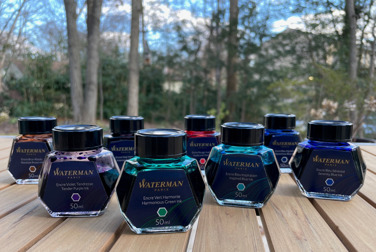
This week I decided to come up with my own topic for the blog, and when I thought about what I most wanted to write about, I knew without a doubt: Waterman Inks. As you can see from the photo, I am a huge fan of Waterman's Tender Purple, Harmonious Green, and Inspired Blue. Those three inks in the picture are my own bottles, and there is quite a bit missing because they are three of my most often used inks. I feel like Waterman inks don't get the recognition they deserve, and I want to share with you how exciting these inks really are.
The Waterman pen company was established in 1884 in New York City by Lewis Waterman and began making inks around the same time, so they've been doing this for a long time and are one of the most trusted inks on the market. One of the defining characteristics of Waterman inks is that they are safe for use in vintage pens, and every list of inks most recommended for use in vintage pens includes Waterman, especially the blue and black shades. I get the feeling Waterman inks have a reputation as being boring, though, and this is far from the truth. Some of their colors are among the most stunning I have ever used, and I love showing customers at the store my ink splat for Tender Purple. The gorgeous rich color and astonishing amount of metallic green sheen amazes them. It looks more like the kind of color and sheen you'd expect from a trendy brand like Sailor, but, nope--it's "boring" and "safe" old Waterman!

There are only eight inks in the Waterman lineup: Intense Black, Mysterious Blue, Serenity Blue, Inspired Blue, Harmonious Green, Tender Purple, Audacious Red, and Absolute Brown. Waterman isn't trying to be a Diamine, Robert Oster, or Sailor, with a vast array of variations on every color. However, of these eight inks I feel that five are so noteworthy that they belong in the collection of any lover of inks. That's a pretty impressive record!
Inspired Blue - Reliable and Inspiring
One of my most often used pens is my Soft Blue Pilot Prera. This pen is my constant companion for important notes. It's not an expensive or fragile pen, so I don't worry about taking it with me when I go out, bringing it on trips, or using it outside where it has the potential to get dropped or exposed to the elements. I'm careful with my pens, but, even so, I like having a rugged little pen for these purposes. The bright color of the pen also makes it easy to keep an eye on. It look me a long time to find the perfect ink for this pen, though. I don't feel like you always need to match an ink to your pen, but for this pen I like using a cheerful turquoise ink that reminds me of the ocean, yet is dark enough to be readable, and most of all, is 100% reliable. I need this pen to always work when I reach for it. It can't hard start, it can't dry up if I don't use it for a while, it can't skip, it can't get clogged or be smear-y.
I tried Diamine Soft Mint, KWZ Menthol Green, Diamine Marine, J. Herbin Bleu Calanque, Diamine Eau de Nil, Diamine Turquoise, Pilot Iroshizuku Ama-Iro, Pilot Iroshizuku Ebisu, and more. None of them were quite right in my Prera. Some were too light or had too much shading and were hard to read. Some were too dry, or clogged the pen right away. Many of them seemed to write well for a while, but then wouldn't behave consistently when I took the pen outside. I started to feel like this pen wasn't going to be able to handle the role I wanted to give it. I started to use the Prera less and less, to put it away in my pen tray and not take it with me.
Finally I sampled Waterman Inspired Blue. I filled my Soft Blue Prera with Inspired Blue and never looked back. When the fill was empty, I bought a bottle. My Prera loves this ink, and so do I. The cheerful sky blue color uplifts me even when I'm taking notes on a depressing topic, it always works perfectly, and the only thing I have to worry about is it running empty. I have used this ink to write down the most crucial information in the most harrowing of situations, I have brought it with me to the ocean, I have drawn whimsical nature illustrations with it in the woods, I have scribbled notes on the backs of envelopes, on napkins at restaurants, and in a spiral notebook at work. Inspired Blue is always there for me.

The color of this ink, and all others similar to it, is hard to capture in a photo. I had to up the saturation and warmth a lot to get the ink color to resemble the real thing, which is why the background might appear a bit yellow in the swatch card comparison. The real color is even more clear and beautiful than it appears, but you can get a pretty close idea of what it looks like from the swatches, and which other inks in my collection is it most similar to.
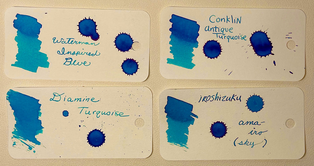

(The top paper in the image is Rhodia, and the lower one is Tomoe River. The windowsill paper is the Rhodia. The large splats are on Tomoe River.)

Tender Purple - It Might Be My Favorite Ink!
I had a similar experience with Waterman Tender Purple. In fact, if I had to name a favorite Waterman ink, it would be Tender Purple, and I might even go so far as to say Tender Purple is my #1 favorite ink of all time. Of course, it's pretty hard for an ink lover to pick a favorite, especially someone like me who appreciates all colors, but Tender Purple definitely ranks up there.
Why do I love Tender Purple so much? Again, part of the reason is that it completely turned around my appreciation for a pen I was having problems with. I own a Pilot Stella 90s and a Pilot Legno 89s, both with a 14k #3 nib in medium. I adore both pens, but I had the same difficulty with both: lots of skipping until I found the right inks! After much trial and error, I developed the perfect mix of Pilot Iroshizuku Kon-peki and Take-sumi for my night blue Stella, and it became by bedside pen, my beloved nighttime companion. But for the deep red wood Legno, I wanted something brighter. It writes exactly like the Stella, but it needed its own personality, its own signature ink. When I stumbled across Tender Purple, not only did this finicky little pen become a joy to write with, I knew that I would always need to keep it inked with Tender Purple because I needed this beautiful color in my life at all times.

Tender Purple is a color that I cannot stop singing the praises of. If you think Waterman Inks are boring or stodgy, think again. Tender Purple is a gorgeous deep lilac with generous metallic green sheen. It's one of the most well-behaved sheening inks I have ever encountered and the amount of sheen is perfectly balanced so that it doesn't overpower the base color but you get sheen on every letter (depending on paper, of course). The combination of the purple and the green is one of my favorite color pairings, and the overall look of the writing is luxurious, smooth, and charismatic. It's not so bright of a purple that it looks frivolous or immature, but it does give the sense that you are unique, with the kind of personality that is not afraid to be a little different. This ink on Tomoe River paper is out of this world, but it also writes without feathering on just about anything, including junk mail and newsprint.
If Tender Purple was a "fancy" brand like Sailor or Iroshizuku or Montblanc, or limited edition and impossible to find like Lamy Dark Lilac, it would be a sought-after "holy grail" ink. But because it's Waterman it doesn't seem exciting. It is exciting! And it's affordable!

Of the inks in my collection, Tender Purple is closest in color to Diamine Monboddo's Hat, but without the sometimes overpowering sheen. Tender Purple's sheen is more subtle and doesn't interfere with the behavior of the ink. It's a warm purple with a tiny bit of mauve-ness to make it a little more complex and sophisticated, but it is not overly reddish.
Harmonious Green - The Perfect Balance
The third Waterman ink that has ended up being the ink for one of my pens is Harmonious Green. Again, I have tried many different green inks, but none can compare to Harmonious Green for its reliability and beauty. I use this green in my floral creme Otto Hutt Design 04 pen, and I love that it perfectly rides the balance between being dark enough to easily read and light enough to easily come across as green. It doesn't look too Christmas-y or weird... it looks like a serious ink that someone with a slightly eccentric personality would use (i.e., the kind of person who likes writing with a fountain pen, who likes standing apart as someone who thinks outside the box).

On Tomoe River paper, this ink shows gorgeous magenta sheen, and it's one of my favorite inks to draw with because the subtle shading and sheen give it so much personality and because it is such a pleasing color to look at. It leans slightly toward blue but is the kind of green that brings to mind plants and nature, and makes my mind feel harmonious in the way way that listening to Mozart does. It has just the right blend of darkness and softness.

Harmonious Green was a hard ink for me to find close matches for. All the other inks in my collection seemed to be either far more yellow or far more blue. I guess this balance is part of why it feels so harmonious. The magenta sheen doesn't show up very well in a head-on photo, but this is actually the highest sheening ink of all the Waterman inks, and, unlike with most sheening inks, the sheen shows up more in writing than it does in a concentrated splotch or thick swatch.


Mysterious Blue - Complex and Intriguing
I hadn't used the other Waterman inks as extensively as these three, mostly because I didn't have a specific need for them like I did for the perfect sky blue, violet, and green. But, for my blog today I discovered two additional favorites.
I decided to ink my Petrol Marbled Pelikan M205 with Mysterious Blue because petrol is a mysterious color that hovers between blue and green, and because I thought the wet nib on this pen would showcase this ink's complexity.
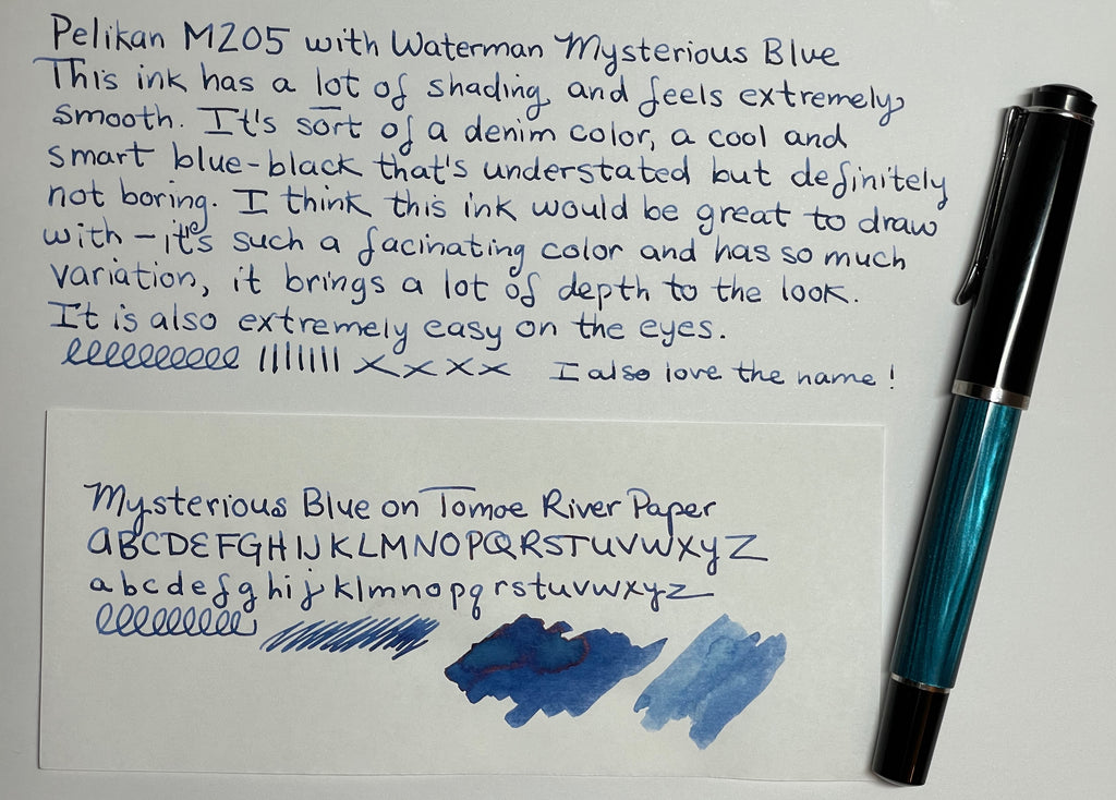
Mysterious Blue is a blue-black, but it's a particularly interesting one. It has a sophisticated copper sheen that pairs particularly nicely with the deep blue color. It also has a lot of shading, and, in fact, when I wrote with it on Rhodia and Tomoe River paper, every single letter looked a little different. It really does live up to its name, and the more I used this ink, the more intrigued I got with it.

The color reminds me of a pair of "dress jeans" -- the nice pair that you wear when you want to look really good, that isn't faded and worn but has that desirable variation in color that makes a great pair of jeans especially attractive. When I started really examining this color on Tomoe River paper, I began to get lost in it, to think it just might be the best shade of Waterman ink. What a strange feeling for a colorful person who doesn't normally go for this kind of understated shade!
 Mysterious Blue is less of a blue-black than Waterman's old formula named Blue Black. (An older gentleman who is my pen pal and helped me get into fountain pens gave me a bottle of the vintage stuff.) It's also a lot more interesting than the old color and has more sheen and vibrancy. The closest ink in my collection is Iroshizuki Tsuki-yo, but Mysterious Blue has more shading than Tsuki-yo. They are both gorgeous inks.

Absolute Brown - An Absolute Pleasure
The other Waterman ink I fell in love with while writing this blog was Absolute Brown. Since Waterman inks are especially recommended for vintage pens, I decided to try it in my striped Parker Duofold from the 1940s. This pen was given to me by my older gentleman friend and was well-loved, so it isn't in perfect condition but it's a great pen and is very cool looking. The Duofold thrived on Waterman Brown, and the color of the ink paired nicely with the tortoise-y shades in the translucent body.

The ink was a pleasure to use--wet, smooth, and had gorgeous shading. It did feather a tiny bit, but I think the Duofold is a very wet pen, and I felt like the beauty in the shading was worth it. It looked so rich and complex, like a beautiful piece of expensive wood with mesmerizing grain. Maybe this is a strange thing to say, but just watching it dry gave me so much pleasure. I was very surprised by how much I enjoyed using Absolute Brown and I might even have to buy a bottle!

Absolute Brown was hard to compare with the other browns in my collection. I don't have as many brown inks as I do some other colors, as I don't normally write with brown, but I do like to get browns to use for hair colors in art, so I have a decent number. I felt like most of my brown inks were either warmer or cooler than Absolute Brown. It's a red-leaning brown, although not as red as Ancient Copper. I think it is most similar to Conklin Mahogany, another ink I recently reviewed and loved! As you can see in the picture, it has some green sheen and is a nice readable color.


Final Thoughts?
I would rank Tender Purple, Inspired Blue, Harmonious Green, Mysterious Blue, and Absolute Brown as my top favorite dark violet, sky blue, green, blue-black, and brown inks! I think having five out of eight inks in your ink lineup be that good is a pretty impressive record, especially when you consider how affordable Waterman ink is compared to some of the other brands. A nice 50 ml bottle is currently priced at under $14 and will last you a good long while. Give Waterman a try if you haven't considered it before. I think you will be pleasantly surprised!
-Laura P.

16 comments