


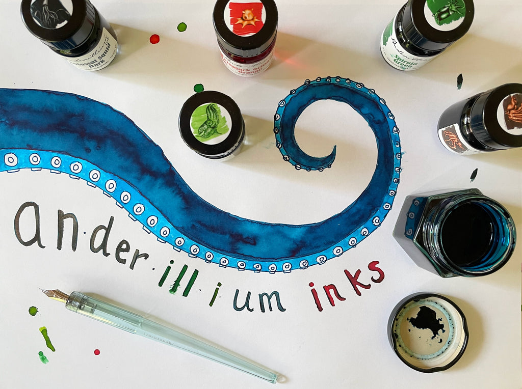
This week's article will be a shorter one, but it's a topic I'm extremely enthusiastic about: Anderillium Inks. I was given the exciting assignment to try all sixteen inks from Anderillium's current lineup and decide whether I thought Pen Boutique should carry them. After experimenting with the inks, my response was an emphatic YES! Several of them have become new favorites of mine, and I've been getting everyone in the store to try them and see how beautifully they write. We are now adding Anderillium to our ink collection, and will have them in stock this week. I'm so happy to be able to share this cool new brand with you!
About Anderillium
Anderillium is a small family-run company (just like Pen Boutique!), with its main location in Minnesota and a backup lab in Florida. We are delighted to be able to work with a new US business! Karen Anderson, the mom of the family, is Anderillium's operations manager in Independence, MN, and Bert Anderson, her son, lives in New Port Richey, FL. Bert is Anderillium's founder, owner, and chief chemist. When he's not making inks, he's a high school chemistry and biology teacher. Producing each ink has many steps and measurements that must be done with the greatest precision, and Bert's methods are as rigorous as laboratory chemistry. Bert's older sisters, Tania and Britta, also live in the Tampa, FL area and are part of the Anderillium team. Tania, a kitchen designer, helps out at pen shows, and Britta, a horse trainer and artist, created the beautiful paintings used on the Avian ink labels. The Andersons' friend Kevin Reinert, a tattoo artist in Maui, created the artwork for the Cephalopod series.
The whole Anderson family is passionate about protecting our oceans and wildlife, and Anderillium tries to minimize plastic in their products and packaging. To reduce waste, they've also incorporated a procedure to re-use packing material from their own suppliers, so when plastic or styrofoam packaging material is shipped to them, they save it and use it in their own outgoing shipping rather than throwing it away. Their inks are made without any animal products at all, including the label and box adhesives. The inks are water based and are made only with chemicals that are safe for the environment. They come in glass bottles that seal well and are easy to fill your pens from.
I asked Karen Anderson a few questions about the company by email and loved her answers. My most burning question was about where the name Anderillium came from, as it's such a cool word but isn't one I could find reference to anywhere else. I assumed the "Ander-" part came from "Anderson," and I was right. Karen sent me Bert's answer: "I chose the name because it is a memorable portmanteau of my name and science sounding syllables implying what things are made of." Ha! Perfect.
Anderillium attends as many pen shows as their schedules allow, and I'm looking forward to meeting them at the Washington DC Fountain Pen Supershow in August, where they will be releasing a Show Exclusive color called Potomac! If there are any bottles left over after the show, we will be able to sell them. All of their inks will be available to try at their table, and Bert will be giving a seminar on The History of Paint and Ink at the show.
Cephalopods
The Andersons' love of animals is quite apparent in their ink color choices. The first series of inks they released was inspired by cephalopods, the class of marine animals that includes octopus, squid, cuttlefish, and nautilus (as well as some extinct groups like ammonites and belemnites). With the exception of the nautilus and cirrina deep-sea octopus, all known cephalopods have an ink sac, which they use to expel a cloud of dark ink to confuse predators. So, they are the perfect muses for a line of fountain pen inks!
 (Sorry I scared you, octopus!)
Each species of cephalopod produces slightly differently colored inks; generally, squid ink is blue-black, octopuses have black ink, and cuttlefish ink is a shade of brown (sepia). Cephalopod ink has been used in the past with pens and quills, and I have actually experimented with it myself. It's pretty easy to write with, and looks great, although it's a little smelly!


As you may have guessed, I love cephalopods, so the minute I saw Anderillium's cephalopod-themed ink, I was very eager to try it! I had the great privilege of holding hands with an octopus twice while diving, and it was one of the most amazing feelings I have ever felt, completely pleasurable and awesome. I will never forget either encounter. They are very intelligent and curious creatures, and are mesmerizing to watch move and transform. Along with their beautiful flowing locomotion, cephalopods have the ability to change their colors, patterns, and textures in milliseconds. I've witnessed their visual transformation and inking abilities in person a dozen or so times while snorkeling and diving, are both are thrilling to experience. One beautiful octopus I met in Bonaire was a magical looking translucent misty green, but he changed color, pattern, and texture so many times, when I tried to paint him with fountain pen ink later, I could only capture an amalgam of the memory.
The number of arms and tentacles varies by cephalopod species, but, as you probably know, octopuses have eight arms, which is why Anderillium created eight colors for their ink series. They chose some very exciting and fascinating cephalopods as their sources of inspiration. I love that they give us a stirring description of each, as well as a gorgeous painting to help us imagine each creature. Be sure to click on the "show more" in our listings to read the creative and very cool write-ups about each one. The eight inks in Anderillium's cephalopod series are Flying Squid Blue, Colossal Squid Dark, Spirula Green, Cuttlefish Brown, Blue-Ringed Octopus Blue, Bobtail Squid Green, Flapjack Octopus Orange and Vampire Squid Red. Some are dark, some are bright, some have sheen and all are interesting and beautiful!
Colossal Squid Dark
It's hard for me to choose a favorite Anderillium ink, but Colossal Squid Dark is definitely one of them. It was the first one I tried, and I've had a stub nib pen inked with this color since March. The ink is a deep, rich, dark petrol (not black like the description says)--a murky color that hovers between blue and green. This ink is gorgeous and feels luxuriously smooth to write with. I absolutely love the mysterious color, its readability, and how well-behaved it has been in my pen. Writing with this ink is a complete pleasure--a feast for the senses. Even the smell (and that of all Anderillium's inks) is nice. To me, it has a fresh, clean, breezy scent.

Colossal Squid Dark has a little bit of sheen in concentration on Tomoe River paper, but it's not a problematic or overpowering one. It just adds shine to the crisp lines the ink produces. I've used this ink on Tomoe River, Write, and Maruman Mnemosyne papers, and even in a cheap spiral notebook from Staples, and haven't experienced any feathering, even with a stub nib. This is remarkable!

I used one of the new Pilot Iro-Utsushi dip pens to draw with all the Anderillium inks, and was very pleased with both the pen and the inks, especially this one. The pen I used has a Japanese medium nib (they also come in fine), which was great for drawing details, and I felt like I had a lot of control over my lines.

The swatch in the lower part of the page shows what happens when you add a tiny bit of water to this ink, something that is interesting to me because I often do that when using fountain pen inks to paint. Sometimes an ink will show multichromatic properties when slightly watered down, and others will just show beautiful lighter and more translucent variations on the same color. You will notice this when comparing some of my swatches of the other inks in the series.
Spirula Green
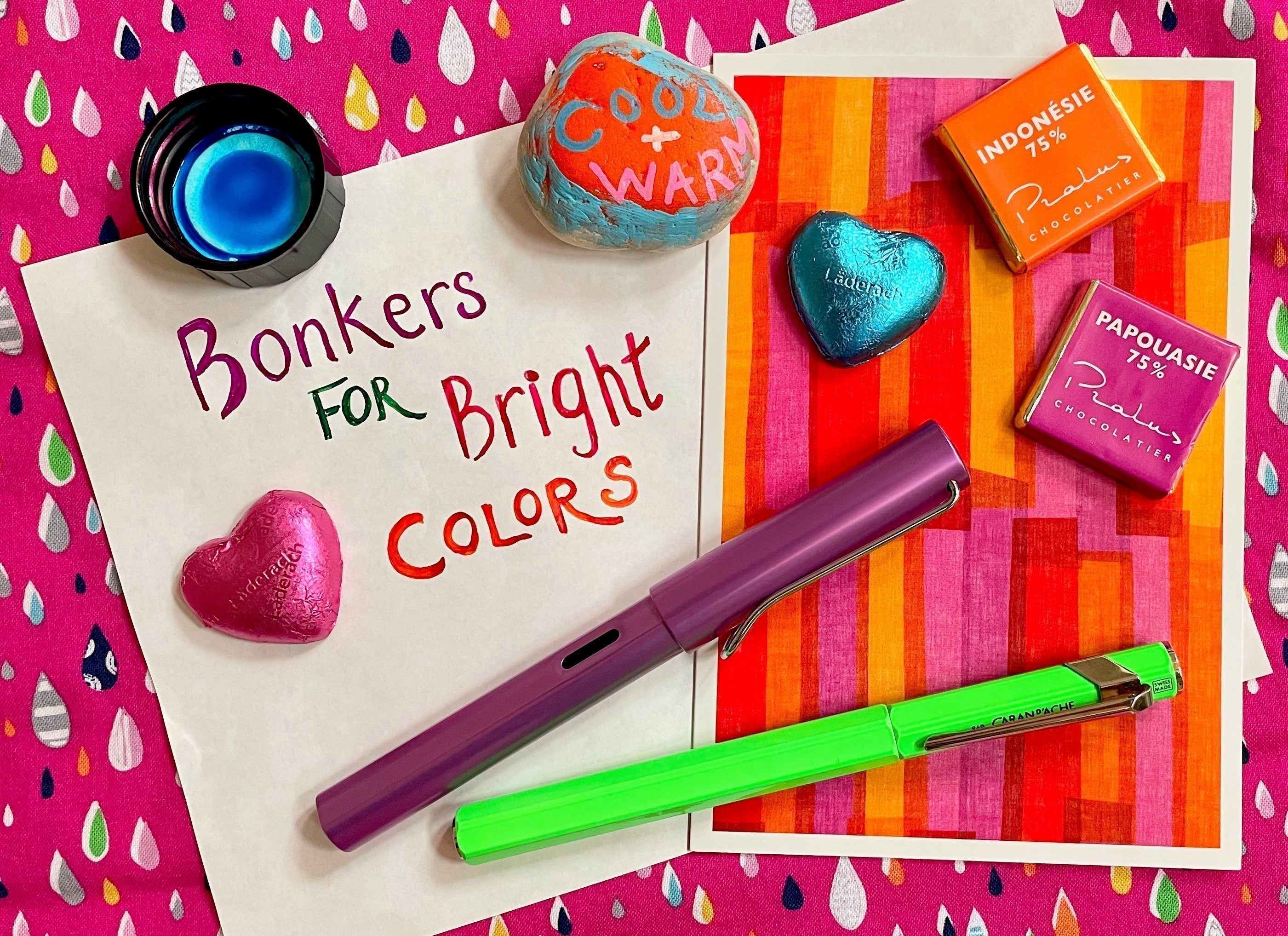
Another one of my top favorite Anderillium inks is Spirula Green. Spirula are fascinating creatures! I had never heard of them until I tried the ink, but I had so much fun learning about them. The ink is my new favorite green, and I featured it in my recent "Bonkers for Bright Colors!" article. I've been using it in my extra fine nib lilac Lamy AL-Star, and I am completely in love with the vibrant shade and the lush feel. I keep making my colleagues and customers in the store try it to show them how great it is, and they never fail to agree that it's a remarkable ink. I've also been using it to take notes and complete our store checklists, and have been extremely impressed by this ink's behavior. It doesn't feather, even on cheap paper, but is always well lubricated and ready to write.

I challenged myself to use Spirula Green to draw a spirula with the Pilot dip pen, and was amazed that my drawing actually looks like one (more or less). The thing on the top of its mantle is a light, by the way! So cool. This ink has a tiny bit of burgundy sheen in concentration.

Flying Squid Blue
More recently, I've been using Flying Squid Blue in my medium nib Otto Hutt Design 04. The two are so compatible! The Otto Hutt loves the feel of the ink, which is rich and lubricated but not at all slippery, and produces a nice crisp line with gorgeous shading. I love the color, a dark azure blue with hints of turquoise. In concentration, there's lots of beautiful shiny metallic purple sheen.

This cyan color was hard to capture. In real life, it has a little more green and more luminosity than you can see in the digital images. I know the white of the paper looks a little dark, but I couldn't brighten the photo without losing the sheen and the depth of the blues.

Here's a closeup so you can get an idea of the beautiful variation.

Cuttlefish Brown
I started using Cuttlefish Brown in my stub nib Pelikan Souverän M400 White Tortoise last night, because, although I love bright colors, I know some of my readers are fans of more subtle shades. I am already starting to fall in love with this very interesting color, which, again, has beautiful shading and a smooth, rich feel. True to its cephalopod nature, this sepia is not just one shade of brown, and it's hard to explain exactly what color it is. To me, it has properties of brown, gray, and green all at the same time.

I am enjoying this ink, and it's the sepia that reminds me most of real cuttlefish ink, which also has elusive brown-gray-green properties. As a cephalopod lover, I find this very cool! I also love how this ink seems to express the personality of a cute-but-grouchy looking little cuttlefish. It also has glossy brown sheen in concentration, which makes it even more fun to draw and paint with.

Flapjack Orange and Bobtail Squid Green
I haven't filled any of my fountain pens with the lighter colors in the Cephalopod series yet, so I can't talk about that part of the experience, but they were very nice to paint and draw with! I used the Pilot dip pen to draw the lines, along with a watercolor paintbrush to explore the colors a little more. I wanted thicker lines for some of my writing to show off the inks better, so I also dipped my Otto Hutt medium nib for some of the writing. I think these lighter colors need a wider nib to really look their nicest.
Flapjack Octopus Orange is named after an adorable and strange-looking tiny octopus that lives on the ocean floor. This luminous soft orange is a juicy apricot shade with glossy sheen in concentration. It has pretty shading, and I love the way the subtle sheen adds depth to my drawings and writing.

Bobtail Squid Green, a beautiful fresh green that leans toward chartreuse, shows remarkable shading. It reminds me of another favorite ink, Diamine Meadow, which I always think is the green that reminds me most of real greens I see in nature. I think Bobtail Squid Green is slightly more yellow than Meadow, and shades slightly more, but I haven't done a head-to-head faceoff. I loved how the confused looking octopus I drew with it turned out. I've definitely seen octopus in that wonderful flowing position, about to do something surprising.

Blue-ringed Octopus Blue and Vampire Squid Red
The two scariest creatures in the collection make a striking pair of inks! As Anderillium explains, "The Blue-Ringed Octopus is one of the most venomous species of cephalopod on the planet. The iridescent blue rings are conspicuous coloration, evolved to warn potential predators away from this little octopus and its potent venom. This color ink is formulated to mimic the vibrant electric blue." Vibrant and electric are the perfect words to describe this shade of blue, and I loved drawing and writing with it. (I also wouldn't mind a sweater this color!) It has bright magenta sheen in concentration, which shows in haloing around letters and when it pools as the ink flows while painting. This is another one of those cyan colors that's impossible to truly capture in a digital image. It's more luminous and slightly warmer in real life!

Vampire Squid Red disappointed me slightly, but only because I love vampires and wanted it to be a darker, more intense shade of red. It's a lovely pink-leaning red with gold sheen that produces opulent looking haloing. I really loved how the sheen showed up in an organic looking way when I watered down the ink and painted with it to color in my vampire squid's body.

As Anderillium explains, the vampire squid isn't actually as scary as its name implies, anyway. It gets its name because its arms are all connected together like a cloak, and its red coloration isn't visible in the depths of the ocean, but it is covered in tiny spots called photophores that can light up dazzling patterns of bioluminescence on its skin. I would love to see that, but I'd never be able to survive at depths of 2,000 to 3,000 ft, with oxygen saturations as low as 3%, like the vampire squid does!

Avian Series
Anderillum's second series of inks were inspired by avians, also known as birds. I am terrible at drawing birds, so I didn't even try, and instead I combined the beautiful colors to explore some fanciful flowers from my imagination.

The Avian series consists of Common Loon Black, Shoebill Stork Grey, Indigo Bunting Blue, Green Kingfisher Green, Pompadour Cotinga Burgundy, Purple Gallinule Purple, Roseate Spoonbill Pink, and American Goldfinch Yellow. Overall, these are more muted colors than the Cephalopod series, but no less beautiful and interesting.
I particularly love the bright and cheerful Roseate Spoonbill Pink, which reminds me of a flamingo pink and is wonderful in my medium nib Pilot Prera. This pen writes more like a fine and is very particular about inks. It has a lot of trouble with anything on the drier side, but Roseate Spoonbill flows exquisitely and made me very happy. It reminds me of Taccia Momo but is slightly warmer, slightly softer, and has more shading.
I paired this color with Common Loon Black and American Goldfinch Yellow, and I think the combination is quite pretty. American Goldfinch Yellow is a bright warm yellow (slightly brighter than it looks in the photo) that I wouldn't use in a pen, but it's very pretty to paint with. For me, like most yellows, it's too hard to see in writing. Common Loon Black is a greyish black with nice shading.

I inked my double broad Kaweco Sport with Pompadour Cotinga Burgundy, and, although it doesn't go with the color of my pen at all, I love the ink and the feel. This is another ink with beautiful shading, a wonderful feel on the page, and an intriguing color. It's a lighter burgundy that has a lot of depth and is hard to pin down. Is it actually a sophisticated deep pink, or a reddish purple? Is there hidden blue in there? And what about that interesting metallic green sheen?
I paired it with the Indigo Bunting Blue, which is a soft cornflower shade that looks perfect for a favorite button-up shirt and has subtle sheen the exact color of Pompadour Cotinga Burgundy! Indigo Bunting Blue is very restrained, but, when you look at it closely, you realize how complex it is. The individual letters in my writing display so much color variation, and even show the sheen distinctly on all the "i" letters, the "n," the "l," and the first "u." This is very difficult to capture in a photograph, but my eyes perceive it.

I like Green Kingfisher Green with Shoebill Stork Grey. Like many of the other colors in the Avian series, Green Kingfisher Green is subtle and interesting, with a greyish dullness but also an elusive shine. When it gets wet, this color displays shades of very pale apricot and a pretty spearmint. It also has lots of shading and writes extremely well. It's soft on the eyes, and very readable. Shoebill Stork Grey is a lighter cool grey that had a little too much shading for me to read comfortably, but it's perfect for you shading lovers out there! (That's American Goldfinch Yellow in the center of the flower.)

The remaining Avian color is one that really confused me. Purple Gallinule Purple looks purple in Anderillium's swatch and in the reviews I could find online, but, when I used it, it didn't seem to be a purple at all. I tried it on Tomoe River paper and on Maruman Mnemosyne, but on both papers it seemed like a multichromatic blue with slight purple and turquoise elements, along the lines of Sailor Hawaii. I filled my Otto Hutt with this ink, and it flowed smoothly and wrote well, but I couldn't get into the color because, if I have to be honest, I'm not really that crazy about those unsaturated dual-shading type inks. My colleagues Leila and Shirya thought it was very readable and said it wrote very nicely for an ink of this type, but none of us were super excited by the color. The great thing about ink, though, is that there's one for every taste, and Purple Gallinule Purple may suit yours! I paired it with Roseate Spoonbill Pink in my drawing, and it does have a very tranquil feel that is extremely nice.

What's Next for Anderillium?
In addition to their exclusive Washington DC Fountain Pen Supershow color that will be coming out in August, Anderillium will be releasing their new Lepidopteran series in July, with eight inks inspired by butterflies and moths! Karen told me her favorite current ink is Blue-ringed Octopus Blue, but one or two of the new colors are vying for her heart. She says, "We hope people using these inks will be reminded of the beauty of these fragile and amazing creatures." Wow, I can't wait to see what beautiful and intriguing shades will be in this set. Thinking about the incredible colors I have seen on butterflies and moths in my yard, I can only imagine.
It takes a year or so to develop eight colors, and since they are just now launching the lepidopteran series, they don't have any animals in mind yet for down the road, but I bet the next collection will be equally as fascinating. I vote cnidarians or echinoderms!
For now, I will definitely be adding my favorite Anderillium shades to my ink collection, especially Colossal Squid Dark, Spirula Green, Cuttlefish Brown, and Roseate Spoonbill Pink. Which ones are you most eager to try?
-Laura P.
I love comments on my blog! Please leave comments if you like the articles, and, if you have any questions about this article, or any of the other blog articles, you can e-mail support @ penboutique.com. Thank you!


10 comments
Jennifer
I got the Pompadour Cotinga Burgundy as a freebie with a pen I bought at the Baltimore pen show and I really like it. Not being blue, black, or grey, it’s different enough to give it some flair, but still feels subtle enough to be “professional” so I use it on work stuff all the time.
I got the Pompadour Cotinga Burgundy as a freebie with a pen I bought at the Baltimore pen show and I really like it. Not being blue, black, or grey, it’s different enough to give it some flair, but still feels subtle enough to be “professional” so I use it on work stuff all the time.
Marcos Sousa
So many inks in one review! That’s a feat! Thank you for letting us know about these inks!
So many inks in one review! That’s a feat! Thank you for letting us know about these inks!
Stephanie
My mom and I (both bird nerds) picked up the Avian set to share at the St. Louis Pen Show. I inked my new Nahvalur Nautilus with the burgundy and am in love. Thanks for a chance to see the set we didn’t buy!
My mom and I (both bird nerds) picked up the Avian set to share at the St. Louis Pen Show. I inked my new Nahvalur Nautilus with the burgundy and am in love. Thanks for a chance to see the set we didn’t buy!
Karen
Thank you so much, Laura! You have written an wonderful article. We really appreciate the spotlight on us and especially how you focus on the amazing animals that inspired us. They are unbelievably unique and super cool!
Thank you so much, Laura! You have written an wonderful article. We really appreciate the spotlight on us and especially how you focus on the amazing animals that inspired us. They are unbelievably unique and super cool!
Dominique
Fantastic and thorough review of the inks’ behavior and recommended uses. I am thoroughly enthralled by the mollusc drawings as well! I plan to give these inks a try.
Fantastic and thorough review of the inks’ behavior and recommended uses. I am thoroughly enthralled by the mollusc drawings as well! I plan to give these inks a try.
Mikele
Love the inks and am equally excited that they’re coming in! Can’t wait to try out the Cuttlefish brown, Colossal Squid dark and the Bobtail squid green! Another great blog. Keep them coming!
Love the inks and am equally excited that they’re coming in! Can’t wait to try out the Cuttlefish brown, Colossal Squid dark and the Bobtail squid green! Another great blog. Keep them coming!
Sujata
Laura, thanks for such a great, in-depth article! Reading your review, I started making a list of the inks that I want….now I have to shorten the list somehow as so many of these inks look fantastic. I have the Green Kingfisher Green which I love so I’m excited to try out other inks as well. Very happy to hear that Anderillium Inks will be at the DC show in August – already setting my sights on the new Potomac ink!
Laura, thanks for such a great, in-depth article! Reading your review, I started making a list of the inks that I want….now I have to shorten the list somehow as so many of these inks look fantastic. I have the Green Kingfisher Green which I love so I’m excited to try out other inks as well. Very happy to hear that Anderillium Inks will be at the DC show in August – already setting my sights on the new Potomac ink!
Brian
Hello Laura
Another sweet blog. I feel like I needed every ink and pen you mentioned! Love the drawings. Can’t wait for your next one!
Hello Laura
Another sweet blog. I feel like I needed every ink and pen you mentioned! Love the drawings. Can’t wait for your next one!
Alicia Gottschalk
Laura, this might become my new favorite ink company! Colossal Squid Dark is amazing.
Laura, this might become my new favorite ink company! Colossal Squid Dark is amazing.
Jen
“ This week’s article will be a shorter one” then proceeded to gush over this ink for several pages 😆 Great article. Love the pictures and super excited you are carrying Anderillium. It really is fantastic ink.
“ This week’s article will be a shorter one” then proceeded to gush over this ink for several pages 😆 Great article. Love the pictures and super excited you are carrying Anderillium. It really is fantastic ink.