
Getting Inspired
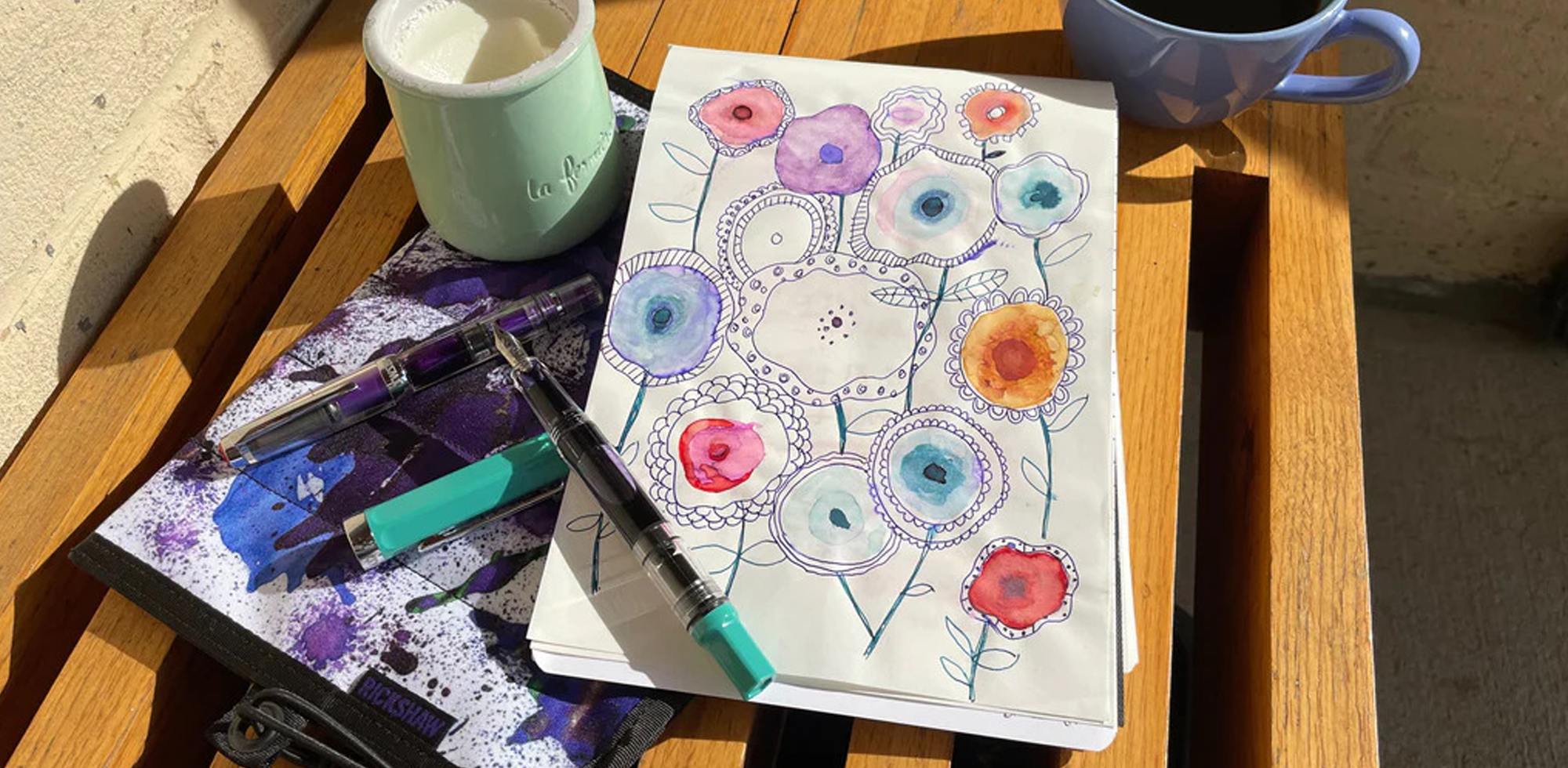
At first I wasn't sure what to write about this week. I'd stayed up too late finishing my Taccia blog article, so I was tired and in kind of a rebellious mood. Every idea I thought of seemed too dull and research-y, not vibrant and alive enough. The air felt like summer and there were flowers in bloom everywhere, so it was hard to stay inside and concentrate. Finally I decided to go for a drive to my favorite coffee shop to clear my head and get inspired. I brought a few pens, of course, and, before I left, I quickly inked one of them with fresh green ink. When I sat down with my cappuccino and uncapped the pen to write in my notebook, the bright ink color and vibrant lilac pen leaped out at me. Suddenly I wanted to replace the inks in all my pens with super bright colors, and I couldn't wait to look at the pens at the store on Wednesday to see which were the most vivid shades.

I finished my coffee and walked around the city for a short while. Vintage clothing and dishware drew me in, as did brightly painted murals and sidewalks. Every time I saw a bright color, I was in love.


The day was overcast, so the colors popped even more. I still didn't know what to blog about, though. I wanted to write a shorter article that I could finish more quickly, but that seemed impossible. I got back in my car and drove home, brain whirling with hot pink, fuchsia, poppy red, magenta, seafoam green, pineapple yellow, cobalt, coral, violet, orchid, blueberry, lime, chartreuse. I couldn't get the beautiful Taccia inks from my previous article out of my head, and I also couldn't stop day-dreaming about my neighbor's poppies. I often think of my best ideas while driving, and suddenly I realized: I don't have to write a "hard" article every time. What's captivating me most right now is bright colors, so why not blog about that?
Yes, it's obvious, but you read the article title. It took me longer to give myself permission to give in to the lure of the vibrant.
My Favorite Bright Inks
When I got home, I considered the question: what are my favorite super bright inks? I shuffled through my Col-o-ring ink swatch cards and pulled the ones that stood out as brightest, then I cleaned some of my pens and replaced the subdued old ink with new, cheerful shades for June. Several of my pens were already filled with brilliant colors, so I left those alone.

I always keep my blue Pilot Prera inked with Waterman Inspired Blue, which is the prettiest and most well-behaved capri blue color I've found. It took me a long time and a lot of experimentation to settle on that shade, and it's been with me through good times and bad. It's a cheerful clear luminous aqua that reminds me of the ocean, yet is dark enough to be readable, and, most of all, is 100% reliable. It uplifts me even when I'm taking notes on a depressing topic, it always works perfectly, and the only thing I have to worry about is it running empty. I have used this ink to write down the most crucial information in the most harrowing of situations, I have brought it with me to the sea, I have drawn whimsical nature illustrations with it in the woods, I have scribbled notes on the backs of envelopes, on napkins at restaurants, and in a spiral notebook at work. Inspired Blue is always there for me. I find it simultaneously calming and electrifying.

Another one of my all-time favorite inks is J. Herbin Rose Cyclamen. I always keep my bright orange Pilot Custom Heritage 91 filled with this vivid jewel-toned magenta, and, like Inspired Blue, it never fails to write perfectly and bring me joy with its pure, delightful hue and subtle shading. Some reddish inks have clogged my pens, but never Rose Cyclamen. Don't tell anyone, but it's been years since I've cleaned this pen.
 (Sorry, we don't carry this color Pilot at Pen Boutique; it was a Japanese import I got a few years ago. The Sailor Royal Tangerine 1911 is a similarly wonderful bright orange, though!)

One of my most recent bright ink discoveries is Colorverse Hayabusa Glistening, a brilliant violet with coppery-gold shimmer. I bought a mini bottle of this ink for my new grape TWSBI Diamond Mini AL, and now I wish I'd gotten a larger one! It's such a perfect pairing, and the shading, sheen, and shimmer are all delightful. I really like Colorverse's glistening inks because I've had much better luck with them not clogging my feeds than I have with other brands. They have smaller glitter particles and feel luxuriously smooth.

I decided to clean my Petrified Forest Estie (with custom fude nib by nibmeister Kirk Speer of Pen Realm) and replace the ink with Sailor Kin-Mokusei, a beautiful vibrant coral that I've had for quite a while. This color is extremely similar to the beloved retired Sailor ink color called Apricot. My bottle was a Sailor Gentle ink, and now Kin-Mokusei is part of the Shikiori collection. This ink has incredibly gorgeous shading and dries to a glossy sheen in concentration. It's not a contrasting metallic type sheen, but a shiny sheen of its own color. This ink looks so delicious and is incredibly fun in my Estie.

I also cleaned my Lamy Safari and put in Diamine Scarlet, from a sample vial I've had for a long time. I'd enjoyed the vivid rose red for painting, but had never used it to ink a pen. I don't use red inks very often, but I started to rethink my anti-red ink feelings as soon as I saw how well this ink wrote with my Lamy Cursive nib and what a pretty combination it was with my pen. I love its luminosity and bright gold sheen. I brought this pen into work on Wednesday, used it in the store, showed the ink to customers, and decided I'm definitely a fan of Diamine Scarlet.


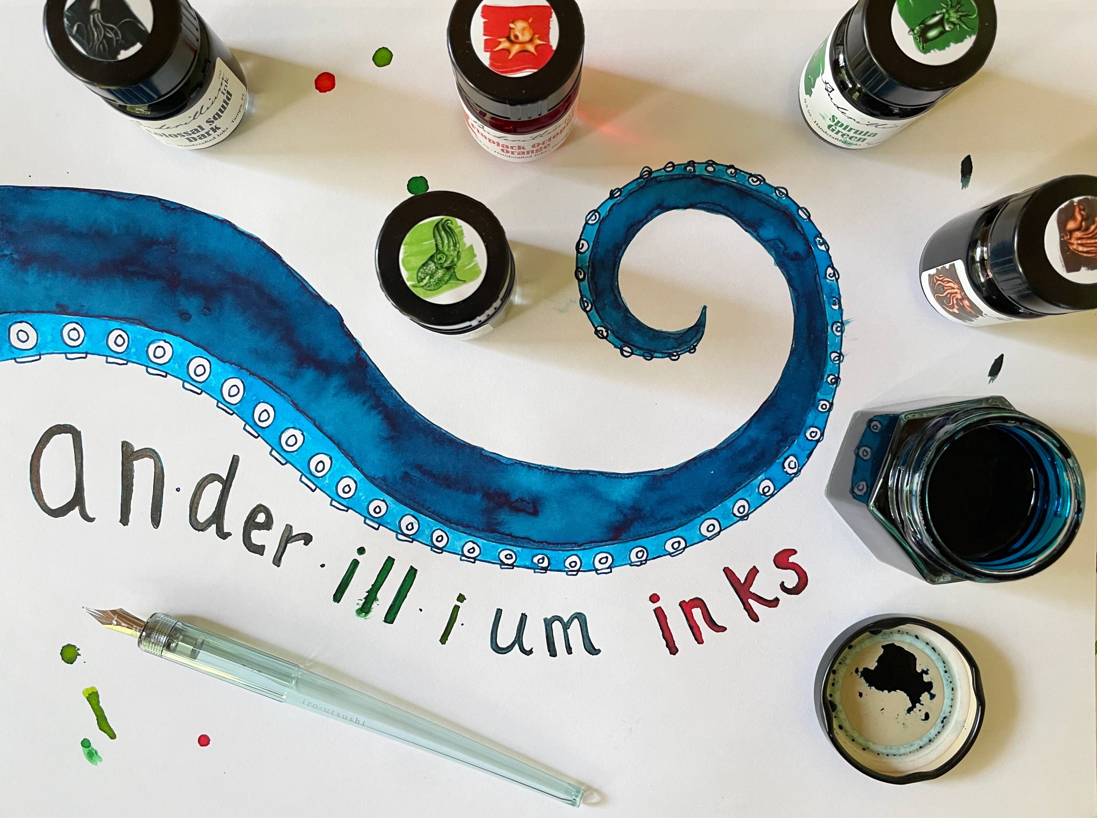
Speaking of Lamys, the contrasting green ink I'd put in my Lilac AL-Star right before my drive to the coffee shop is one we don't carry yet, but we have it on order and will be getting it soon! Spirula Green is a beautiful and very smooth ink made by Anderillium Inks in Florida. I've tried a few of their other inks, too, and am very excited about this brand. I am completely in love with this vibrant shade and the lush feel. It's my new favorite green!


I also decided to re-ink my double broad Iridescent Pearl Kaweco Skyline Sport with a brighter and more summery shade, and went with Spearmint Diva from Diamine. I'd tried this ink when writing my article about Waldmann pens and really liked the color. It's such a refreshing, cool, and happy shade of fresh minty teal, with pretty silver shimmer and a little pink sheen in concentration. This is a fun ink because the color fluctuates to look bluer or greener depending on lighting.

At the store, I realized I was missing a yellow in my bright inks selections. I wanted a shade that was both truly bright and also easy to read, which is a tricky combination to find in a yellow ink. After a little trial and error, I chose Sailor Manyo Yamabuki, and am very happy with it. This is a beautiful bright golden yellow that is named for Japanese Kerria, a type of rose which is also known as Yamabuki and has been the subject of Japanese people’s love and appreciation for over 1000 years. I love this warm sunshine-y color and the rich feel of the ink. It looks especially wonderful paired with a bright blue pen like the Esterbrook JR in Paradise Blue Breeze.

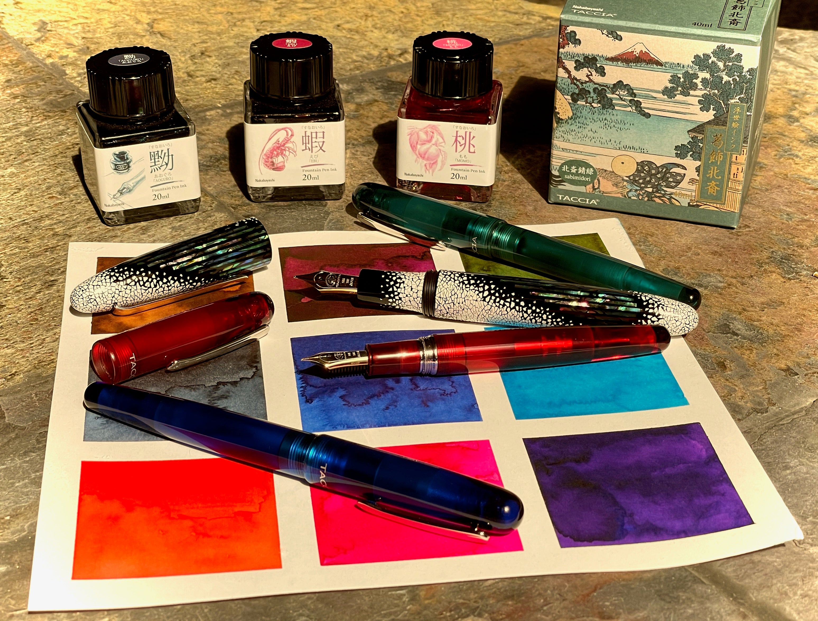
Other favorite extra bright inks that I've used and love include Diamine Flamingo Pink, Diamine Apple Glory, Colorverse Supernova (a stunning azure with lots of pink sheen), Iroshizuku Tsutsuji, Diamine Wild Strawberry, Iroshizuku Fuyu-gaki, Irishizuku Ama-iro and Kon-peki, Diamine Jade Green, Sailior Yomogi, Kobe No. 11 Ikuta Orange, Conklin Vintage Purple (extremely wet, so keep this in mind), and Taccia Momo Pink, which you may remember from my Taccia article. I've actually had a sample of Taccia Momo for years and have always loved its bright and cheerful color. It's a hot pink that is easy to see even in my extra-fine pen, but doesn't look like a little girl's pink, either. Momo has a bit of orange-yellow sheen, a beautiful combination.


Bright Pen Mania at the Store
At the store on Wednesday, naturally I couldn't get bright colors off my mind. Fortunately, it wasn't a very busy day, so, in between customers, I was able to take photos of all the super bright pens that caught my eye. Yes, we have plenty of pens in every color of the rainbow, but I chose only the most extreme.
First: some Lamy Safaris in green, yellow, and pink. They even have matching notebooks!


Next, the neon green Pelikan Twist stood out from all the others, as did the Faber-Castell Grip fountain pen in turquoise and Faber-Castell Grip ballpoint in bright pink with orange dots.

I own this ballpoint (yes, in this color) and I like to replace its refill with a Monteverde Parker style Capless Ceramic Gel refill. It's comfortable, colorful, and handy, and I'm crazy about the feel of the raised dots and triangular grip. This isn't a fancy pen, but I just love the design and the pink/orange color combination. My colleague Leila owns a Pelikan Twist in Shine Mystic (which is the coolest color, but that's not relevant here) and a Faber-Castell Grip fountain pen in Glam Pearl (also a wonderful color... I love the whole Glam series and also own a Glam Violet ballpoint), and she says they are both great pens that are fun to use and have very smooth nibs. The Grip pens come in ballpoint, rollerball, and fountain, and in lots of fantastic colors.
Another pen that comes in lovely bright colors is the pretty little JR Pocket Pen from Esterbrook. (My favorite is the Paradise Purple Passion color, but that one didn't get in this photo.) This cute little pen was inspired by Esterbrook's vintage classic, the J Pen, and gives you lots of great Esterbrook nib options: extra fine, fine, medium, broad, stub, journaler, scribe, and needle point. The vibrantly colored acrylic resin is beautiful.

One of the most inspired pens we have in the store is the very compact and clever Lamy Pico. I'm not a big ballpoint fan, so I don't own one, but I love its looks and the way it springs open like magic when you push the end. I relish showing this pen to customers and watching their delighted expressions when they watch it open and close. This pen comes in a variety of colors, but I love the pop art look of the White, Laser Orange, and Neon Pink versions. (By the way, The Secret Lives of Color is a very good book. I highly recommend it.)

As soon as I glanced into the Sailor display case, I knew I had to include the Sailor Cocktail Cantina pens in this article. We currently have these gorgeous Professional Gears available both as a set or individually. They are all inspired by tequila-based cocktails. (Yum!) The colors are: Cyclamen (yellow/rose), Mockingbird (green), Mexican Screwdriver (orange), Blue Margarita (blue), and Lavender Margarita (purple). I adore the bright color combinations and would love to own one of these pens! It's very hard to choose a favorite, though.

(I arranged them on the top of our store exclusive Monk Paper Batik Multicolor Patch Work Lokta stationery box set, one of my other colorful favorites. Such a great design.)
Here are some other vivid and vivacious pens that are complete eye candy as well as sporting that famous Sailor nib: our store exclusive Bora-Bora Waters Professional Gear with its luminous translucent finials and grip section, the fun and happy yellow LINE FRIENDS "SALLY" Professional Gear Slim, the bold and striking Royal Tangerine (available in both 1911S and 1911 Large sizes), and flamboyant Transparent Green Pro Gear Slim.

The Cosmic Blue Quasar Professional Gear grabs my attention in our display case with its daring, stellar shades of blue. It looks like it has superpowers! I also love the extra-bright white White with Silver Trim, the warm rich Red with Gold Trim, and the audacious Transparent Orange with Silver Trim Pro Gear Slims. So much variety! Thank you for embracing the colorful, Sailor.

Caran d'Ache 849
My favorite bright pen discovery was kind of a strange one, though: the Caran d'Ache 849. I don't sell Caran d'Ache pens that often, as we only carry a few models, but I've always thought it was an interesting brand because it's Swiss and the pens look very different. The 849 resembles the premium Ecridor model, but comes in colors so bright they look like they belong on a psychedelic poster from the 1960s. You can see them from all the way across the room and this is one pen that would be very difficult to misplace.

I had never tried the 849, but I read a few reviews of it on Tuesday night and was impressed by how positive they were. I loved The Well-Appointed Desk's review, as well as the Pen Addict's. I wasn't sure if I'd like the pen myself, but I was excited to try it. When I got to work, I unlocked the Caran d'Ache cabinet right away and took out all the brightest 849s. (They do come in more conservative colors, too, like Blue, Black, and White.) The pens are made of aluminum with a glossy enamel lacquer coating and shiny chrome trim. They are lightweight and don't feel too expensive, but I don't care, because I'm obsessed with these pens! I dip tested two and used them on and off all day in the store, and fell in love. The pen is an excellent writer, feels nice in my hand, and is just so enjoyable to look at.

I probably love the Caran d'Ache 849 more than I should, but I don't know. It has so many great details: the distinctive shape of the clip, the classy choice to basically hide the "849 Caran d'Ache" branding under the clip, the tiny modernist-looking "Swiss Made" motto, the completely linear angular body and cap, the strange looking but wonderful nib.

The nib is Lamy-esque, but different. I love how modern it looks, and the way it's marked only by Caran d'Ache's simple bolt-like logo and the nib size. It's steel but has a noticeable amount of bounce and is nice and wet, even in extra-fine. After comparing the EF and F nibs, I love both but decided I want a fine because it shows off my ink more. Both are extremely smooth and fun to write with. The grip is plastic, but I like its length and find it very comfortable to hold. It's not slippery, and even has a little bit of a grippy feel.
I love the Caran d'Ache 849 with Lamy Crystal Beryl ink. The color is similar to my beloved J. Herbin Rose Cyclamen and has a smooth, wet feel and pretty shading.

The 849 posts securely, but I'm not sure if I'd post it during an extended writing session, because the pen is very long that way. It feels well-balanced both posted and with the cap set to the side. The cap has a great snap when you put it back on! The only thing I dislike about the pen is the way the cap and body can rotate freely, so the hexagonal sides don't always match up. That happens with a lot of angular pens, though. I guess I'm spoiled by my Hexo in that regard.
Like many other brands, this pen takes standard international cartridges, and you can purchase a standard international converter to use with it. I tried the Faber-Castell converter and found it too tight, but then Joy discovered that the Schmidt converter fits perfectly. It comes in both economy and deluxe for two dollars more. (I'd go for the deluxe! It's worth it.) The pen includes a Caran d'Ache Idyllic Blue cartridge, and other brands like Diamine fit fine, too. I tried a Diamine Turquoise cartridge, and the ink was very compatible with the 849.

I don't own an 849 yet, but I want one. It's only $52, so I'm pretty sure I'm going to buy it. I'm not the kind of person who buys a lot of inexpensive pens just to collect them or for the enjoyment of buying something to brighten up your day. (Not that there's anything wrong with that... it's just not me.) I have enough pens, but I feel like this one is unique, and, well... yes, I love that it's SO BRIGHT IT HURTS. I can see why some people would hate this pen (okay, my mom definitely does... her extreme reaction when I showed it to her was hilarious), but that just makes me want it more. Wanting it makes me feel rebellious and a little deranged, but in a fun way, and that's how this whole topic started in the first place, so it's perfect.


No, the pens aren't available for sale like this, but I swapped the caps on the pink and orange ones and was instantly hooked. I know I have to put them back before I return them to the store, but now I can't stop trying different combinations, and I'm scheming to get someone else to buy a different color and trade caps with me. I'm even tempted to buy two pens myself because I love them so much as two-tone pens. But which two?
 (Inks in the photo are Lamy Crystal Beryl in F, Diamine Apple Glory in EF, a Diamine Turquoise cartridge in EF, and Sailor Ink Studio 735 in F.)
On Friday, a very cool couple with a huge collection of rare vintage pens came into the store. I had met them once before, and had a lot of fun talking pens with them again and admiring the ones they'd brought in to show me this time. They browsed around the store a little, and, to my surprise and delight, the woman asked me to show her the fluorescent yellow 849. She said it matched her new bag perfectly and she loved the extremely bright, eye-catching shade. I couldn't resist showing her my discovery about how great the pens look with contrasting caps, and she immediately agreed. Her boyfriend loved the look, too, and decided he wanted to get the fluorescent pink version so they could swap caps and each have an even more distinctive pen! YES!
We discussed the 849 excitedly. They agreed that it wasn't a fancy pen, but they didn't care. They thought the grip was ergonomic and that the light weight gave the pens an airy, comfortable feel that was relaxing to use. They both loved the nib, and each chose a different size: fine for him and extra fine for her. Most of all, the extremely bright colors and modern lines were different and exhilarating.
We tried a few more possibilities as I rang up their purchase, and he told me there are 25 different possible cap/body combinations with the pink, orange, yellow, green, and white pens. That's way too many to photograph, but I knew I had to explore this pen more, so I brought my five favorite colors home to experiment with. I couldn't stop mixing them around to see which combos appealed to me the most. There are so many good ones.


It's hard to pick a favorite. Green and pink? Orange and pink? Orange and white? White and green? Pink and white? Each combination has its own feel. Pretty soon I was convinced the 849 belongs in a modern art museum. What do you think? Is it not your thing, or do you love it?


I still can't settle on a favorite cap/body combo. I want them all, but I know I can't have everything, so, until I decide, I'll indulge my love of bright colors by drinking them in with my eyes every chance I get. Enjoy summer and let yourself go a little wild, at least when it comes to color. Ciao for now.
-Laura P.
I love comments on my blog! Please leave comments if you like the articles, and, if you have any questions about this article, or any of the other blog articles, you can e-mail support @ penboutique.com. Thank you!








7 comments
catexotica
Thank you for sharing your colourful insights! Your feedback brightened our day and added depth to our discussion.
Thank you for sharing your colourful insights! Your feedback brightened our day and added depth to our discussion.
Susan
I love the bright colors and swapped tops. Pink and orange is my vote!
I love the bright colors and swapped tops. Pink and orange is my vote!
torre
loved this post! really needed the bright cheery colors! had my eye dr appt up your way on Wednesday – stopped in store and purchased the Lamy Al-Star in Lilac and the Herbin Rose Cyclamen! love the way the Lamy writes! i already have the taccia momo – gorgeous pink!
thanks for a great post!
loved this post! really needed the bright cheery colors! had my eye dr appt up your way on Wednesday – stopped in store and purchased the Lamy Al-Star in Lilac and the Herbin Rose Cyclamen! love the way the Lamy writes! i already have the taccia momo – gorgeous pink!
thanks for a great post!
Stacy
I’m also a fellow fan of bright colors. I bought the Apple Green Lamy Safari when that was the special color in 2012. I also have a Monteverde Limonada in Tivoli Yellow that cheers me every time I see it.
Every time I see bright green and bright orange together, I think of my paternal grandfather, who marked all of his tools in those two colors. You could always find them! So, I might partial to that combo (though green and pink are also nice) for the 849 swap.
The Herbin Rose Cyclamen ink looks just like the flowers of the same name that bloom in my garden. I have a bottle of the ink just because of that! When the cyclamen are blooming at the same time as the orange crocus, the garden pops! A little purple crocus doesn’t hurt, either.
Yes, even our house is a bright turquoise color-picked to be the shade seen in some glacier lakes. Our painter thought we’d marked the colors wrong and meant for the bright to be the trim. We had to assure him that we really wanted the bright for the main color.
Cathie Scott
I like bright colors too and like matching pens to inks. Unfortunately my big hands fine caran d’arche pens to small. Not the weight but the diameter. Get blog post. Thanks
I like bright colors too and like matching pens to inks. Unfortunately my big hands fine caran d’arche pens to small. Not the weight but the diameter. Get blog post. Thanks
Brian
I really enjoyed this blog Laura. I need every pen and ink you mentioned!! The links you placed to various pens and inks were excellent. I’ve been away too long!
I really enjoyed this blog Laura. I need every pen and ink you mentioned!! The links you placed to various pens and inks were excellent. I’ve been away too long!
Mikele D.
Great article Laura!!!! I know it’s hard to believe but I like bright inks too! Love the J. Herbin Rose Cyclamen! May I also suggest Monteverde’s Mango Mousse?!! Great bright yellow.
Now after reading this blog I’m kind of kicking myself that I didn’t purchase the neon, eye bleeding yellow 849 that you showed me this weekend!!! Sometimes you just have to step out of your comfort zone! Anyway, great article! Can’t wait to come in and try some more bright inks for the summer. Until then…happy writing!