


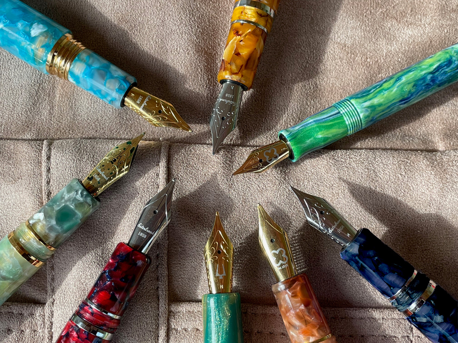
Last week in the blog, I shared my adventures getting to know Esterbook's innovative new 2GO Cup pen holder, and this week I continue my Esterbrook exploration by checking out all ten nib choices offered for the Estie. When I was thinking about my 2023 goals last month, one of my plans was to talk about how fun and valuable it is to try different nibs. There are so many unusual nibs available out there if you want to go down that rabbit hole, but seeking out a nibmeister or ordering a custom nib online can be intimidating. Esterbrook makes it easy to try specialty nibs with their accessible and approachable options. Along with the standard Extra Fine, Fine, Medium, Broad, and Stub nibs, Esterbrook offers custom grinds made for them by nibmeisters. Their current specialty nibs include Journaler, Scribe, and Needlepoint. They have also recently added Fine Flex and Extra Fine Flex nibs. This week, I try them all!

Note: the pen on the upper right in the photo is Esterbrook's JR Pocket Pen in the Beleza color variation. Although I will be focusing on Esterbrook's Estie model in this article, many of the special nib options are also available for the small and cute Esterbrook JR inspired by Esterbrook's popular vintage J pens, and for the classy Camden named for the city in New Jersey where Richard Esterbrook started the company, so check those out, too, if you like the idea of trying one of these nib styles but want a different pen body. Only the Estie opens you up to Esterbrook's full line of nib offerings, however, and the nibs are not interchangeable between the different pen models.
As you read this article, you'll notice that Esterbrook has more than one pattern on their nibs. JoWo is phasing out the etching on the edge and transitioning between these designs. They aren't particular to any specific nib size or grind, so the nib you receive could be any of the styles that appear in these photos. They are all nice, and it's kind of cool having a variety of different ones in your collection!
If you'd like to know more about the Esterbrook company's story, read the Esterbrook section of the article I wrote back in July when Cary Yeager of Kenro Industries visited our store. Esterbrook is a fun company with a very interesting history.
How To Choose Your Nib
Having ten nibs to choose from can seem a little overwhelming, but hopefully this article will help you understand their differences and figure out which will be the best for you. I love variety, so I own pens with quite a few different nibs, and I'm always excited to try new ones, but there are certain nibs that just suit my writing style better and feel more comfortable for me to write with. If you are able, it's always best to try writing with a nib by asking for an in-person dip test at a store like Pen Boutique or by testing out a friend's pen (with his or her permission, of course!). But, even if you can't test the nib you are interested in before you buy it, you can still narrow down the choices if you think about how you plan to use the pen.
Remember, when you order a pen from us, you have 45 days from the date of delivery to return or exchange it if you don't like it, as long as you have only dip tested it. This means you dip the nib in ink and try writing with it, but do not fill the pen with ink by using the internal filling mechanism (such as a converter or piston fill). Once the pen has been filled with ink (and/or the cartridges it may come with have been used) we do charge a 20% restocking fee. Please read and understand our return policy before trying your pen. When you get a nib custom ground for you by a nibmeister, the cost of the custom grind work is usually not refundable, so trying a pre-made specialty Esterbrook nib is definitely a safer option if you aren't quite sure about what you want!

Here are some things to consider when thinking about which nib you'd like to try:
- How large is your handwriting?
- Which hand do you use to write, and do you hold your pen at an unusual angle or with an unusual grip?
- Do you like your ink lines to be fairly uniform in color, or do you enjoy the look of shading, where different parts of each letter within a word are are noticeably lighter or brighter than others?
- Similarly, do you like your ink lines to be uniform in width, or do you want to see line variation, where certain parts of a letter will be thicker and thinner?
- What kind of paper do you usually write on? Is it "fountain pen friendly" paper that isn't overly absorbent, or do you use lower quality paper that may be more susceptible to feathering and bleeding? What is your paper's texture: smooth, or more toothy?
- Do you usually write in print, cursive, or a mix of both? What languages do you write in?
- What is your goal for your new nib? Are you looking for a nib that is the most comfortable for you to write with, one that will change the look of your writing with no extra effort, or perhaps one for a specific situation such as taking notes in very small spaces, writing cards with a calligraphic look, or experimenting with a new handwriting style?
In my discussions of each nib below, you will see that the choice of nib can change the look of my writing quite a bit. For better or for worse, I just use my normal handwriting in my writing samples and do what feels natural with each nib, not making a special effort to write extra fancy or neat, and I am not trained with any special writing techniques, so you will see an honest example of how the nibs effect the look of my writing.
For my initial tests, I used a blank Maruman Mnemosyne notebook with a 7 mm (college ruled) guide sheet underneath. The ink was my bottle of Sailor Ink Studio 873, and it was very interesting seeing how the color varied between nibs. Later, I used Tomoe River paper to further experiment with some of the nibs.
Needlepoint and Extra Fine

In this writing sample, I used the JR Pocket Pen pictured at the beginning of this article, but later I also compared an Estie Needlepoint nib, too.
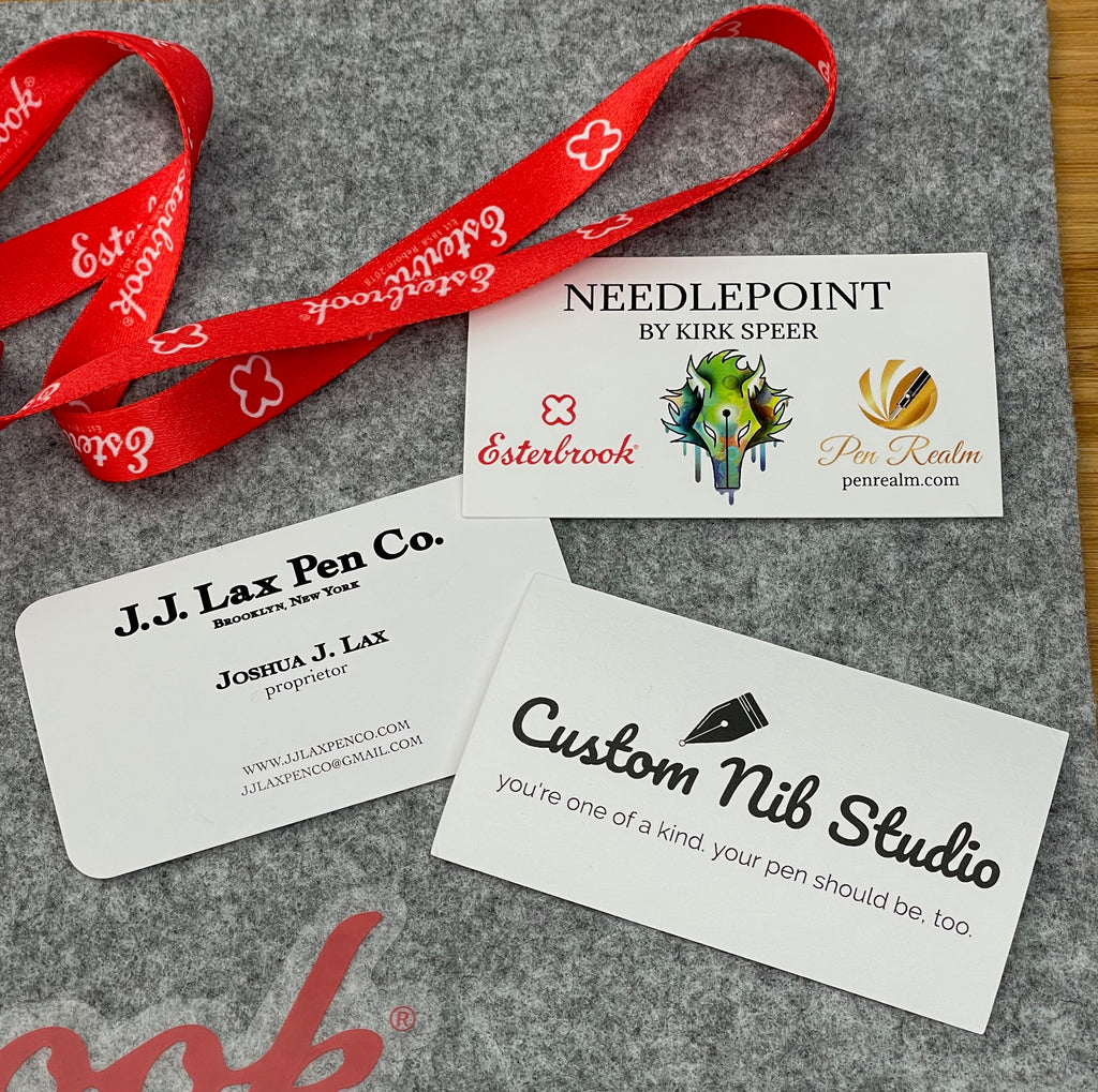
The Needlepoint is custom ground for Esterbrook by nibmeister Kirk Speer from Colorado. He's the talent behind Pen Realm, and is also an extremely nice guy, as I found out when he visited our store for a two-day event in December. I loved hanging out with Kirk, watching him work, and learning about pens from him.
As Kirk explained when interviewed by Esterbrook, "[The Needlepoint nib] gives a very precise line good for writing small in tight spaces like the margins of books or bibles or maximizing the use of a notebook. It can also be very good for artists and sketching. The nibs are a bit unique in that they don't grab or tear paper, and the shape of the tip is not common to traditional needlepoints. It was inspired in part by my love of the posting nib."
On their website description of this nib, Esterbook advises,
If you're into planners such as Hobonichi, you'll know that the small grids don't always accommodate for larger sized nibs. A needlepoint is a great way to have a controlled writing to fit more into a smaller space.
And let's say you're not writing in one of your favorite planners, but on a cheap piece of printer paper. A needlepoint does really well on cheaper paper not specifically designed for fountain pens, given how controlled the ink flow is, which means less feathering and bleeding on the paper.

As you can see from the "F" on the nib in the photo, the Needlepoint is ground from a Fine nib. When you get an Estie with this grind, the nib may say "NP" right on it.
I was very surprised by how smooth the first Needlepoint I tried was, especially considering how sharp it is and how small you can write. I was able to write so small I could barely see my writing, and experienced no feathering even on inferior paper, yet the nib felt nicer than many other extra-fine and even fine nibs I have tried. The second one was a little less smooth, so keep in mind that nibs can vary a bit. If you aren't happy with the nib you received, let us know! We will make it right. Do keep in mind that an extremely fine nib will almost always be more scratchy feeling than a broader nib, though. The benefit to this tradeoff is how precisely you can write.
For me, the Needlepoint was a little too extreme. I don't usually write that small, and I'm able to use fountain pen -friendly paper most of the time, so feathering and bleed-through isn't a big concern for me. I have customers who love it, though, and are very excited about having access to a nib like this. One of my favorite customers even got Kirk to custom grind two of his non-Esterbrook pens into Needlepoints during Kirk's visit to our store. He loves the Needlepoint because it uses up ink more slowly and is perfect for the low-quality paper he has to use at work.
My first Estie was a Fine, but I was surprised by how much I loved the Extra Fine when I tested it for this article. I've been doing a lot of small writing since I got a Hobonichi planner this January, and I love using both the Fine and the Extra Fine to write in my Hobonichi, so I've decided to get a second Estie in Extra Fine. Here's a closeup (below) of the Extra Fine Evergreen pen I used for my writing sample above. My Sea Glass Estie appears in the background. The cap from the Evergreen pen appears behind the Beleza JR in the photo above.

Esterbrook's Extra Fine nib is very smooth and I love the precise feel. The amount of feedback you like is a very personal thing, but, for me, the amount of feedback the nib provides is perfect. Although Esterbook's nibs are steel, they have a little bit of bounce so you don't feel like you are writing with a hard, unyielding nail, yet you feel in control. It's kind of like when you are driving a sports car and are more in touch with the road, rather than the cushy and insulated feel of the ride in a luxury sedan. I like this balance.
Fine and Medium

I absolutely love my Fine Estie, and I reach for it a lot. It's extremely smooth, performs well on a variety of paper, and is fun to write with. I used it for the writing sample above, and also to make a list of Estie color choices in my Oasis notebook when I was working on this article. I currently have it filled with Montblanc Petrol ink, a wonderful pairing.

Esterbrook's Fine nib is very similar to the Extra Fine nib, except the line width is slightly larger and you see a little more shading in your ink.
When you choose a medium nib (see sample above), that's when you can really start to see a lot of beautiful shading in your ink, and the writing experience feels even smoother. The downside to thicker nibs is that your writing is more prone to feathering (especially on lower quality paper) and your details aren't as sharp. You may also experience smudging if you aren't careful, like happened to me on the word "prone" when I wrote the sample above. I honestly don't mind a smudge here and there when I'm using a fountain pen; I feel like it adds to the personality of the writing and gives it more character. However, you may disagree! Smudging is a real challenge for left-handers, as they are more likely to brush their hand over their writing before it's dry. For this reason, many lefties prefer Fine, Extra Fine, or Needlepoint nibs, which put down less ink and therefore dry more quickly. I have always found Medium nibs extremely comfortable and enjoyable to write with, especially for longer writing like letters or journals. The majority of my nibs are Mediums, although I have been buying more Fine and Extra Fine nibs recently.
Here's a closeup of one of Esterbrook's Medium nibs in the Cobalt Estie. Cobalt is an older color, so we only have a few left in stock. The Medium nib is also used as the starting point for Esterbrook's Journaler nib, which I will talk about later.

Broad and Stub
I tried the Broad nib on both Maruman Mnemosyne and then later Tomoe River paper. It felt great, and really showed off my ink, especially on the Tomoe River. As you can see, the lines are much thicker, so you can't write as small or as precisely, but the nib feels even smoother and wetter, so it's very fun to write with a Broad nib, especially if you want to create a bold effect or play around with ink that has a lot of sheen, shading, or even shimmer. It's also wonderful for signatures!
 The sample above was written on Maruman Mnemosyne paper.
The sample below was written on Tomoe River paper.

A Broad nib is much more likely to feather or smear, however, and broad writing can fill your page pretty fast. It also uses up a lot more ink. Some people adore broad nibs, while others would never want one. It's up to you!
Here are closeup photos of the Broad and 1.1mm Stub nibs. The Broad is a Maui Estie and the Stub is Gold Rush Prospector Black. As you can see, unlike the standard (Extra Fine, Fine, Medium, Broad, etc.) nibs that have rounded tipping material, the "nose" of a Stub nib is ground down, giving the nib a flat end. This produces a broad down stroke and a thin horizontal stroke.


Stub writing looks beautiful if you know how to hold and angle the pen correctly, but if you try to write in your normal handwriting, the squared-off corner of the tip can catch on the paper when you're writing lines that are partway in between horizontal and vertical, which feels unpleasant and doesn't look as nice. This is part of the reason that nibmeisters have invented variations on the stub nib that are more forgiving. When I first tried the Stub nib on Maruman Mnemosyne I had trouble getting it to look nice and move smoothly across the paper. A few days later, I tried the same pen on Tomoe River paper and had a much nicer experience! I don't know if it was the smoother surface of the paper or that I was just angling the pen better, but my writing looked much, much better. So, if you try a Stub and have a bad experience with it, don't give up right away. Sometimes it just takes a little practice and experimentation.
My first attempt with the Stub nib is pretty embarrassing, but I'm going to show you anyway.

Yuck! Lots of feathering and bad contact with the paper. Here's my second attempt, which felt great and I think looks fantastic! Read what I wrote for tips about how to angle your Stub nib properly.

I ended up loving the Stub nib after I got the hang of it. Keep in mind that you'll need nice smooth and non-absorbant paper to get the best experience out of this nib. It puts out a lot of ink, so is susceptible to feathering. I had a great experience with Tomoe River and Write paper.
Journaler
If you want to see line variation in your writing but are lazy about holding your pen, a Journaler nib may be perfect for you! It's a lot more forgiving than a Stub and felt comfortable to me right away.
Gena Salorino of the Custom Nib Studio in Los Angeles created this nib for Esterbrook, and she describes it as a "medium stub grind, based on the vintage Esterbrook 9314M nib. The idea is that it’s smooth and friendly enough for everyday use, gives your writing some flair, all without being too huge for practical writing." I love that she describes this grind as "friendly!" That word is so apt. Gena was an apprentice to veteran nibmeister John Mottishaw of Nibs.com for nearly four years, so her work is derived from his style, but her signature nibs have become well-known for her own trademark style and beautiful handmade quality.
Because the nib is a modified Medium nib instead of a modified Broad like the Stub, the downstroke is less wide and you can write smaller. You still get some line variation, with a wider downstroke and narrower side stroke, but the variation is nowhere as extreme. I love that the Journaler is pretty subtle, but gives your writing a distinctive look that is just slightly quirky and fresh.
Here's my first experiment with the Journaler nib. I really liked it.

A week or so later, I tried the same pen on Tomoe River paper and enjoyed it even more.

I used an oversized Sunflower Estie with for my Journaler nib, and the pen looked as happy as my writing felt!

Scribe
The Scribe nib was created for Esterbrook by New York based nibmeister Josh Lax, and is Josh’s take on an Architect nib. An Architect is a type of reverse Stub, where you get broad cross-strokes and narrow downstrokes. The Scribe nib is a modified Broad nib, and your nib will probably have a B on it.
Take a look at the nib from the side. The tip is angled!

Josh's interview with Esterbrook on their website is quite interesting, and he is clearly very knowledgeable about Esterbrook's legacy nibs. As he explains,
I found this nib very interesting to write with. It wasn't as user-friendly as the Journaler, but I really liked the look it gave my writing, and it looked neater and less "fancy" than my writing with the Stub nib. I like the clean look, and thought it was cool that it made my printing look neater with no extra effort on my part.

I was a little surprised that i enjoyed using the Scribe nib for cursive writing, as a traditional Architect grind isn't very good with curves!
This nib performs best if you hold it at a lower angle to the paper than my natural one, so it may take you a while to find its sweet spot. Here's how my writing looked when I finally got in the groove. I used a Nouveau Bleu Estie and a Write pocket ledger. As you can see, the line variation is subtle, but has a distinctive look.

Fine Flex and Extra Fine Flex
Esterbrook's newest additions to their nib offerings are Fine Flex and Extra Fine Flex. These two nibs are available with any Estie of your choice and can also be purchased separately so you can install the nib unit in an Estie that you already own. Like their other nibs, they are steel nibs made for Esterbrook by JoWo. I borrowed two nib units and found them easy to install. All you have to do is firmly grasp the existing nib on your Estie and turn it counter-clockwise to unscrew the nib and feed, then insert the new nib unit, push down slightly to get it started, and screw it in clockwise.
I used an oversized Aqua Estie to try the Extra Fine Flex nib and a Scarlett Estie for the Fine Flex.

(I didn't screw the nibs in all the way when I tried them out, so sorry they are protruding slightly in my photos. I didn't notice this until later! Oops.)
Here's how the nib units look when they are outside your pen. They include the nib and feed seated in a threaded housing. The black "ring" part right below where the nib emerges is supposed to be flush with your pen when fully installed.


As you can see, Esterbrook's flex nibs achieve their flexibility with small cut- outs in the side that allow the steel to bend slightly when you apply gentle pressure to the tip of the nib.
As Esterbrook describes it, "If you love a little line variation in your writing, or just want to have some fun with a new nib, the FLEX is a great option to consider. Designed to provide some pliability at the nib's point, pressure applied when writing will create variations in ink flow and, ultimately, your handwriting. This is great for those who want a bit of a calligraphic look to their writing or who generally write in a more Italic/cursive print."
I was surprised by how smooth the two flex nibs were, but disappointed by the amount of feathering I experienced in my first test. Flexing the nibs allows a lot of ink to flow onto the paper, which is great for showing off sheen and shimmer, but is also challenging for many papers to handle. I've experienced this problem with other flex nibs, however, so it's not unique to Esterbrook's nibs and is just something you need to keep in mind when using a flex nib.

My first tries with the flex nibs were messy and didn't look that great. I also observed that, although they are called Extra Fine Flex and Fine Flex, they are not comparable to Extra Fine and Fine nibs at all, so keep this in mind if you decide to order one. The Extra Fine is more like a Medium and Fine is more like a Broad regular nib.
I experimented with the nibs more on Tomoe River paper and enjoyed them much more, although they still weren't quite what I had expected, as I was more familiar with the feel of a gold flex nib.

I had fun with the flex nibs, but had mixed feelings about them. I think they are a great option if you already own an Estie and want to play around with semi-flexible nibs. They are easy to use, very smooth, and enjoyable to write with. However, if I were to choose a new pen specifically because I wanted a flex nib, I would go with a gold flex nib like a Pilot Falcon or Pilot Custom 912 with FA nib. I prefer a softer flex nib, where the flexibility feels more natural. The Esterbrook flex nibs required me to make a conscious effort and use a firm hand to get line variation. They are also not a great choice if you want a flex nib that writes very fine, and I think their names are a little misleading. That said, I still think they are cool and applaud Esterbrook for adding flex nibs to their growing nib choice collection! (They are also a good choice if you are concerned about springing a gold nib, as gold nibs can be easy to flex too far and ruin if you write with too much pressure.)

The Flex nibs are sold without an extra charge when bought on a pen, and cost $50 each when purchased separately. The other custom nibs are not available separately, but would have a retail of $90 if they were.

Final Thoughts
I loved trying all ten of Esterbrook's nib choices, and I really think it's great that Esterbrook offers us so many options and that they are working with nibmeisters to make it easy for us to have access to custom grinds. I think it's so cool that they chose three different nibmeisters and that each of their custom grind selections is unique. I also think Esterbrook's nibs in general--whether a "fancy" nib like a Flex, Stub, or Needlepoint, or a regular old Fine or Medium--are a joy to write with.
As I said in my previous article, I absolutely love Esterbrook's #6 JoWo German steel nib, and the special lock seal cushion cap closure that keeps it from drying out. The cap takes a little getting used to the first few times you screw it on, but it works brilliantly. My Estie is always wet and ready to go, and I find myself reaching for it frequently, mostly just because it's such a pleasure to write with. The feel of its nib on paper makes me happy, I love how compatible it is with my favorite inks, and the complex material continually catches the light in unexpected and delightful ways.
I don't think I can pick a "best" Esterbrook nib, but, for me, personally, I think my favorites are the Extra Fine, Fine, Journaler, and (after some trial and error!) Stub. Of course, that's what I think today. My nib tastes are changing all the time, and I am always eager to try new ones! I hope you will also give a new nib a try. Esterbrook's many options are definitely worthy.

-Laura P.
I love comments on my blog! Please leave comments if you like the articles, and, if you have any questions about this article, or any of the other blog articles, you can e-mail support @ penboutique.com. Thank you!

13 comments