


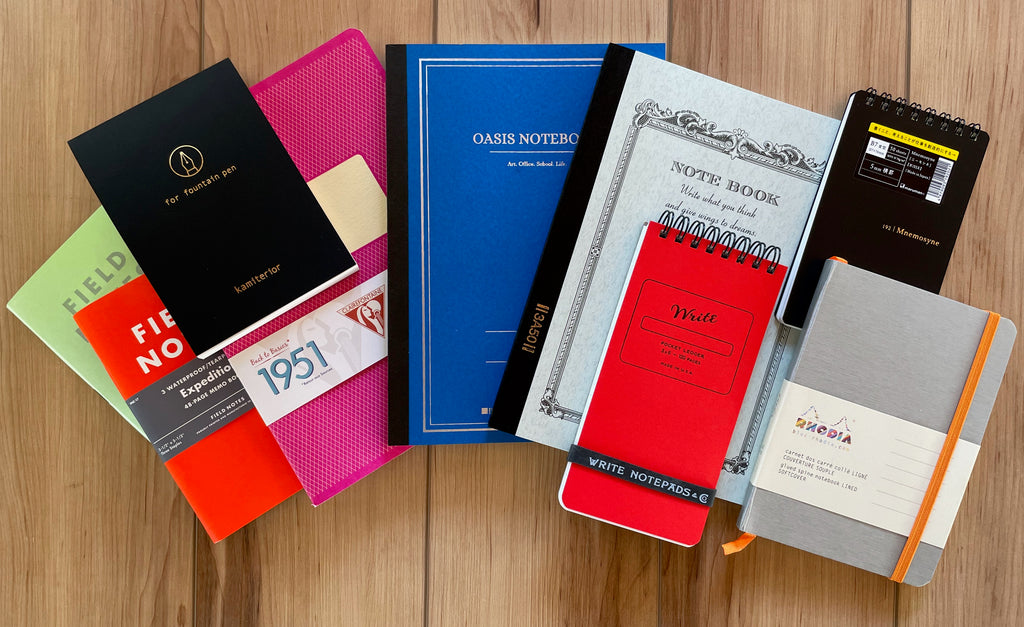
Thursday, May 19th, was National Notebook Day, so I thought it would be fun to take home a selection of the notebooks we carry and try them out. Customers often ask me how our different papers handle fountain pens, but, since I had personally tested so few of them, I couldn't give a very good answer. Well, now I can! Come along as I sample Rhodia, Write Notepads, Mnemosyne, Apica, Clairefontaine, Oasis, and Yamamoto's Memoterior sampler for Fountain Pen.
Experimenting with Paper
First of all, if you are using a fountain pen and you haven't tried it with fountain pen-friendly paper, you are missing out. Of course, no one can use special paper all the time, and there's a place for inks and pens that work well on regular school notebooks or on whatever paper you need to use at work. We don't always have a choice about our paper. But in situations where you do have a choice, the right paper is just as important as the pen and the ink, and can elevate your writing enjoyment just as much.
The key things that I look for when choosing a paper for my fountain pens are: 1) I want a paper that is resistant to feathering, so my lines look nice and crisp, 2) I love a paper that has the ability to show off the beautiful qualities of my ink, like sheen and shading.
Other factors to consider: does fountain pen ink bleed through the paper? Does ink show through to the back side of the paper ("ghosting"), so you can only use one side? Do you like a more translucent paper, so you can trace something underneath or use a guide sheet of your choice? What about weight? Thin paper allows you lots of pages in one notebook, but maybe you prefer a more substantial feel. Does your ink take an inordinate amount of time to dry on the paper, leading to smearing? Or do you feel that a slower dry time is worth it because it allows more sheening? Do you like bright white paper to show your ink's true colors, or do you prefer a softer ivory or cream shade that's easier on the eyes? Do you like your paper blank, or with guides of some sort to help you write straight?
How does the paper feel to write on? Some people like the feel of extra smooth paper like Tomoe River and Clairefontaine that allows their pen to glide over the surface; others prefer paper with texture that offers a little bit of resistance or feedback, such as Bank Paper. I like both, depending on what I'm in the mood for! Choosing paper is just like choosing a fountain pen nib... do you like the super smooth feel of a wet soft bouncy nib, such as the Pilot e95s, an S.T. Dupont, or a Pelikan M1000? Or do you prefer a stiffer nib that gives you audible feedback and allows you to feel the paper, like a Sailor 1911 or Professional Gear? Maybe you love both! Exploring the sensuous aspects of fountain pens is all part of the fun, and paper can be a big factor in that.
Because everyone's tastes are different, and writing with a fountain pen is such a personal experience, there is no one perfect paper. Choosing the kind of paper that works best with your particular pens and feels the best to you can take a little trial and error, but it's definitely worth it to buy a few different brands of paper designed for use with fountain pens to see which ones appeal to you the most. For this blog article, I took home small notebooks in a wide variety of brands and sampled them all.
Rhodia Dot Pads
I love Rhodia paper, and when I first got into fountain pens, I always used the inexpensive and readily-available Rhodia Dot Pads to test out my new pens and inks. They come in orange and black, and with either stapled or wirebound bindings. The people in the videos I watched to learn about fountain pens and inks were always using Rhodia Dot Pads, so I figured they were on to something. They were! Rhodia Dot Pads are great with fountain pens and are very versatile, although I discovered that the line spacing of the dot grid isn't really comfortable for my natural handwriting size (just my personal preference), so I moved away from using them as much, but I always have a few around. The dot grid design is cool because it's much less confining than lines, but provides guidance both horizontally and vertically. The dots are a subtle grey that isn't distracting and recedes into the background, allowing your words or artwork to take center stage.
 This is one of my well-used wirebound Rhodia Dot Pads, filled with to-do checklists, scribbled notes from phone calls, pen/ink combo tests, instructions about how to water my sister-in-law's plants when she and my brother were on vacation, and all sorts of things! I used this notebook on International Scribble Day to celebrate with a "scribble" on social media for Pen Boutique. As you can see, it handles all kinds of different inks and nibs very well!

Rhodia Rhodiarama
I often use a very practical 8-1/4 x 11-3/4 blank Rhodia pad when working on my Pen Boutique blogs because the blank page allows me any format I need, but I decided to try a Rhodiarama notebook for this article. I have always admired the beautiful colors, especially the lilac, the purple, and the metallic silver, and I wanted to experience one of Rhodia's more special offerings.
I chose a small Lined Silver A6 notebook to try out on the town, because I am fascinated by the silver notebooks. They look so different from all the other ones... either more sophisticated or more glam, or maybe both. I prefer blank notebooks, but Rhodiarama notebooks only come in lined and dot grid, so I ended up pretty much ignoring the lines when I was using it, especially because I decided the perfect test of this notebook would be to take it to an opera, along with my trusty black Pilot Metropolitan.
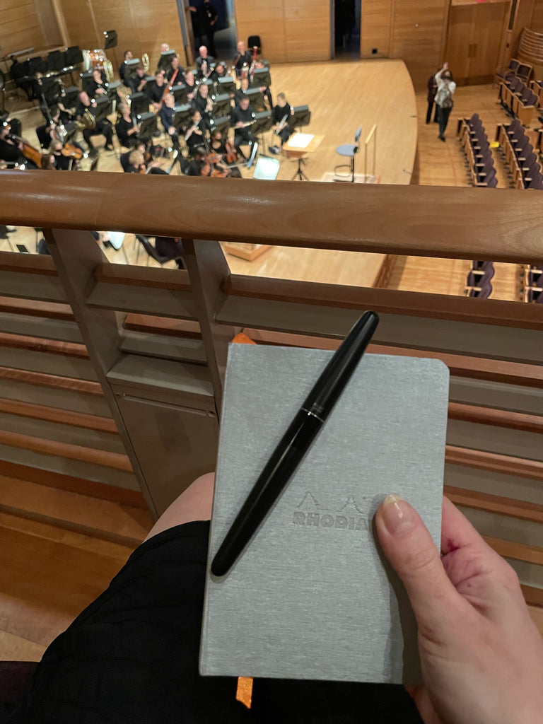
The A6 size notebook (4 x 5.8") was perfect for throwing in my bag, and the expandable inner pocket in the back came in handy for storing my COVID-19 vaccination record card, which I had to show along with my ticket and ID to get into the venue.

The little notebook felt like a faithful companion right away. There ended up being no one else sitting in my box, so it was easy to take out the small silver Rhodiarama and rest it on my lap to scribble notes during the performance without bothering anyone.
I have never taken notes at an opera before (I don't think I could have gotten away with it when I used to go to the Met), but under the circumstances it was a lot of fun and really helped me remember my favorite details so I could share the experience with my online friend Gaby later. It was a little hard to see in the dim light of the darkened concert hall, so I just treated the lines like they weren't there, but the size and shape kept my scrawled comments under control, and the paper showed very little ghosting, so, after the first couple of pages, I started writing on the backs, too.
The stiff but slightly flexible cover made a very stable and comfortable backing, and the orange placeholder ribbon helped me quickly find my current page without having to flip through the notebook or look down. The orange elastic band stayed out of the way while writing and kept the notebook closed and the pages protected when it was in my bag.

I felt like the silver notebook matched my other accessories quite well and looked very classy! I also appreciated the silent snap cap on my Pilot Metropolitan fountain pen, as I did a lot of quick capping and uncapping without looking at the pen. I didn't want to take my eyes off the stage for very long!
Back at home, I gave the notebook a more scientific test by trying it with four different pen/ink combinations: my medium nib Pilot Metropolitan with Aurora Black ink (this was the "control"--a commonly used pen and highly regarded plain black ink), my medium nib Otto Hutt Design 04 with Monteverde Ocean Noir (an ink that shows a lot of sheen, without being completely overwhelmed by it), my SF Pilot Falcon with Iroshizuku Yama-budo (well-loved ink with lots of shading that sometimes shows sheen, and is very wet with the semi-flexible soft fine nib of my Falcon), and my double broad Kaweco Skyline Sport with Robert Oster Sterling Silver (a shimmer ink that also shows cool shading on some paper).

It performed well with all four pen/ink combinations, showing quite a bit of sheen with the Ocean Noir and beautiful shading with the Yama-budo. There was some very slight feathering and bleed through with the Yama-budo in my Falcon a couple of times when I held the nib in place for too long. The Sterling Silver shimmer ink also looked great--very metallic and shiny, just like the cover of the notebook! I wasn't crazy about having lines in the notebook, but they are a good line width.
Overall, I was very happy with this notebook and look forward to using it more in the future. I'd love to own more of them in different colors and sizes. The Rhodiarama Soft Cover notebooks comes both lined and dot grid, and in three sizes:
| 8.5 x 12.0 cm |
(3 ⅜ x 4 ¾ ")
|
|
| A5 |
14.5 x 21.0 cm
|
(5 ½ x 8 ¾ ") |
|
19.0 x 25.0 cm
|
(7 ½ x 9 ⅞ ")
|

When it comes to Rhodia paper, the options are overwhelming. When I walk into our Pen Boutique warehouse, I am greeted by about 150 different kinds of Rhodia notebooks in all shapes, colors, and sizes. Some have blank paper, some are lined, some have graph paper, some are designed with special purposes like meetings, goals, or calligraphy in mind. And, of course, there are plenty of choices with dot grid paper, too. Think about which style suits your needs and give one a try!
Write Pocket Ledger
The next notebook I tried surprised me when I unwrapped the plastic packaging. I should have guessed that something called a Write Pocket Ledger would be... well, a pocket ledger, but I had foolishly assumed the description only referred to the shape.

In fact, this little red hardcover spiral notebook (which also comes in pistachio, brown craft paper, black, and blue) has lines inside for making lists and adding up numbers! I'm terrible with numbers, so I tried using it to make a list of amari that I want to sample, using the extra columns to check off the ones I've tried and to mark a few favorites.

I felt like the narrow width was slightly confining but I loved the stiff heavy cardboard back and double-wire spiral binding, as well as the paper! The notebook is the perfect size to hold in one hand while standing up and making lists. (Almost exactly the same size as my iPhone, actually.) It's extremely stable, so you can write neatly, and it's fun to come up with ideas for how you could use this ledger on the go. Shopping lists? Sports scores? Plants in your yard? Favorite cheeses? People's names? Math?
The sturdy black "Write Notepads & Co." rubber band that comes wrapped around the ledger keeps it closed when you aren't using it, and can be stored around the flipped-back part of the notebook when it is open. Since it's not attached, there is always the danger of losing it, and I do envision it springing across the room and hitting someone (preferably my brother), but maybe that's because I'm always tempted to shoot rubber bands at people.
Most of all, I was extremely impressed with this paper. It showed no ghosting or bleed through even with my wettest pen, and I could have easily continued my list on the back, but I did use a totally clean sheet for page two. The nice smooth surface showed Ocean Noir's sheen beautifully and was a pleasure to write on. It also worked extremely well with the Sterling Silver shimmer ink. Plus, although it's strong and stable, it tears off completely cleanly if you mess up a page! I always make mistakes and like things to look nice, so I love this feature. No one will ever know that I spelled Branca Menta wrong the first time I wrote it!
Write Notepads & Co. is a local brand from Baltimore, Maryland and now I want to try their other notepads, which all use the same fabulous high-quality materials.
Maruman Mnemosyne
The black lined Maruman Mnemosyne B7 notebook is a featherweight 3" x 5" spiral bound notepad with a strong and extremely flexible black plastic cover. You can practically fold it in half without anything bad happening to it! I really like that the sticker on the front of the notebook peels off completely cleanly, leaving no residue, so only an elegant "192 | Mnemosyne" remains. This handy little Japanese notebook only cost $2.80, a pretty impressive price considering its performance!

Each sheet is divided into three sections, set off by solid lines indicating the different zones (the rest of the lines are dotted), a concept I found a little strange, but I guess it could be useful and it's pretty inconspicuous if you wish to ignore it. The pages are also perforated to tear off cleanly if you want to remove a sheet and have a nice straight edge instead of the ragged spiral notebook edge, a very thoughtful feature.

The paper is nice and smooth but very lightweight, and all the inks I used showed through to the other side of the page, so you'd never be able to write on the back with fountain pens. (I don't usually write on the back of pages anyway, so this didn't bother me much.) If you use this notebook for notes you're going to keep, also be aware that the writing on the pages below will show through, as in the photo above.
In my testing, the paper feathered a little with the wet nib of my Pilot Falcon inked with Iroshizuku Yama-budo, but not too badly. The Monteverde Ocean Noir ink showed sheen really well, and the Robert Oster Sterling Silver shimmer ink looked great!

I wasn't sure at first if I'd like this notebook, but, the more I used it, the more it grew on me. It's great for quick notes, looks good, and is so inexpensive and portable, you can always keep one close at hand.
Maruman Mnemosyne makes lot of different notebooks in all shapes and sizes, all with a similar look and feel. I have a large A4 size notebook that I have used for the blog, which has nice blank paper. The paper in that notebook is 80 gsm as opposed to the 70 gsm in this little notebook, and the plastic cover is thicker and heavier. I like it a lot, although I do have trouble with feathering with some inks in that notebook, too. That notebook was recommended to me by a customer who loves using Maruman Mnemosyne with his fountain pens and finds the blank notebooks perfect for drawing. He told me he prefers the feel to other fountain pen friendly brands' paper. It's not my top favorite, but paper choice is very personal, so Maruman Mnemosyne is definitely worth trying to see what you think! It has a lot of loyal repeat customers, who tell me they love the smooth but not slippery feel.
Apica
Apica another brand of Japanese notebooks that's an amazing value if you're looking for great paper at a low price. Apica notebooks are thin, lightweight, and extremely simple, with a stitched spine and paper that has a dull-looking surface with a slight greyish tinge that is very soft on the eyes. It has an old-fashioned look to me, like a school notebook from the early part of the 20th century. The green cover with the motto, "Write what you think and give wings to dreams" also contributes to this nostalgic look.

The paper doesn't look like anything special, but I was amazed by its performance. There was NO bleed-through and NO feathering, even with my wettest nib/ink combo! My sheening ink looked fantastic, with the sheen showing up more the faster I wrote, and it also brought out the shading in the Yama-budo. The shimmer ink also worked well and looked great. I particularly liked how the notebook laid open completely flat, and how slim it was (slim enough to slip into my close-fitting laptop sleeve along with my computer!). This notebook isn't the kind you'd want to use for a journal or something special you're planning to keep for a long time, but it's perfect for notes.
The only problem I had was with the Aurora Black ink in my Pilot Metropolitan. For some reason this paper and ink combination wasn't compatible at all, and the normally reliable pen started writing very thin and dry and skipping like crazy. The paper felt too slippery with this pen and ink. This happened every time I tried it, even with writing sessions a week apart. Every time I switched back to a different paper, my writing was normal again. So bizarre!

I guess this is a good lesson: even if a paper is very fountain pen friendly, there are certain combinations that just don't work well together. And, if you are having trouble writing on a paper, try it with a different pen or ink! It might seem horrible with one, but be your favorite paper with another. Overall, I really liked the Apica notebook and would recommend trying one. The A5 notebook I sampled was only $3.40!
Clairefontaine
The Clairefontaine 1951 lined raspberry 5 ¾ X 8 ¼ notebook that I tried next is a pretty notebook that is almost exactly the same size as the Apica (with a similar price point) but is staplebound instead of stitched and has a slightly different line spacing. To my surprise, I preferred the Apica even though the Clairefontaine looks and feels nicer!


My Metropolitan liked this paper better than the Apica but, as you can see, it still wasn't very happy. The paper felt too slippery to me, and all of my pens wrote with a thinner line than usual. (I am not sure if I can blame the poor performance of the shimmer ink on this paper, or not. The pen had started to clog at this point, although it was still writing okay on the papers in the Kamiterior sampler, which I'll talk about last. After cleaning the nib, I tried the shimmer ink again on this paper and it wrote fine and looked lovely.)
The bottom line is that certain papers have the ability to enhance performance for a dry or imperfect pen or poor writing technique, while others make them struggle, and, for me, this paper made some of my pens struggle. They didn't feather, but they weren't happy.
I did a little more research into this topic, and it's an issue for other people, too. Papers with an extremely smooth hard finish, like Clairefontaine and Apica, are less tolerant of a nib turning off of its "sweet spot" when you don't hold it at just right angle, while softer papers with a little bit of a nap to them reach up to the ink and are okay with your writing angle if the nib is not perfectly in contact with the page. The reason the nib sometimes has trouble writing on very smooth paper is that the capillary action is interrupted.
My problems with these papers really surprised me, because for years I have been happily using Clairefontaine Triomphe notepads for writing letters and drawing! Why is the performance any different? They are both 90 gsm Clairefontaine paper, and so is the paper in the Rhodia Rhodiarama notebook that I used at the opera and enjoyed very much! (Rhodia paper is made by Clairefontaine.)
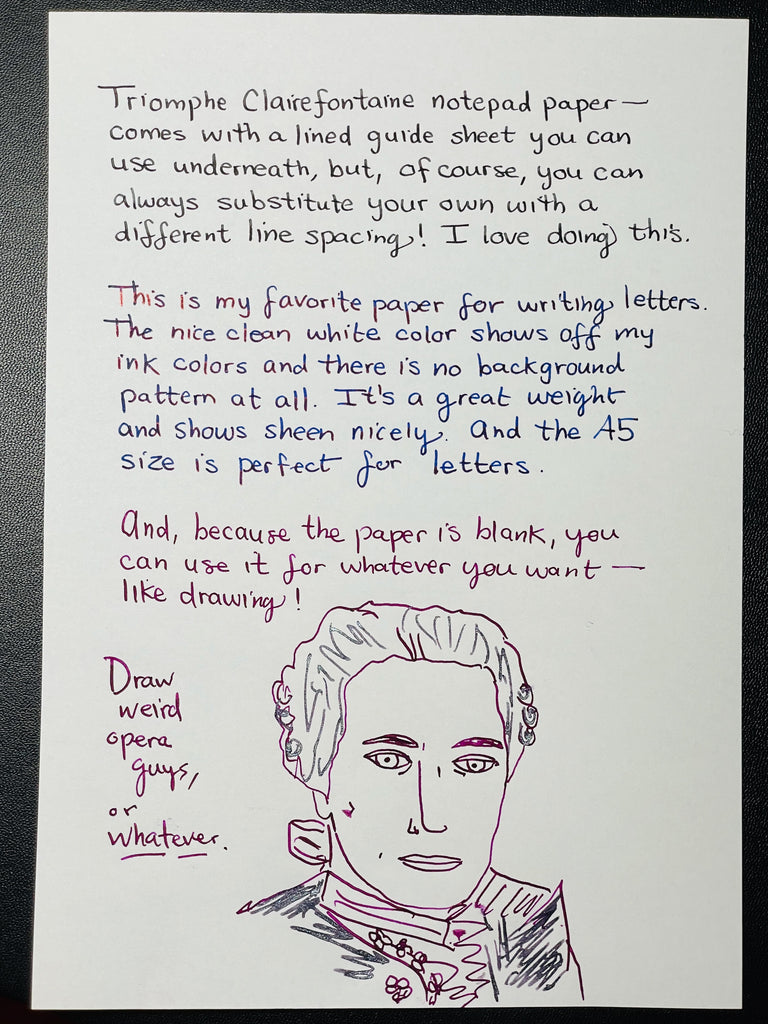
I think I found the answer: when I use a Clairefontaine Triomphe notepad, I tear out the individual sheets of paper and write with them on my desk mat, which has a little bit of give and allows the nib to stay in contact with the paper. The notebook doesn't provide enough softness for some of my pens. To prove my theory, I tried writing on the same piece of paper directly on top of my hard desk surface with no padding underneath. When I held the pen at lower angles, it wouldn't write at all! So, Clairefontaine paper can be a joy to use, but it can also be unforgiving. You may love it and never encounter any problems, or you may struggle. This classic French paper is absolutely worth experiencing and experimenting with yourself!
Oasis
Oasis is a brand of notebook I had never heard of before I started working at Pen Boutique, but which I often see customers buying, so I was very curious to try it for myself. Several customers mentioned to me that they discovered it in one of our Mystery Product packages. They loved it, and wanted more. I brought home a sky blue ProFolio Notebook to try, and I, too, fell in love with the unique Japanese paper and beautiful cover.

The simple and clean design, with stitched pages and a heavy paper cover is a beautiful shade of azure blue, and features an extremely interesting page. As Oasis describes it, "While many people have a hard time choosing between dot grid, graph, or lined, the Oasis Journal combines the best of all three with its new proprietary paper pattern. The combination of dots, grids, and lines as well as their light application makes this notebook ideal for handwriting, bullet journaling, and even drawing straight lines without the necessity of a ruler."

Although I normally prefer blank paper, I found these guidelines fascinating to experiment with! (Yikes, I didn't even notice I misspelled "practicing" until now. I think I was concentrating too hard on practicing!)


It was a little tricky to get my columns spaced correctly to squeeze in all my text, but the whole concept is very cool and versatile! I like that you can use a ruler to connect the vertical markings on the page if you wish to be very precise, or else just eyeball them. The paper feels extremely smooth but not glassy, and my all pens performed well. The light cream color is restful and lovely.
The journal is 5/16" thick, but it's still very lightweight. I love that it lies open flat, although I always end up wanting to tear out pages when I mess things up, which doesn't work so well with a stitched style notebook. I cut them out, which doesn't look great, but at least I'm not tortured by my mistakes! You can always cover the rough edges with decorative washi tape, a trick I employed when I used to keep a journal.
This is a notebook I'm looking forward to experimenting with more, and I'd purchase it for myself. Oasis also makes a fancier notebook called the Summit which uses this same cool paper in a slightly heavier weight, with a studier cover and more pages.
Yamamoto Kamiterior Sampler
I was planning to also cover Field Notes notebooks, but I feel like this article is getting too long and I'm getting too exhausted, so I'll have to save that popular brand for another time. Sorry about the tease in the cover photo! Instead I'd like to end with the most fascinating product I tried, the Yamamoto paper Kamiterior for fountain pen. (Note that we also carry versions for pencil and ballpoint, so make sure you select the right one!)
The Kamiterior isn't really a notebook. It's more of a notepad like the Clairefontaine Triomphe tablet. As with that tablet, the pages are bound at the top but they tear off easily and cleanly if you wish to remove them, with no residue on the edge. Unlike the Clairefontaine Triomphe tablet or any of the other products we've covered today, this fascinating little bundle of joy features five different kinds of paper! It's like a tasting menu for paper.
The explanatory text that comes with the pad is written in Japanese, so, if you don't read Japanese, it doesn't provide much help identifying the papers. After a little research, I discovered that the featured papers are:
- OK fools Foolscap
- Bank Paper
- Tomoe River
- Spicabond
- Eastory CoC

Each of the five sections are divided by a black sheet, and each has its own unique color, texture and feel. I love Tomoe River paper and Life Bank Paper, and have been using them for years, but I had never encountered the other paper types. They are all amazing. This tablet is so fun and such a pleasure to use!
I think I can mostly let my photos speak for themselves with this one.
OK Fools Foolscap:
This paper has an interesting texture, and a beautiful watermark if you hold it up to the light. It made my Metropolitan look much fancier than usual, I think because of the way it draws out shading even from an ink like Aurora Black! The Robert Oster Sterling Silver shimmer ink also showed an unusual amount of shading and a little bit of its subtle purple tones. The Ocean Noir sheen was lovely. My Falcon with Yama-budo feathered a little bit with this one, but the other cool attributes outweigh that!


Bank Paper:
I especially loved how the Bank Paper brought out the beautiful color of the Ocean Noir ink. It has a heavier weight and a soft but crisp feel. This paper got all around A+ scores for me.

Tomoe River:
I still haven't tried Cosmo Air Light paper (from what I've read, Tomoe's closest rival), but for me Tomoe River is hard to compete with. Just see how amazing the inks look! Finally, I got my sheen out of that Yama-budo. And not a trace of feathering. Tomoe River is extremely lightweight (but strong) and is easy to see through, so it's not good for all applications, but it's glorious for trying out inks, and I adore it for drawing.


Spicabond:
Spicabond paper was nothing like Tomoe River, but was nice in its own way! It has an old-fashioned stationery feel and would be great for letters.


Eastory CoC:
Eastor CoC was my least favorite in the sampler because it feathered like crazy with my Falcon! If you want to see a perfect illustration of feathering and how it happens, check out the details on the closeup. On the other hand, it's a very nice writing paper, with very little show through onto the reverse side, a substantial weight, and a lovely old-fashioned texture. This paper was good with my shimmer ink for the same reason it was terrible with the Falcon--because it drew out the ink from the pen.


So, Which Ones Do You Want to Try?
This was a lot of papers and notebooks to sample, and I felt like I could have written twice as much as I did about each one, but this is very long, so I'll call it a night. The world of fountain pen paper is so rich, I could spend an entire blog article just discussing one piece of paper.
I know there's a lot about each notebook that I didn't cover at all (for example, drying times), but I hope this sampler whet your appetite for exploring fountain pen friendly paper and notebooks on your own and discovering your favorites. I'm planning to bring some of the notebooks that I used into the store, so if you are in the area you can try them for yourself. I guarantee that experimenting with paper is very rewarding and fun! I definitely made some big personal discoveries. Which notebook will be your new companion?

-Laura P.

2 comments
Charlene Maximenko
What a wonderful review of these notebooks! Like you, I have always preferred Rhodia and Clairefontaine paper, with Tomoe River another favorite. But now I want to try a few new notebooks thanks to your article. The samples you showed say a lot about how ink and particular fountain pens will behave. It really is important for fountain pen users to try fountain pen-friendly paper. Thank you so much for sharing!
What a wonderful review of these notebooks! Like you, I have always preferred Rhodia and Clairefontaine paper, with Tomoe River another favorite. But now I want to try a few new notebooks thanks to your article. The samples you showed say a lot about how ink and particular fountain pens will behave. It really is important for fountain pen users to try fountain pen-friendly paper. Thank you so much for sharing!
Stacy Chiarello
Thanks for the reviews. I especially liked the “List Of Amari” on the Write notepad. Reminds me of my many years in the restaurant biz. -Stacy
Thanks for the reviews. I especially liked the “List Of Amari” on the Write notepad. Reminds me of my many years in the restaurant biz. -Stacy