


Pilot's nibs are adored by the fountain pen community for being smooth, consistent, and reliable, celebrated as well-tuned good writers straight out of the box. Each nib has its devoted followers, from the basic stainless steel one featured on the Metropolitan and Kaküno, to the beautiful vintage-inspired inset E95s nib, the unique retractable Vanishing Point nib, the flexible Pilot Falcon nib, the famously bouncy #30 nib, and huge #50. There are actually 16 different nibs available, if you count the steel, gold-plated steel, and 14k and 18k gold versions separately!
On top of that, each nib comes in a range of options... some stick to the basic Fine and Medium, while others offer intriguing choices from Posting to Waverly to Soft Fine to Coarse to Signature, and beyond! With that many different possibilities, the choices can feel overwhelming, but I'm here to explain which nibs are available on which pens, what they look like, and how they write. If you're new to Pilot nibs, this will be a great introduction, and, if you already have favorite Pilot nibs, you'll learn more about them and get ideas for which to try next.
Pilot Nib Basics
To make this article clearer, I will refer to Pilot's different nib offerings as nib styles and nib options. In general fountain pen terminology usage, the term "nib size" is used to describe both the physical size of the nib (which is often designated with a number, such as a "#5 nib") and the way the nib is designed to write, such as "Medium" (a line width in between Fine and Broad). Using the same word to describe two completely different things can be very confusing, so I will avoid that.
Many other modern fountain pen brands share European nibs from the same manufacturers, and use the same numbers to describe the physical size of their nibs. You'll commonly see #5 nibs (a smaller size, found on slim or compact pens), #6 nibs (the most common size for full-size pens), and #8 nibs (used on oversized pens). These numbers are based on the width in millimeters of the feed diameter. Pilot's nibs are proprietary (and made by Pilot), and their numbers have no relation to the numbers used by other companies. Many of Pilot's special nibs have no name, other than the name of the pen that uses them, and their numbered nibs are designated #3, #5, #10, #15, #20, #30, and #50. Pilot's nib numbers do represent the physical size of the nib, but are meaningless other than in general terms--i.e., #3 is small and #50 is huge. They don't correspond to any actual measurement and aren't proportional (that is, #15 is not three times as big as #5).
The way different nibs write is affected by a combination of factors:
- the material (steel, gold-plated steel, 14 karat gold, or 18 karat gold)
- the physical size of the nib
- the physical shape of the nib
- the hardness or softness of the material (nibs can be made more flexible by a heat treatment called annealing)
- the shape of the writing tip that touches the paper
Pilot's nib styles cover a vast array of shapes and sizes:
- Pilot's steel nib (plain or gold-plated)
- the inset E95s nib (14k)
- the retractable Vanishing Point nib (18k)
- the semi-flex Pilot Falcon nib (14k)
- the adjustable Justus 95 nib (14k)
- the inset Silvern nib (18k)
- the #3 nib (14k)
- the #5 nib (14k)
- the #10 nib (14k and 18k)
- the #15 nib (14k and 18k)
- the #20 nib (18k)
- the #30 nib (18k)
- the #50 nib (18k)
In this article, I will only be addressing the pens and nibs available to Pilot's US market. There are different options from Pilot Japan.
Pilot's Steel Nib
Pilot's stainless steel nib is renowned for its smoothness and value. It's featured in the Kaküno, Explorer, MR (Metropolitan), and Prera pens, and comes in Extra Fine (EF), Fine (F) Medium (M), and Calligraphy Medium (CM). Extra Fine is only available on the Clear Kaküno, which also comes in Medium. All other Kakünos, MRs, Explorers, and Preras are available in Fine and Medium. Clear Preras, the MR Retro Pop Collection, and the plain Black Metropolitan have the Calligraphy Medium nib option, a 1.0 mm stub.
 [Pictured, top to bottom: Kakuno, MR, Explorer, and Prera models, with original steel nib.]
The dreamy Kaküno Madoromi Collection, which has a milky translucency, introduced a gold-plated version of the steel nib that writes even more smoothly.

[Pictured: Kaküno Madoromi model with gold-plated steel nib.]
There are several versions of the original steel nib, with different markings, but they all write the same. Kaküno's nibs are engraved with cheerful smiley faces to brighten your day and help teach young or inexperienced fountain pen users to make sure the flat part of the nib is facing up when they write. MR's nibs have a subtle decoration on the tines along with the word "Japan." Another version of the nib, found on Explorers and Preras, says "Super Quality Japan."
You can read more about all of these pens and their nibs in my article, Beginners and Beyond: the Steel Nib Pilots.

[Pictured: Some of the steel Kaküno nibs on the left, and gold-plated Kaküno Madoromi nib on the right.]

[Pictured: MR Nibs, featured on the Retro Pop Collection.]

[Pictured: The "Super Quality Japan" nib on a Prera.]
E95s Nib
This beautiful 14k gold inset nib has vintage styling similar to nibs used on Pilot's Elite model that was introduced in the 1960s. (The name Elite is still used in Japan for the contemporary version of this pen.) It is only available on the E95s, Pilot's most affordable gold nib pen, although a similarly shaped larger 18k gold inset nib is featured on Pilot's sterling silver Silvern pens. The E95s nib comes in Extra Fine, Fine, and Medium.

If you look closely at the exposed lower part the nib, you can see numbers that tell you the month and year it was made. For example, my burgundy and ivory E95s nib is engraved with the number 818, meaning it was created in August, 2018. You can find these numbers on other Pilot nibs as well, but they are easiest to see on the inset nibs.

Some nibs may also include a letter, designating the factory in Japan where the nib was produced:
- T: Tokyo factory (in Shimura, Itabashi ward)
- H: Hiratsuka factory (in Kanagawa prefecture)
- A: Hiratsuka, production line A
- B: Hiratsuka, production line B
- F: Thailand, Burma, India, or Brazil
All current Pilot nibs are made in Japan, so the "F" code would only be appropriate on vintage pens!
Compared to Pilot's steel nib, the gold nibs write slightly thicker and feel smoother and more luxurious.
Vanishing Point Nib
All of Pilot's capless Vanishing Point pens use the same skinny 18k gold nib unit, which is available in Extra Fine, Fine, Medium, Broad, and Stub. Some of the models come with limited choices out of the box, but we can swap them to a different nib size if you wish. The rhodium-plated and matte black nibs are available in all line widths, but yellow gold is limited to Fine, Medium and Broad.

[Pictured: Disassembled Vanishing Point, with nib unit removed.]

Even though it's so small, the 18k gold Vanishing Point nib feels even more smooth and luxurious than the 14k gold E95s nib, and has more bounce. The Extra Fine Vanishing Point nib is known for being especially fine compared to the Extra Fine nib on other pens.

You can read all about the Vanishing Point pens and their special nibs in my article, Updating My Perspective on Pilot's Vanishing Point Pens.
Falcon Pen Nib
This one is a little tricky. The "Pilot Falcon" (known as an Elabo outside the US) is a pen that comes in either resin or metal, with rhodium-plated and yellow gold nib and trim possibilities. The metal version is a little larger, and can use Pilot's larger CON-70 converter. Both Falcons have four nib choices—Soft Extra Fine, Soft Fine, Soft Medium, and Soft Broad—and these 14k gold nibs have a unique, slightly arched triangular shape found only on this pen model. The nib itself doesn't have its own special name, but it's designed to be semi-flexible to yield to your writing pressure and angle, and it produces line variation when you exert a little pressure.

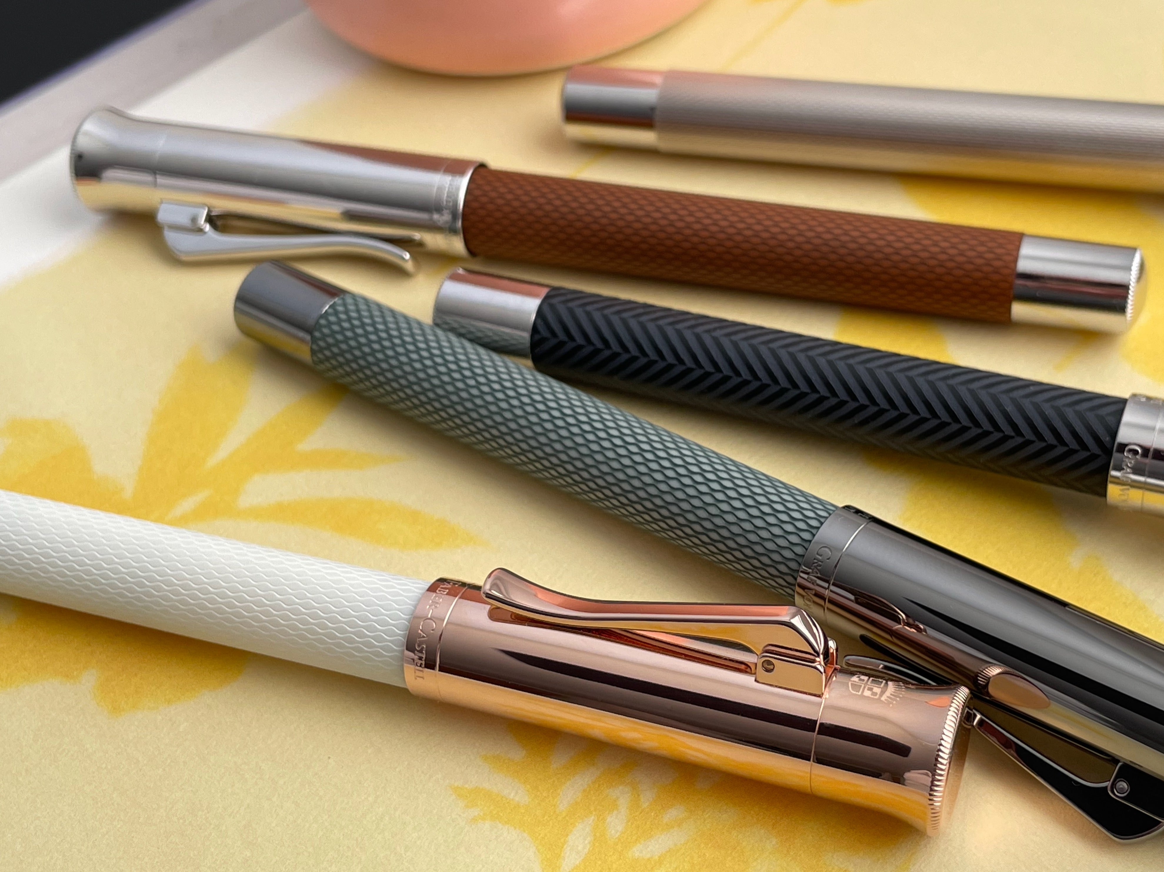
[Pictured: Resin Falcon on top, with metal Falcon in the foreground.]
Pilot offers Soft Fine and Soft Medium nib options on its #5, #10, and #15 nibs, too (along with Soft Fine Medium), but those nibs have a completely different shape, and the soft options are only available with certain pens.
Pilot also has a completely different nib called the Falcon (abbreviated FA), which is an option, along with many other great nib choices, on the Custom Heritage 912's #10 nib and Custom 743's #15 nib, and has a semi-circle cut into each side that allows the gold to bend much more dramatically than a traditionally-shaped nib allows. You can learn about both kinds of Falcon nibs, and how they write, in my article, Flexing My Creativity with Pilot's Falcon Pen and Nibs.

[Pictured: Pilot Falcon/Elabo with a Soft Fine nib on the left, Custom Heritage 912 with #10 sized FA nib is in the center, and Custom 743 with #15 size FA nib on the right.]
Justus 95 Nib
The Justus 95's unique 14k gold nib features a tension adjuster at the top of the grip section that you can turn to extend and retract a plate which makes the writing point softer ("S"), stiffer ("H," for hard), or anywhere in between. The softer setting allows for greater line-width variation, and the hard setting writes like a more traditional nib. It is available with Fine and Medium options, and comes in both yellow gold and rhodium-plated versions to match the two Justus 95s' trim colors. On its "S" setting, the line variation is similar to that produced by the Pilot Falcon, but the Justus 95 writes a little wetter.


Silvern Nib
Pilot's sterling silver Silvern Collection features a special 18k gold rhodium-plated inset nib offered in Fine or Medium options, both of which are extremely smooth and sumptuous.

This nib is similar in shape to the E95s nib, but it is much larger and more flexible.

[Pictured: E95s nib on the left, and Silvern nib on the right.]
The large size, unusual shape, and softness allow for beautiful and very expressive variation in line width. When I allow the nib to glide lightly over the page, it writes with a supremely satisfying precision, but, when I add some gentle pressure on the downstrokes, the line changes almost as much as the one produced by my flex nib pens!

The writing is a little thicker than most other Fine or Medium Pilot nibs, with a width comparable to the #30 nib's writing. It feels very luxurious!
Before I move on to the numbered nibs, here are all the irregular nibs together for size comparison. From left to right are: Pilot's steel nib, E95s nib, Vanishing Point nib, Falcon pen nib, Justus 95 nib, and Silvern nib.

#3 Nib
Pilot's 14k gold #3 nib is about the same physical size as its steel nib, but, like the other gold nibs, it feels less sharp than the steel nib and writes with a slightly thicker line. Its small size makes it firm, but it is very smooth and is a lovely writer. The only pen that Pilot currently offers with this nib is the slim and elegant Grance (pronounced to rhyme with "khan-say," not "dance.")

Grance's nib is available in Fine and Medium, and features a pretty Art Nouveau-looking engraving with a stylized capital G that is not used on any other nib. Other pens with #3 nibs (such as the retired Stargazer) feature the traditional Pilot scrolled border found on the other numbered nibs.

#5 Nib
The 14k gold #5 nib feels less firm than the #3 nib, and very smooth. It is used on three pens: Custom 74 (Pilot's core introductory pen in the Custom series), Custom Heritage 92 (a clear demonstrator, and Pilot's only piston-filler), and Custom Heritage SE (which features vibrant Italian marbled resin in five different colors). You can read about all three pens in my Pilot Pens by the Numbers article. They all have rhodium-plated trim and nibs.

[Pictured, top to bottom: Custom Heritage SE, Custom Heritage 92, and Custom 74 pens.]
Custom Heritage SE is available with Fine or Medium nib options, while Custom Heritage 92 adds Broad, as well. Custom 74 comes in eight transparent colors with Extra Fine, Fine, Medium, and Broad nib options, and a US-exclusive color variant, Lavender Fog, in Soft Fine (SF), Soft Fine Medium (SFM), Soft Medium (SM), and Double Broad (BB). The soft options have some flexibility, similar to the SF, SM, and SFM nibs available on the Custom Heritage 912's #10 nib.

All the #5 nibs have the same elegant scrollwork also featured on Pilot's #10, #15, and #30 nibs.

#10 Nib
Pilot's #10 nib feels even nicer than the #5. When comparing the two side by side, I immediately noticed that the larger nib brings my hand a little farther away from the page, which makes my writing feel more precise. It's a subtle difference, but it really makes the #10 nib feel like a step up, appropriate for the next-level pens it is featured on. I love the #10 nib! It comes in 14k gold and 18k gold versions, with several different designs.

A 14k gold rhodium-plated version of this nib is used on the Custom Heritage 912, Pilot's most versatile pen. Although it only comes in black, Custom Heritage 912 is available with fifteen different nib options, more than any other pen Pilot offers. Back in August, 2022, I was thrilled to be able to compare all fifteen nibs, and wrote about the experience in my article, A Pilot Pen Geek's Dream. All but one of Custom Heritage 912's nib options is also available on the Custom 743, which features a #15 nib, and I will discuss all the nib options in detail near the end of this article.

[Pictured: Custom Heritage 912 with 14k gold #10 nib on the left, and Ishime with an 18k gold version, on the right.]
Extra-smooth 18k gold versions of the #10 nib are featured on two additional pens, both of which are made with Urushi lacquer. The Pilot Ishime, which comes in four different colors, features a "stone path" pattern that is hand-drawn into the cap and barrel while the lacquer is wet, creating a design resembling Japanese cobblestones. The feel of the surface reminds me of a cat's tongue, and is both stimulating and relaxing to touch. The three-dimensional design is also captivating to look at as it catches the light in different ways.
The Black and Burgundy Ishime pens come with Fine or Medium nibs, and Navy and Hunter Green are available with an additional Broad option. You can read more about the Ishime in my Attainable Urushi - Pilot's Urushi Lacquer Pens $1,000 and Under article. It's my favorite pen in my personal collection, and the nib is part of the reason why I love it so much. I honestly feel that it has my own ideal nib.

[Pictured, top to bottom: Pilot Ishime, Pilot Custom Heritage 912, and Namiki Chinkin Kinshu from the Yukari Collection.]
The Namiki Yukari Collection pens have elegant two-toned 18k gold Namiki branded #10 nibs to signify that they are crafted by the Kokkokai, Pilot's elite group of dedicated Maki-e artisans. They can be either torpedo shaped or have flat ends, and feature Maki-e and Chinkin designs that focus on the beauty of nature. Pilot customarily introduces one limited edition Yukari size pen each year, but also has many lovely designs in its regular collection. These pens usually offer Fine, Medium, and Broad nib sizes. You can read more about them in my article, Maki-e, Chinkin, and More - Exploring Namiki's Lacquering Artistry Techniques.
The Namiki version of the 18k gold nib is essentially the same nib used in the Ishime, but is two-toned, and its engraving features the Namiki logo and silhouette of Mt. Fuji. There is also a 14k solid yellow gold Namiki branded version of the #10 nib, which was used on Pilot's retired Nippon Art Collection. It is equivalent to the rhodium-plated nib used on the Custom Heritage 912, and writes the same, although it looks a little more fancy.
#15 Nib
Pilot's #15 nib, like the #10, comes in both 14k gold and 18k gold versions. Unlike the #10, all of them are featured on Pilot-branded (rather than Namiki-branded) pens, so the nibs all use Pilot's traditional scrolled border. However, the 14k gold nibs featured on the Custom 743 and Custom 823 are all yellow gold, while the 18k gold nib on the more elite Urushi lacquer Custom 845 is two-toned, with rhodium plating in the center.

[Pictured, top to bottom: the Urushi lacquer Custom 845; vacuum-filled translucent-barreled Custom 823; and Custom 743, which features 14 nib options. Custom 743 and Custom 823 are the same size and shape, but Custom 823 is heavier due to its metal plunger rod, and it has a longer end finial to accommodate its plunger knob.]
The Custom 743 and Custom 823 pens use the exact same nib, but offer different options. Custom 743 is available with 14 different nib options (all of the same ones available for the Custom Heritage 912, except for Music), while the Custom 823 only allows Fine, Medium, and Broad, but also adds the Signature nib, an option not available on any other pen. You can read all about the fun Signature nib in my article, Trying Pilot Demonstrator Pens - Custom 74 and Custom 823. I'll also talk briefly about it near the end of this article.
The Custom 845's two-toned, 18k gold nib is available with Fine, Medium, Broad, and Double Broad options. The Double Broad is popular for dramatic signatures, and also with people who like to get their pens customized by nibmeisters, as the extra material allows them more material to work with for the special grinds.

[Pictured: Custom 845 in Vermillion Urushi lacquer.]
Comparing the #15 and #10 style nibs is tricky. The #15 nib has more bounce when writing because its shoulders flare out more, a shape that allows the tines to be more springy. However, because the smaller #10 nib has a narrower shape and is made from slightly thinner gold, the tines of its "Soft" nibs--Soft Fine (SF), Soft Fine Medium (SFM), Soft Medium (SM), and Falcon (FA)--flex more easily that the tines of the equivalent #15 nibs.
Although the amount of line variation doesn't look dramatically different between the soft #10 and #15 nibs when you compare them on the page, the #10 style soft nibs flex more often in normal writing, while flexing with the #15 nib versions feels more deliberate. You can see writing samples comparing the nibs near the end of this article.
As I mentioned earlier, the #5 nib's soft options that are available on the US-exclusive Custom 74 color variant, Lavender Fog, feel pretty similar to the soft versions of the #10 nib. Which of these nibs will feel best to you is a matter of personal preference!
As we've seen with the other numbered nibs, the increased length of the #15 nib also brings your hand a little farther away from the page. This incremental increase in distance for each #3-#15 numbered nib makes each one a little more proportionally pointy, which, to me, makes my writing feel subtly more precise.
#20 Nib
The #20 nib, featured only on Yukari Royale size pens, is an 18k gold Namiki-branded nib with a totally different shape from nibs #3 through #15, and looks like a smaller version of Pilot's largest nib, the #50. Instead of having flared shoulders, its sides are closer to parallel, and wrap around the feed more. You can see the difference in this photo, which compares, left to right, #3, #5, #10, #15, #20, #30, and #50.

The shape of the #20 and #50 nibs makes them more firm, so they are less bouncy than the #15 and #30 nibs. When comparing all the nibs for this article, I was surprised by how much I loved the #20 nib. My writing felt very controlled, but so smooth and effortless. I was able to get some line variation by giving the nib a little pressure, but it only happened when I was very deliberate about it. This nib's Medium line width is slightly wider than that of the #15 nib, but narrower than the Silvern, #30, and #50 nibs' line width. (Due to time constraints, I was only able to compare every Medium nib, but I assume the case is also the same for the other widths.)

[Pictured: Black Yukari Royale from the Urushi Collection.]
The #20 nib is available in Fine, Medium, and Broad. A yellow gold version is used on the plain Black and Vermillion Yukari Royale pens in the Urushi Collection (paragons of the Roiro lacquering artistry technique), while a two-toned version is featured on the Yuarki Royale sized Maki-e and Chinkin pens. You can read more about all of these pens in my article, Maki-e, Chinkin, and More - Exploring Namiki's Lacquering Artistry Techniques.

[Pictured: Namiki Yukari Royale Golden Rose.]
#30 Nib
The #30 nib, featured on the Pilot Custom Urushi and Namiki Aya, returns back to Pilot's customary numbered nibs' style, but it has much more widely flared shoulders than any of the other nibs, a shape which, combined with its large size and 18k gold, produces a dramatically different feel. This famous nib is springy and very, very responsive. Even when you use a light hand, it constantly bounces as you write, producing natural line variation and making writing feel like dancing.
 [Pictured: Custom Urushi in my hand.]
If I intentionally give the nib a little more pressure, the degree of line width variation it is capable of rivals that of the flexible Falcon (FA) nib option available with the Custom Heritage 912 and Custom 743 pens, although the FA nib's line width is much finer. In fact, the #30 nib's line width is thicker than any of the other nibs. Its Fine Medium nib line width is about equivalent to what you'd expect from a Medium gold nib from Pilot, but, if you have a heavy hand, it gets thicker.
However, it is not difficult to control the #30 nib if you slow down and take your time with it. The nib is smooth, but not overly smooth, even in Broad. It doesn't feel slippery or imprecise. You can feel the tip of the nib as it moves over the paper, and even hear a pleasing amount of auditory feedback. Although it is a very wet writer, the feed is able to keep up, and I didn't have any problems with railroading, even when gently flexing the tines.
The two pens that feature the #30 nib are very different looking, and, because the Custom Urushi is Pilot-branded, while the Aya is a Namiki, they also have different looking versions of the nib, although both are beautiful and two-toned. Both are available in Fine Medium, Medium, and Broad.
 [Pictured, top to bottom: Namiki Aya in Tokiwa and Pilot Custom Urushi in Prussian Blue.]

[Pictured: Pilot Custom Urushi in Vermillion and all four Namiki Ayas, with Black Custom Urushi in the background.]
You can read all about this nib, and the pens that feature it, in my article, "Go #30 Or Go Home" -- What Makes Pilot's Custom Urushi and Aya So Special?
#50 Nib
The awe-inspiring #50 nib is used only in the huge Namiki Emperor pens, which look like a much larger version of the Yukari Royale, but are eye-dropper filled instead of filling by cartridge or converter. Again, a plain 18k yellow gold version of the nib is paired with the Black and Vermillion Urushi Collection Emperors, simple statement pieces of glossy Roiro lacquering artistry, while a two-toned 18k gold #50 nib is featured with the Maki-e and Chinkin pens. You can read more about all of these pens in my article, Maki-e, Chinkin, and More - Exploring Namiki's Lacquering Artistry Techniques.

Just like the Yukari Royale's #20 nib, the #50 nib has sides that are nearly parallel to each other instead of flaring outward at the shoulder, and it wraps around the sides of the feed, giving it a firmer feel, extremely different from the #30 nib's bounciness. In this side-view photo our Pilot representative, Bill Pearcy, took for me, you can see the #50 nib's flatter shape and how much more it hugs the feed.

[Pictured: #30 nib on top, and #50 nib below.]
The #50 nib's writing isn't dramatically different from the #20's, but, because the nib is so much bigger, your hand is a lot farther away from the paper. The pen also feels much bigger in your hand!
You can see just how large the #50 nib is is in this photo comparing the #15 nib, #30 nib, and #50 nib on the Custom 845, Custom Urushi, and Emperor pens. Note the proportionally broader shoulders on the #30.

Because the #50 nib is so large, it is only available in Fine Medium, Medium, and Broad. Although it seems extreme, this nib is actually very comfortable to write with and not at all difficult to control. It's extremely smooth but not overly smooth, and, although it puts down a lot of ink, the feed always keeps up. The matching Urushi lacquer coating on the underside of the feed makes it even more special.

All the Nib Options
Here's the complete nib style lineup, as described by Pilot:
- Extra Fine (EF): This nib has a firm tip for intricate, small lettering, resembling a nearly needle-like point.
- Fine (F): Designed with a hard tip, this nib is perfect for precise, fine lettering.
- Soft Fine (SF): This nib boasts a soft touch, making it perfect for fine lettering with a subtle flexibility.
- Fine Medium (FM): Striking a balance between Fine and Medium, this hard nib suits those seeking a versatile, in-between option.
- Soft Fine Medium (SFM): A soft nib that bridges Fine and Medium, offering a delicate touch combined with versatility.
- Medium (M): With a firm nib tip, this option is ideal for clear- and medium-width lettering.
- Soft Medium (SM): Featuring a soft nib, this choice is great for producing medium-width lettering with added flexibility.
- Broad (B): This hard nib is tailored for bold lettering, producing striking lines.
- Double Broad (BB): With a robust, firm, and large tip, this nib excels in very bold lettering. Situated between Broad and Coarse options.
- Posting (PO): A hard nib with a downturned tip shape, this choice creates fine, crisp lines with minimal pressure. Preferred for writing on paper prone to feathering.
- Falcon (FA): This nib exhibits subtle flexibility while writing, enhancing expressive qualities, and providing variation in line thickness.
- Waverly (WA): Engineered with a slightly upturned tip, this nib delivers a uniquely flexible and custom writing experience, with exceptional smoothness from any angle.
- Stub (SU): Highlighting a squared-off tip, this traditional italic nib creates broad vertical strokes and thin horizontal lines, making it ideal for calligraphy.
- Coarse (C): With an extra broad nib, this option produces extremely bold lines for a commanding presence.
- Music (MS): Features three tines and was originally designed for writing sheet music and calligraphy. Modern italic nib.
-
Signature (S): Designed for increased flexibility, this nib allows for subtle variations in line width with changes in writing pressure. [My note: The nib is a very slight stub with rounded edges. Its line width is similar to a broad, but with more line variation and a different feel. It's very fun and easy to write with!]
As I mentioned earlier, all of them except Signature are available on a #10 nib with the Custom Heritage 912, and the Custom 743 features all except Signature and Music, in a #15 nib. The Signature nib is only offered on the Custom 823.
Here are Extra Fine, Fine, Soft Fine, Fine Medium, and Soft Fine Medium, shown on #10 nibs:

Medium, Soft Medium, Broad, Double Broad, and Coarse, also shown on #10 nibs:

Next, this is Waverly, Falcon, and Posting, shown on #15 nibs:

And, finally, Stub (#15), Music (#10), and Signature (#15).

I've written extensively about all the nib options in other articles, but I wanted to review them and compare the #10 and #15 versions side by side to prepare for a seminar I will be teaching about Pilot's vast array of nib offerings at the upcoming Baltimore/Washington International Pen Show, along with Bill Pearcy, our Pilot representative and my very good friend!
So, while Bill was in town with his pens to help me with this article and plan our seminar together, I quickly wrote with them all. This is messy, and I mostly did it for my own knowledge, but it's pretty interesting. You can see more extensive writing in my articles, Trying Pilot Demonstrator Pens - Custom 74 and Custom 823 and A Pilot Pen Geek's Dream - Comparing all 15 Nib Options!


I also compared every nib style in Medium, except for #50. Bill's #50 nib was broad, so I had to exclude it from my sample. I did write with the Medium #20 nib and Broad #50 nib side by side, however, and they looked extremely similar!


Here's one more writing sample... kind of a fun one. I compared the Soft Fine, Soft Fine Medium, Soft Medium, and FA (Falcon) nibs on the Custom 74 (#5 nib), Custom Heritage 912 (#10 nib), and Custom 743 (#15 nib). I also wrote a little more with the Signature nib and Waverly nibs because they are so fun and feel so nice. I love that both the Signature and Waverly nibs allow you to hold your pen at unusual angles and still get great contact with the page. They are both excellent for lefties, and for people like me who tend to rotate their hand while writing. The Signature nib has a line width similar to a Broad, and the Waverly is more like a medium.

Forgive the messiness of these writing samples... I was very limited by time, because I used Bill's show kit, which he brings to pen shows and store events. It was amazing to have access to the whole collection of pens all at once, be able to write with them all, and have Bill's invaluable assistance when I was taking the photos and writing this article. I couldn't have completed this article without him, and I can't wait to teach our seminar together! If you are able to attend it, you, too, can try all the different Pilot nib styles and the 16 different nib options.
After sampling all these nibs, I am now in love with the Yukari Royale's #20 nib and the Silvern nib, and very pleased to confirm that my Ishime's #10 nib is still a top favorite! I was also reminded just how cool the Waverly and Signature nib options are, how much I love my FA (Falcon) nib, and what an incredible range of line widths and writing styles Pilot offers! There is truly something for everyone, and I love having a fun and interesting range of different nibs in my collection, so I can choose one to express my mood, or for all sorts of different uses, whether it's writing cards with a bold signature, sketching tiny precise details, jotting down quick notes, composing long letters or journal entries, or treating myself to the luxurious experience of an extra-sumptuous nib and world-class pen. From the Kaküno to the Emperor, they are all part of Pilot's wonderful pen and nib family!
-Laura P.
I love comments on my blog! Please leave comments if you like the articles, and, if you have any questions about this article, or any of the other blog articles, you can e-mail support@penboutique.com. Thank you!


10 comments
Alan
Wonderful write up, Laura.
> All of Pilot’s capless Vanishing Point pens use the same skinny 18k gold nib unit
I believe there are Japan only Vanishing Point series that come with a stainless steel alloy nib.
Wonderful write up, Laura.
> All of Pilot’s capless Vanishing Point pens use the same skinny 18k gold nib unit
I believe there are Japan only Vanishing Point series that come with a stainless steel alloy nib.
Pete T
This is an amazing article! Thank you for taking the time to write, research, and share. I recently received a 742 with a #10 WA. I absolutely love how it writes at any angle. I’ve often thought that it would be a great beginner fountain pen for it’s ease of use. Even though it would probably teach some bad habits. Thank you again. This was a fun read!
This is an amazing article! Thank you for taking the time to write, research, and share. I recently received a 742 with a #10 WA. I absolutely love how it writes at any angle. I’ve often thought that it would be a great beginner fountain pen for it’s ease of use. Even though it would probably teach some bad habits. Thank you again. This was a fun read!
Eric Arnold
An exceptional addition to your Encyclopedia of Pilot Renderings. I wonder if you realize that within this article you refer (link) to eight other blog pieces you’ve written about Pilot/Namiki pens. This collection of articles is an amazing, deeply in-depth, passionate exploration, and you wrap flesh it out quite well here. Perhaps you should turn it into a book! You seem eminently qualified for such an endeavor!
An exceptional addition to your Encyclopedia of Pilot Renderings. I wonder if you realize that within this article you refer (link) to eight other blog pieces you’ve written about Pilot/Namiki pens. This collection of articles is an amazing, deeply in-depth, passionate exploration, and you wrap flesh it out quite well here. Perhaps you should turn it into a book! You seem eminently qualified for such an endeavor!
Laura P. (blog author)
Thank you so much, Chris and JED! I learned a lot while writing this article, and loved sharing it. And, I agree, the nib is the heart of any pen. And that Prussian Blue color is gorgeous. I am excited that it is coming out in the Custom 845 model, too!
Thank you so much, Chris and JED! I learned a lot while writing this article, and loved sharing it. And, I agree, the nib is the heart of any pen. And that Prussian Blue color is gorgeous. I am excited that it is coming out in the Custom 845 model, too!
Laura P. (blog author)
Hi Terrence, yes, you did miss that part! :-) The gold-plated version of the steel nib writes even more smoothly. The difference is easily noticeable, at least to me. It’s quite nice! The two nibs look the same in writing (same line width), but don’t feel the same.
Hi Terrence, yes, you did miss that part! :-) The gold-plated version of the steel nib writes even more smoothly. The difference is easily noticeable, at least to me. It’s quite nice! The two nibs look the same in writing (same line width), but don’t feel the same.
Laura P. (blog author)
Hi Keith, the nibs are only interchangeable with other nibs of the same style. So, you could swap any of the steel nibs amongst the different models of pens that use them, or you could put a #10 nib into another #10 nib pen (like swap a Custom Heritage 912 and an Ishime), or swap a #15 nib with another #15 nib (such as putting a #15 FA nib from a Custom 743 into a Custom 823), but you can’t put a #15 nib into a #10 nib pen (etc.). I hope this helps!
Hi Keith, the nibs are only interchangeable with other nibs of the same style. So, you could swap any of the steel nibs amongst the different models of pens that use them, or you could put a #10 nib into another #10 nib pen (like swap a Custom Heritage 912 and an Ishime), or swap a #15 nib with another #15 nib (such as putting a #15 FA nib from a Custom 743 into a Custom 823), but you can’t put a #15 nib into a #10 nib pen (etc.). I hope this helps!
Terence GF Flynn
Hello,
I might have missed my answer in your article.
Just what is the difference between a steel nib and a steel gold plated nib???
The difference not being one is plated and one is not. :)
Is the Pilot steel gold plated nib noticeably smoother than just the Pilot steel nib?
Hello,
I might have missed my answer in your article.
Just what is the difference between a steel nib and a steel gold plated nib???
The difference not being one is plated and one is not. :)
Is the Pilot steel gold plated nib noticeably smoother than just the Pilot steel nib?
Keith
Laura,
Are any of the nibs interchangeable between models of pens. If I have a barrel that fits my hand, is it possible to change to a different nib?
Keith
Laura,
Are any of the nibs interchangeable between models of pens. If I have a barrel that fits my hand, is it possible to change to a different nib?
Keith
Chris
Fantastic article, thorough and informative. Thank you, Laura, for sharing your experience with the myriad of Pilot nibs. After all, I contend, the nib is the most important aspect of the experience of pen to paper.
Fantastic article, thorough and informative. Thank you, Laura, for sharing your experience with the myriad of Pilot nibs. After all, I contend, the nib is the most important aspect of the experience of pen to paper.
JED
I am saving this as an excellent resource.I am also in love with the Prussian Blue Urushi. Thanks for your endevor! JED
I am saving this as an excellent resource.I am also in love with the Prussian Blue Urushi. Thanks for your endevor! JED