


At last, I am back to conclude my "Laura's Favorite Pens this Year!" series! First of all, I want to apologize for Part Three being late. I know some of you have been waiting. I was supposed to write it last Thursday, but a few of our staff members were sick, so I had to fill in. You never know what will happen week to week at a small business like Pen Boutique, so we've learned to be flexible and go with the flow when unexpected circumstances arise. Actually, my entire theme for this week's episode is "Go with the flow," as I will explain as I talk about each pen! Read on...
S.T. Dupont Défi Ballpoint
Before I describe why I, personally, love this pen, I want to tell you a story. A few weeks ago, a very vivacious customer came into the store and asked me to help her pick out a ballpoint. My initial assumption was that she wasn't a serious pen lover, but, boy, was I wrong. She had very specific preferences in mind for this ballpoint, and every time I suggested a pen that met her criteria, she told me she already owned it! Visconti, Aurora, Montegrappa, Montblanc, even Pininfarina... every nice ballpoint I recommended was already in her collection. I was astonished and intrigued by the challenge. We started to develop a rapport and I was having a lot of fun bantering back and forth with her as we attempted to find her a new pen that met her specifications. As it became clear to me that she appreciated high quality pens and had the budget for them, I turned to S.T. Dupont. Eureka! She wasn't familiar with the brand! When I told her more about it, she became very interested. She thought the larger ballpoints were beautiful but not what she was looking for, but, when I showed her my favorite, the Défi, she immediately liked it.
I told her that it was actually one of my picks for the new blog article I was working on about my ten favorite pens from the past year, and asked her to try writing with it on one of our tester pads. Right away, her mind was blown by the comfortable feel and how exceptionally smooth it was! Despite her large collection, she had never experienced a ballpoint that wrote as nicely as the Défi.
Our tester pads are printed with the phrase, "The art of writing," and people who try out pens often copy this when they can't think of anything else to write. My customer loved the feel of the Défi so much, she couldn't stop writing with it, and filed the entire page! As she wrote the words over and and over, she kept exclaiming about how great the pen was. "This one here is no joke! This thing is the bomb! " I was so delighted by her reaction, I took a photo of the page with the pen after she had bought one, and wrote down a few of her quotes to remember.

Not everyone reacts so strongly to the Défi, of course, but this pen is special. I'm not usually into ballpoints, but it really impressed me when I wrote my article about S.T. Dupont back in April. I loved doing that article, and the whole brand is one that I often turn to when a customer asks me to suggest an alternative to consider when they are looking at Montblancs. Like Montblanc, S.T. Dupont is an internationally famous brand with a reputation for luxury. It was founded in Paris in 1872 by Simon Tissot-Dupont, and became the first luxury house to master the Asian lacquer technique on metal. S.T. Dupont is famous for this beautiful polished natural lacquer finish, which is very strong, durable, waterproof, and smooth. Although both brands are very high quality and sophisticated, S.T. Dupont's lacquer pens are much heavier than Montblanc's resin writing instruments, so they have a totally different feel.
I love the look of S.T. Dupont's elegant lacquer fountain pens, especially the Line D and Liberté series, but I prefer lighter pens, and they are just too heavy for my hand. The Défi ballpoints, however, are small and sleek enough to feel satisfying and perfect to me. They are still fairly weighty at 41-42 g, but are so well-balanced that I can barely feel the pen in my hand when I hold it cradled in writing position.

And, as my customer will attest, S.T. Dupont ballpoints are exceptionally smooth writers, just like their rollerball and fountain pen brothers. They use their own name-brand refills, which glide over the page without that oily feeling most ballpoints have. The Défi feels insanely smooth on nice paper like Rhodia or Tomoe River, but also performs perfectly on yellow sticky notes and coffee shop napkins.

They are also less expensive than fountain pens and rollerballs, so you can still get that S.T. Dupont reputation and luxurious feel without stretching your budget so much. Plus, the Défi just looks cool. I think the black version looks like it should belong to an architect, and I could also imagine Tony Stark scrawling down the plans for some invention with the Défi. S.T. Dupont describes it as, "The highest-performing and most precise pen of its generation. Designed as a truly sophisticated object, like a fighter jet, its dynamic, vigorous and elegant design makes it both contemporary and masculine at the same time." Whatever they say, this pen just reads "creative genius with style" to me. I think it would suit a woman just as easily as a man. The sleek shape and slim profile with juxtaposed curves and angles is made for a confident person of contrasts.

We carry this pen in five color/material combinations, each of which has its own distinct feel and particular charms. The Glossy Black body with Matte Black Trim and Matte Black body with Brushed Copper Trim ("Vintage") are my two favorites, but the Brushed Steel body with Matte Black Trim, Matte Black body with Gunmetal Trim, and Glossy Black body with Palladium Trim are each cool in their own way, depending on which one most suits your personality and preferences.
So, what about that "Go with the flow..." snag I mentioned earlier? Well, when I chose my official pen for this article, I went with the Vintage model because the contrasting black and copper is so striking, but then I realized that we only have one left in stock! I asked Joy if we could order more, but she discovered that all the original Défi pens are being retired to make way for the new Défi Millennium series that just came out, so we can't get more in any of the colors. Oh, no! My plans were awry! There was still time to switch to a different pen, but should I? I didn't want to drop the Défi and I just didn't feel the same personal connection with the new version.
After a few days of consideration, I decided not to worry and to just stick with my initial instinct. I love these pens and want to tell customers about them even if we only have limited quantities left. We still have a few in each of the original colors, so, if you are like me and prefer the older Défi, now is the time to snag them while you can. If you miss your chance (or if you love the new look even more), the new Défi Millennium is a great alternative. It writes just as beautifully. Go with the flow, like the smooth-flowing Défi.

(Photo shows a mix of old and new style Défi pens. The Défi Millennium models are the third and fifth ones pictured. They come in a lot more colors than the retired model, and have a slightly different shape with a slanted end and no contrasting bars running down the front and back.)
Pilot Custom 912 with Falcon (FA) nib
If I had to choose one writing experience that excited me the most this past year, the Pilot Custom 912 with Falcon (FA) nib would be it. Back in August, I got to compare all 15 nib options available for this pen, which was both a lot of work and a tremendously cool opportunity. I'm a huge fan of Pilot pens (I have 14) and I own a pretty big selection of Pilot nib sizes (Extra Fine, Fine, Fine Medium, Medium, Broad, Double Broad, and Soft Fine), but getting my hands on every single Custom 912 nib was literally like something that would happen to me in a dream. When I put the Falcon nib to paper, I immediately knew I wanted one and that it was a nib every serious fountain pen lover should try.

First, let me explain again what this nib is. Pilot's names for their pens and nibs have made this a little confusing, and I feel like I didn't make it completely clear in my original article where I discussed all 15 nibs. You may be familiar with the pen called the Pilot Falcon. That pen is available in both resin and metal versions, and in a number of different nice colors. Its uniquely shaped 14-karat gold nib is designed to be semi-flexible to yield to your writing pressure and angle, and it produces line variation when you exert a little pressure. It's available in Soft Extra Fine, Soft Fine, Soft Medium, and Soft Broad. I own a Pilot Falcon with a Soft Fine (SF) nib, and I like it a lot. It took me a little while to get used to the feel, but it's great when I want a distinctive look to my writing, and I especially love it for Christmas cards. When the soft fine nib flexes slightly, the thicker flow of ink shows beautiful sheen.
The Pilot Custom 912's Falcon (FA) nib option is entirely different from the nibs available on the pen named the Pilot Falcon. It's a completely different shape, and is much, much more flexible. The Pilot Falcon's nibs are triangular shaped and slightly hooded, while the Custom 912's Falcon nib is flat but has a semi-circle cut into each side that allows the gold to bend much more dramatically. Both nibs are 14K, but the Falcon nib feels much softer and is far juicier. It's capable of much more line variation and your writing looks very distinctive even if you don't intentionally exert pressure to flex the nib. If you have a very light hand, the line will stay fairly fine and the nib won't flex, but, if you have a heavier and more expressive way of writing, like mine, the line variation will be very dramatic.
Here's a comparison between my Pilot Falcon with Soft Fine nib vs. the Pilot Custom 912's Falcon nib. I used the same ink, Iroshizuku Ku-jaku, for both.
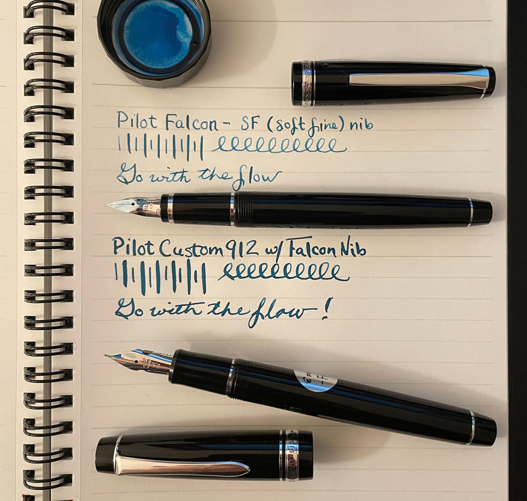
Here's a closeup comparison between the two nibs. The Custom 912 with FA nib is on the left, and the Falcon with SF nib is on the right.

I've owned my Falcon for four years, and I've also owned a Scribo pen with a flex nib and various vintage pens with flex nibs, including Eversharp Skylines and others. The Custom 912 feels like none of these. I loved my beautiful Scribo, but its flex nib was so flexible that it scared me. I was completely unable to write neatly with it. The only time I was happy with the look of my writing was when I loosened up and got a little bit out of control, scrawling stream-of-consciousness thoughts across the page, something I wasn't comfortable with. The same thing was the case with my super flexible "wet noodle" vintage pens. Yes, they were really cool, but I couldn't write a letter with them! The extreme amount of flexibility was tiring, and I was always afraid I'd push a little too hard and spring the nibs.
The Falcon nib, on the other hand, feels perfect to me. The gold is firm enough that I'm not afraid it's going to bend without my wanting it to, but I can easily exert a slight bit of pressure and get a very dramatic and beautiful line. It's comfortable, fun, and effortless. With more practice, I could develop a personal handwriting style that would look very distinctive, and the idea of exploring this nib's possibilities is so exciting!

No, this isn't a nib for people who are new to fountain pens. It should absolutely, positively not be your first nib. This is a nib for the fountain pen lover who has graduated from beginner steel nibs to gold nibs, who has tried gold nibs in several different sizes, and who wants to experience more, to find out what's next. I wish all fountain pen lovers at this stage in their journey could try this pen. I want people to know about it; I want to share it with the world!
When I chose this pen/nib combo as one of my favorites, I couldn't wait to write with it again and refresh my memory of how it felt, but, when I looked in our Custom 912 inventory, I discovered that we had none with Falcon nibs left in stock! Yikes! I immediately asked Joy to order some more, but it took longer than we expected for them to come in, and I was beginning to fear that I wouldn't get one in time to include it in my series. I delayed writing about it until my third episode, but was running out of time. Finally, the evening before I took the pens home to write Part Three, the box from Pilot arrived with more Custom 912s! Thank goodness! Everything worked out, just as I'd hoped.

The Custom 912 isn't a prohibitively expensive pen. It's currently on sale for $224., which is a bargain. (Prices are going to go up in January.) This is a handsome resin pen that is very comfortable to write with, along the same lines as the Pilot Custom 74 and Pilot Falcon. It's slightly larger than the Falcon, and comparable in size to the Custom 74. It comes with a proprietary Pilot ink cartridge and a nice CON-70 converter that has a large capacity and features a unique push-button filling mechanism. If I had to pick only one fountain pen as my companion, the Pilot Custom 912 would be a fine choice. This pen is elegant, reliable, and timeless. With the Falcon nib option, it's next-level and unforgettable.

Montegrappa ZERO Cityscape
Telling you about the Montegrappa ZERO Cityscape fountain pen makes me a little uneasy. It feels almost too personal. The moment I started my list of ten favorites, I knew I had to include this pen, and it was actually the first one I tried as soon as I brought them all home. I took the photos right away and wrote about my feelings, but then I held off and I saved my account for last because this pen is special to me. I still remember Cary Yeager from Kenro showing us the ZERO Cityscape during his store visit on November 18th last year, a couple weeks after I first started working at Pen Boutique. I immediately fell in love with that pen and have been secretly wanting it ever since. I took this photo that morning.

This pen is out of my budget, but, if I could have any pen in the store, ZERO Cityscape is the one I'd choose. (Excluding expensive pens for the purpose of re-selling them, obviously!) It's just so me. I love the combination of colors in the stripey Montegrappite (an artisanal resin made in-house), and Montegrappa's description makes me swoon: "Exclusive to Kenro and their retail partners, the Cityscape Montegrappa ZERO... evokes the landscapes of cities around the globe. It reminds us that while we all live in different places, the skies we share are the same. The Cityscape celebrates this through the complexity and depth of the Montegrappite and the rich colors of dusk: deep purples, azures, fiery burnt oranges and a bronze trim and clip to represent the setting of the sun."
Yes, the nib is gold-plated rather than solid gold, but I have other gold nibs, and this large and beautiful JoWo-made nib is smooth, precise, and perfectly tuned. The iconic design on the nib is a filigree pattern that references the octagonal profile of the first luxury pen ever produced by Montegrappa in Bassano del Grappa.

I was nervous about bringing home an extra-fine, but, the minute I started writing with it, I knew it was going to be torture when I had to return it to the store.

When I took Cityscape ZERO out for a short walk the next afternoon, my torture only increased exponentially. I texted my friend Jim, "Help. This topic is too dangerous. I WANT this pen." When he asked to see, I replied with nothing but this photo and the comment, "Look at the END. Ak!!"
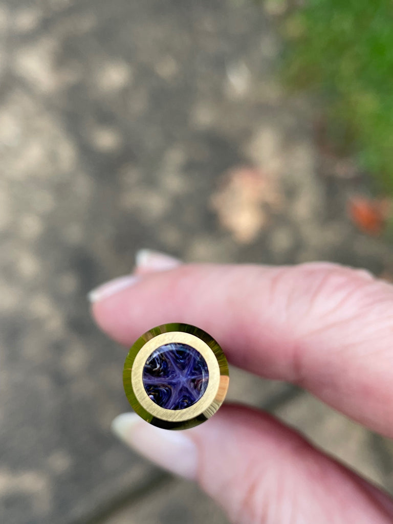
The end finial and crown are inspired by prestige timepieces, and feature sapphire glass set in a miniature bezel. As Jim remarked, "It looks like a precious stone from a distant galaxy!" I replied, "I know. Or a brittle star on the bottom of the ocean."

The brittle star is one of my all-time favorite creatures, and memories of their wonderful wriggling spiny arms filling my hands will be with me forever. I drew this brittle star after a dive. Even the position of the arms seems to match!
I love that the ZERO pen combines modernist Italian lines with mechanical precision and refinement. The chamfered-edge clip is made of brass, and is stress-tested for more than 20,000 actions. As I've mentioned before, clips with wheels on the end are my favorite (I call them wheely clips, but the real name is a "ruzzolino" clip), so the clip excites me from every angle.

Likewise, the straight lines of the pen shape feel harmonious to me, while the slightly chaotic wavy and unpredictable striations in the Montegrappite resin material speak to my creative and individualistic nature. The ZERO pen also comes in ballpoint and rollerball, and in several other equally beautiful colorways. These purple and orange Cityscape shades are Laura colors, but the sunlit forest -colored Samba and warm creamy Caramel are also gorgeous. What a handsome pen. I just can't resist.


Final List and Honorable Mentions
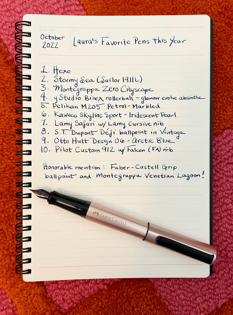
I have two honorable mentions before I draw this series to a close. 1) I considered selecting our store exclusive Montegrappa Venetian Lagoon fountain pen, because I got such pleasure from that pen when I wrote my recent blog article about it. It was a little difficult to force myself to return it to the store when I was finished! However, I didn't want to include two pens from the same brand, and I'd been in love with the Montegrappa ZERO for far longer and had never written about it in depth. Please check out my other article if you'd like to read about why I also love the gorgeous autumnal-looking Venetia. 2) I'm a little embarrassed to admit it, but I adore the Faber-Castell Grip ballpoint, and I own two of this inexpensive little pen, one in bright pink with orange dots, and one in glam violet that I was very excited to receive after having it on backorder for months. I like to replace the Grip's refill with a Monteverde Parker style Capless Ceramic Gel refill. I keep this pen in my desk drawer and use it when writing checks and for other stuff where a fountain pen isn't practical. I feel like blog readers aren't really interested in pens like this, but I endorse the Grip ballpoint. It's comfortable, colorful, and handy, and I'm crazy about the feel of the raised dots and triangular grip. This isn't a fancy pen, but I just love the design.

That said, here's my finial list in the order I originally wrote it. I hope you enjoyed this series and found something that interested you in my selections!
1. Faber-Castell Hexo fountain pen
2. Sailor 1911L fountain pen Stormy Sea
3. Montegrappa ZERO Cityscape fountain pen
4. YStudio Bihex rollerball - Glamour Evolve Absinthe
5. Pelikan Classic fountain pen - M205 Petrol-Marbled (special edition)
6. Kaweco Skyline Sport fountain pen - Iridescent Pearl (collector's edition)
7. Lamy Safari fountain pen with Lamy cursive nib
8. S T Dupont Defi ballpoint Pen in Vintage
9. Otto Hutt Design 06 fountain pen - Arctic Blue
10. Pilot Custom 912 fountain pen with Falcon (FA) nib
I'm hoping to write a short article next week, but my blog will probably have to go on hiatus during December because it's our busiest season and I will be needed in the store every day. I'll miss writing, but remember: go with the flow. Thank you for reading, and I look forward to more new topics next year!
-Laura P.
I love comments on my blog! Please leave comments if you like the articles, and, if you have any questions about this article, or any of the other blog articles, you can e-mail support@penboutique.com. Thank you!

5 comments
devel
Things are very open and intensely clear explanation of issues. It was truly information. Your website is very beneficial.
brake oil for car
Things are very open and intensely clear explanation of issues. It was truly information. Your website is very beneficial.
brake oil for car
Laura P. (blog author)
Bill: I know what you mean about the Lamy Studio grip. I prefer the All-Black edition Studio with the ergonomic grip. I don’t find the Otto Hutt grips slippery because they are flared, especially the grip on the Design 06. (The Design 04 grip is comfortable for me, but may be too narrow for you.)
Natalie: Thank you so much for the nice comments! And, yes, I’d love to do an article about my top ten favorite inks sometime.
Bill Brockman
One quick question, if I may. I’ve watched numerous reviews on Otto Hutt pens but don’t recall any of them saying if the metal grip sections are slippery. Could you favor me with your opinion. For reference, I have avoided purchasing pens with metal sections since I bought a Lamy Studio and found it too slippery for me. Nevertheless, I do have a few and can use them comfortably provided the shape of the grip includes a flared end or the surface is not completely smooth. The Kaweco Student, for example, works just fine for me, as does the Montblanc 225. Thanks in advance.
One quick question, if I may. I’ve watched numerous reviews on Otto Hutt pens but don’t recall any of them saying if the metal grip sections are slippery. Could you favor me with your opinion. For reference, I have avoided purchasing pens with metal sections since I bought a Lamy Studio and found it too slippery for me. Nevertheless, I do have a few and can use them comfortably provided the shape of the grip includes a flared end or the surface is not completely smooth. The Kaweco Student, for example, works just fine for me, as does the Montblanc 225. Thanks in advance.
James George
Laura: It’s just so much fun reading your blogs because your excitement is infectious. And I must confess that I still love expanding the size of that photo of the montegrappa pen cap simply because it is beautiful to look at! I know who to come to when I receive the calling to take the plunge. Tres bon!
Laura: It’s just so much fun reading your blogs because your excitement is infectious. And I must confess that I still love expanding the size of that photo of the montegrappa pen cap simply because it is beautiful to look at! I know who to come to when I receive the calling to take the plunge. Tres bon!
Natalie
Hi Laura,
Thank you for sharing your Top 10 pens! It was refreshing to see a mix of different writing instruments and the hyperlinks to the items on the website was most helpful! In the future, when you have time, will you please do a blog of your top ten favorite inks?
Also, I had to laugh when I got to the end of the post and noticed your trusty Hexo on your notebook! Thank you for suggesting that one! It has become a favorite pen of mine.
I’m curious about the Lamy Cursive nib and will try that out the next time I’m in the store. Here’s hoping this top 10 list will become a yearly, regular future! Thanks again for sharing!